# Tab Control Elements
## Content
The [C1TabControl](/componentone/api/wpf/online-basiclibrary/dotnet-framework-api/C1.WPF.4.6.2/C1.WPF.C1TabControl.html) is comprised of three elements – the tab, the tabstrip and the tab page – that combine to make the complete **C1TabControl** control.
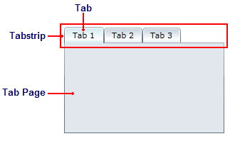
The following tabbed content explains the elements that make up the **C1TabControl**.
### Tabs
Each tab on the **C1TabControl** is represented by the [C1TabItem](/componentone/api/wpf/online-basiclibrary/dotnet-framework-api/C1.WPF.4.6.2/C1.WPF.C1TabItem.html) class. The header of the tab is exposed by the [Header](/componentone/api/wpf/online-basiclibrary/dotnet-framework-api/C1.WPF.4.6.2/C1.WPF.C1TabItem.Header.html) property of the **C1TabItem**. Each tab is associated with a tab page (see Tab Page).
Tabs can appear rounded, sloped, or rectangular. When a tab is added to a page, its default appearance is sloped – it looks similar to a tab on an office folder.
You can add a close button to each tab by setting the [TabItemClose](/componentone/api/wpf/online-basiclibrary/dotnet-framework-api/C1.WPF.4.6.2/C1.WPF.C1TabControl.TabItemClose.html) property to **InEachTab**. This will allow users to close any tab in the control; however, you can deny users the ability to close a particular tab by setting that tab's [CanUserClose](/componentone/api/wpf/online-basiclibrary/dotnet-framework-api/C1.WPF.4.6.2/C1.WPF.C1TabItem.CanUserClose.html) property to **False**.
**Adding a Tab**
It's easy to add a **C1TabItem** to a **C1TabControl**.
* At **Design** time, you can select the **C1TabControl** on your page, and add a **C1TabItem** by double-clicking the **C1TabItem** icon in the Toolbox.
* If you would rather use XAML markup, you can add a **C1TabItem** using the following markup:
```EXAMPLE
```
* It's also easy to use code to add a **C1TabItem**. Import the correct namespace first, and then add the following code to the **InitializeComponent()** method:
```vbnet
'Create the tab and add content
Dim C1TabItem1 As New C1TabItem()
C1TabItem1.Content = "C1TabItem1"
'Add the tab to the control
c1TabControl1.Items.Add(C1TabItem1)
```
```csharp
//Create the tab and add content
c1TabItem c1TabItem1 = new c1TabItem();
c1TabItem1.Content = "c1TabItem1";
//Add the tab to the control c1TabControl1.Items.Add(c1TabItem1);
```
**Customizing the Header**
When you want to add something simple to the tab's header, such as an unformatted string, you can simply use the common XML attributes in your XAML markup, such as in the following:
```xml
```
The **Header** can also be customized using code:
```vbnet
C1TabItem1.Header = Hello World
```
```csharp
c1TabItem1.Header = Hello World;
```
You can also customize the header using the [HeaderTemplate](/componentone/api/wpf/online-basiclibrary/dotnet-framework-api/C1.WPF.4.6.2/C1.WPF.C1TabItem.HeaderTemplate.html).
### Tabstrip
The **C1TabControl**'s tabstrip is created by adding one or more **C1TabItem** items to the control. Each tab in the strip is associated with a tab page (see **Tabs** and **Tab Page**).
By default, the tabstrip appears along the top of the **C1TabControl**, but you can adjust the position of the strip by setting the [TabStripPlacement](/componentone/api/wpf/online-basiclibrary/dotnet-framework-api/C1.WPF.4.6.2/C1.WPF.C1TabControl.TabStripPlacement.html) property You can also adjust the overlap of the tabs by setting the [TabStripOverlap](/componentone/api/wpf/online-basiclibrary/dotnet-framework-api/C1.WPF.4.6.2/C1.WPF.C1TabControl.TabStripOverlap.html) and [TabStripOverlapDirection](/componentone/api/wpf/online-basiclibrary/dotnet-framework-api/C1.WPF.4.6.2/C1.WPF.C1TabControl.TabStripOverlapDirection.html) properties.
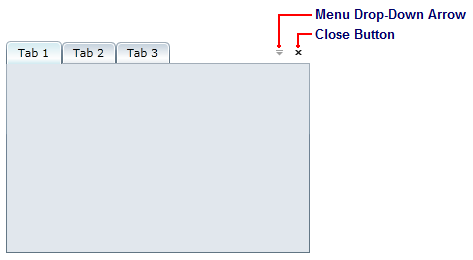
The tabstrip can also contain two optional items: a close button and a menu drop-down arrow. The close button, when clicked, closes the selected tab; the menu drop-down arrow, when clicked, exposes a drop-down menu from which users can open a different tab.
### Tab Page
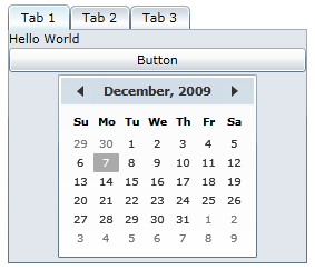
When a tab (**C1TabItem**) is added to a **C1TabControl** control, it will have a corresponding tab page that will initially appear as an empty space. In the tab page, you can add grids, text, images, and arbitrary controls. When working in Visual Studio's Design view, you can add elements to the tab page using a simple drag-and-drop operation.
You can add text to the tab page by setting the item's **Content** property or by adding a **TextBox** element to the tab page. Adding elements to the tab page at run time is simple: You can either use simple drag-and-drop operations or XAML in Visual Studio. If you'd prefer to add a control at run time, you can use C# or Visual Basic code.
A **C1TabItem** item can only accept one child element at a time. However, you can circumvent this issue by adding a panel-based control as its child element. Panel-based controls, such as a **StackPanel** control, are able to hold multiple elements. The panel-based control meets the one control limitation of the **C1TabItem** item, but its ability to hold multiple elements will allow you to show several controls in the tab page.
**Adding Content to Tab Pages**
* **Using XAML markup**
When you want to add something simple to the tab page, such as an unformatted string or a single control, you can simply use the common XML attributes in your XAML markup, such as in the following:
```xml
```
However, there may be times where you want to add more complex elements, such as grids or panels, to the tab page. In this case you can use property element syntax, such as in the following:
```XMAL
```
* **Using Code**
Using code to customize content is just as easy as using markup. To add a button control to a tab page, first import the appropriate namespaces, and then add the following code to the **InitializeComponent()** method:
```vbnet
'Create the Button control
Dim NewButton As New Button()
NewButton.Content = "Button"
'Set the Button Control's Width and Height properties
NewButton.Width = Double.NaN
NewButton.Height = Double.NaN
'Add the Button to the content area
c1TabItem1.Content = (NewButton)
```
```csharp
//Create the Button control
Button NewButton = new Button();
NewButton.Content = "Button";
//Set the Button Control's Width and Height properties
NewButton.Width = double.NaN;
NewButton.Height = double.NaN;
//Add the Button to the content area
c1TabItem1.Content = (NewButton);
```
You can also customize the content using the **ContentTemplate**.