# Header
Header element of the Expander appears at the top of the Expandder control. Learn more about the Expander header in Expander for WPF documentation.
## Content
By default, the header element of the Expander control appears at the top of the control and the expander button appears on the right side of the header. The header element contains no text initially. However, you can add text to it using [Header](/componentone/api/wpf/online-accordion5/dotnet-api/C1.WPF.Accordion/C1.WPF.Accordion.C1Expander.Header.html) property of the [C1Expander](/componentone/api/wpf/online-accordion5/dotnet-api/C1.WPF.Accordion/C1.WPF.Accordion.C1Expander.html) class.

To add text to the header element, you simply need to set the **Header** property to a string, say Expand Me!, as illustrated in the following example. Once the text is added, you can style it using several font properties available by default.
```xml
```
```csharp
ExpanderControl.Header = "Expand Me!";
```
## Customizing Header
In addition to adding text to the header element, Expander allows you to change the appearance of the header. It lets you change the template of the expander header using [HeaderTemplate](/componentone/api/wpf/online-accordion5/dotnet-api/C1.WPF.Accordion/C1.WPF.Accordion.C1Expander.HeaderTemplate.html) property of the **C1Expander** class. The **HeaderTemplate** property sets the template for the header by accessing the **DataTemplate** class:
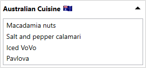
The following code demonstrates how you can set a header template for the Expander control:
```xml
Australian Cuisine
```