# Content Area
Content area element of the Expander appears below the header when the Expander control is expanded. Learn more about the content area in Expander for WPF documentation.
## Content
The content panel of the Expander control is initially an empty area. However, you can add grids, text, images, and arbitrary controls in this content area. To simply add text to the content area of the Expander control, use the **Content** property or add a **TextBox** element to the content area as shown in the image below.

```xml
```
```csharp
ExpanderControl.Content = "Content Area";
```
However, there may be times where you want to add other elements, such as check boxes, grids or panels, to the content area. In this case, you can add the elements of your choice to the Expander control. For example, in the following example, we are adding a check box to the content area of the Expander control as shown in the image below.
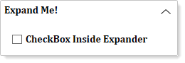
The following code can be used to add a check box to the content area of the Expander control:
```xml
```
```csharp
CheckBox chkcontent = new CheckBox();
//CheckBox as Expander Content
chkcontent.Content = "CheckBox Inside Expander";
ExpanderControl.Content = chkcontent;
```