# Expander Overview
Expander is an expandable and collapsible information panel that can include text, images, and controls. Learn more about it in Expander for WPF documentation.
## Content
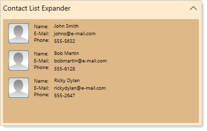
**Expander for WPF**, as the name suggests, allows you to create an expandable and collapsible information panel that can include text, images, and controls. The Expander control appears as a header and a blank content panel whose behaviors, such as the expandability, state and the direction, can be modified based on your requirements.
| **Documentation** | **Blogs** |
| ------------- | ----- |
| [Create Your First Application with Expander](/componentone/docs/wpf/online-accordion5/overview/expander-overview/quick-start)
[Expansion Direction](/componentone/docs/wpf/online-accordion5/overview/expander-overview/expander-expand-direction)
[Expandability](/componentone/docs/wpf/online-accordion5/overview/expander-overview/expandability) | [Animating Expander](https://developer.mescius.com/blogs/animating-componentone-expander) |