# Customization

Users can easily customize the header, icon and content area of the Accordion control. See more demos, documentation, and samples here.

## Content


A user can customize the default look of the Accordion control to give it a unique appearance. You can customize the different elements of an Accordion control such as its header, icon or content area.

The section below covers each type of customization.

### Header customization

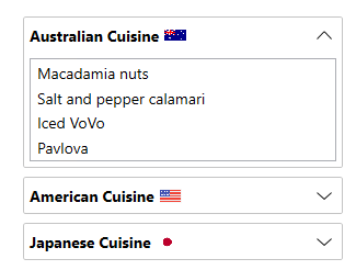
The user can customize the header of the Accordion control by modifying the header of the expanders in each accordion pane using the **HeaderTemplate** property.
![Accordion Header Customization](https://cdn.mescius.io/document-site-files/images/530ec557-536d-4b6e-94ca-c0cf743e2c3a/images/header-customization-accordion.png)

The code snippet below shows how the **HeaderTemplate** has been used to enhance the look of the Accordion for WPF control.

```xml
<c1:C1Accordion x:Name="accordion" Width="300" Margin="25"  >
             <c1:C1Expander  IsExpanded="True"  >
                 <c1:C1Expander.HeaderTemplate>
                     <DataTemplate>
                         <StackPanel Orientation="Horizontal">
                             <TextBlock VerticalAlignment="Center" FontWeight="Bold">Australian Cuisine</TextBlock>
                             <Image Margin="5, 0" Source="australia.png" Height="20" Width="20"></Image>
                         </StackPanel>
                     </DataTemplate>
                 </c1:C1Expander.HeaderTemplate>
                 <ListBox>
                     <ListBoxItem Content="Macadamia nuts"></ListBoxItem>
                     <ListBoxItem Content="Salt and pepper calamari"></ListBoxItem>
                     <ListBoxItem Content="Iced VoVo"></ListBoxItem>
                     <ListBoxItem Content="Pavlova"></ListBoxItem>
                 </ListBox>
             </c1:C1Expander>
</c1:C1Accordion>
```

### Icon customization

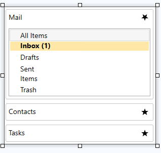
The user can customize the icon of the Accordion control by using the ExpanderIconTemplate property. So, the user can add the expander icon of their choice.
![Icon Customization](https://cdn.mescius.io/document-site-files/images/530ec557-536d-4b6e-94ca-c0cf743e2c3a/images/icon-glyph_customization.png)

The code snippet below depicts how to use the **ExpanderIconTemplate** property:

```xml
<c1:C1Accordion x:Name="accordion" ExpandIconTemplate="{x:Static c1:C1IconTemplate.Star5}" > 
</c1:C1Accordion>         
```

### Content customization

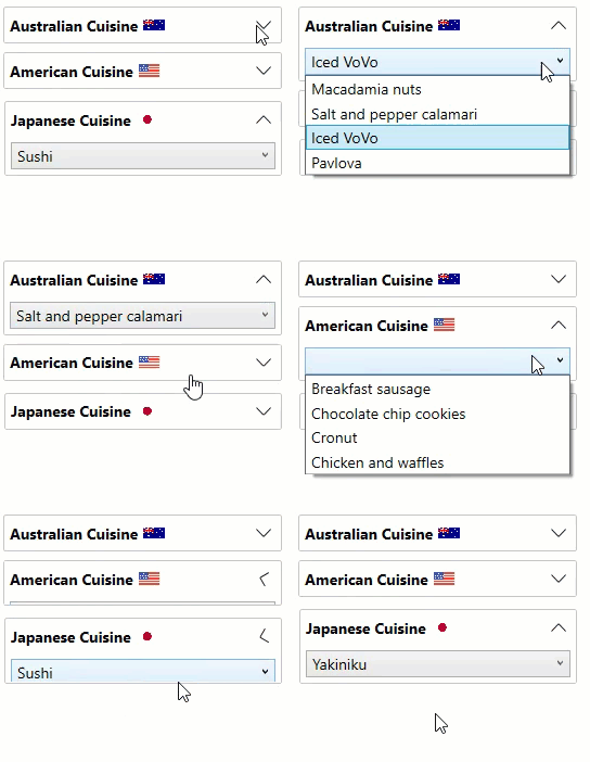
The user can customize the content within each Accordion pane in the Accordion control, so that the user can add the controls or items of their choice, such as ComboBox, CheckBox, Slider, Button etc. within the Accordion control.

In the GIF below, we have used a ComboBox to populate data within Accordion panes in the control.
![Accordion Panes](https://cdn.mescius.io/document-site-files/images/530ec557-536d-4b6e-94ca-c0cf743e2c3a/images/accordion-contentcustomization.gif)

The code snippet below depicts how you can add a ComboBox control to the Expander in the Accordion pane:

```xml
<c1:C1Accordion x:Name="accordion" >
            <c1:C1Expander IsExpanded="True" >
                <c1:C1Expander.HeaderTemplate>
                    <DataTemplate>
                        <StackPanel Orientation="Horizontal">
                            <TextBlock VerticalAlignment="Center" FontWeight="Bold">Australian Cuisine</TextBlock>
                            <Image Source="australia.png" ></Image>
                        </StackPanel>
                    </DataTemplate>
                </c1:C1Expander.HeaderTemplate>
                <ComboBox>
                    <ComboBoxItem>Macadamia nuts</ComboBoxItem>
                    <ComboBoxItem>Salt and pepper calamari</ComboBoxItem>
                    <ComboBoxItem>Iced VoVo</ComboBoxItem>
                    <ComboBoxItem>Pavlova</ComboBoxItem>
                </ComboBox>
            </c1:C1Expander>            
</c1:C1Accordion>
```