# TextBox
## Content
The Input TextBox allows users to enter text values in the control. Though it typically captures a single line of text, but can also be configured to capture multiple lines of text. The TextBox control serves the purpose of displaying and editing plain text.
## Set Watermark
Users can set the **PlaceHolder** property of C1TextBox class to get or set the textual place holder, which is displayed by the control to prompt the user for information.

The code snippet below depicts the use of placeholder or watermark in TextBox control.
```xml
```
## Multi-line TextBox Input
The TextBox control lets users create multi-line versions of the control as shown in the snapshot by using the **AcceptsReturn** property, which set the value that determines whether the text box displays newline characters.
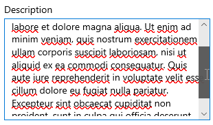
The code snippet below depicts the multi-line behavior in TextBox control.
**xml**
```xml
```
**csharp**
```csharp
textBox.AcceptsReturn = true;
textBox.TextWrapping = TextWrapping.Wrap;
textBox.MaxHeight = 172;
textBox.Width = 300;
textBox.Header = "Description";
ScrollViewer.SetVerticalScrollBarVisibility(textBox, ScrollBarVisibility.Auto);
```
The TextBox with multi-line feature will grow vertically unless it is limited by **Height** or **MaxHeight** property. Also, scrolling using a scroll-wheel is automatically enabled when needed.