# Header
## Content
Column header refers to the fixed row/s on the top of the grid which contains a caption string, sort glyph etc. In FlexGrid, by default, the top row with zero index is allocated for the column header.
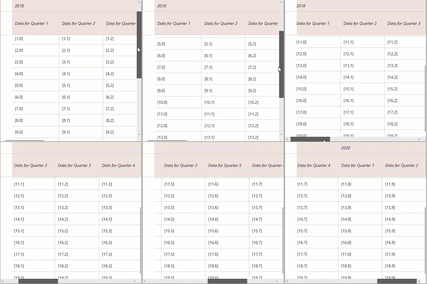
## Set column header and header text
WinUI FlexGrid control lets you set column header using the [ColumnHeaders](/componentone/api/winui/online-winui/dotnet-api/C1.WinUI.Grid/C1.WinUI.Grid.FlexGrid.ColumnHeaders.html) property of **FlexGrid** class. It helps to add column headers in unbound grid. Here, we have added 2 rows in column header and set text in cells of column header.
The code snippet below lets you specify the column header and set the header text:
```csharp
// set unbound column headers
var ch = flexGrid1.ColumnHeaders;
ch.Rows.Clear();
ch.Rows.Add(new GridRow());
ch.Rows.Add(new GridRow());
for (int c = 0; c < ch.Columns.Count; c++)
// set column header text
{
ch[0, c] = 2018 + c / 4; // year
ch[1, c] = string.Format("Data for Quarter {0}", c % 4 + 1); // quarter
}
```
## Merge column header
FlexGrid provides the [AllowMerging](/componentone/api/winui/online-winui/dotnet-api/C1.WinUI.Grid/C1.WinUI.Grid.GridRow.AllowMerging.html) property in **GridRow** class for Row object which specifies whether it is allowed to merge cells in a particular row (in this case, the header row) or not.
Use the code below to merge column headers in FlexGrid.
```csharp
// allow merging
flexGrid1.AllowMerging = GridAllowMerging.All;
// allow merging of the first column header row
flexGrid1.ColumnHeaders.Rows[0].AllowMerging = true;
```
## Wrap column header text
To wrap the text in column header, access the particular row and set its [WordWrap](/componentone/api/winui/online-winui/dotnet-api/C1.WinUI.Grid/C1.WinUI.Grid.GridRow.WordWrap.html) property of **GridRow** class to true. Note that to view the wrapped text properly, you need to adjust the row height using the **Height** property of GridRow class.
Use the code below to wrap header text of the FlexGrid columns.
```csharp
// Wrap column header text
flexGrid1.ColumnHeaders.Rows[1].WordWrap = true;
flexGrid1.ColumnHeaders.Rows[1].Height = new GridLength(80);
```
## Style column header
To style the column header, you can access the [ColumnHeaderBackground](/componentone/api/winui/online-winui/dotnet-api/C1.WinUI.Grid/C1.WinUI.Grid.FlexGrid.ColumnHeaderBackground.html) property of the **FlexGrid** class and set a solid color in the background using the [SolidColorBrush](https://docs.microsoft.com/en-us/dotnet/api/system.windows.media.solidcolorbrush?view=net-5.0) method, and further, use the **ColumnHeaderFontStyle** to set a particular font style.
Some of other properties that can be used to style the column headers are ColumnHeaderFontFamily, ColumnHeaderFontSize, ColumnHeaderFontStyle, ColumnHeaderFontWeight, ColumnHeaderForeground etc.
Customize column header of the FlexGrid control using the code below.
```csharp
// Style column header
SolidColorBrush colHeaderBrush = new SolidColorBrush(Windows.UI.Color.FromArgb(34, 124, 9, 9));
flexGrid1.ColumnHeaderBackground = colHeaderBrush;
flexGrid1.ColumnHeaderFontStyle = Windows.UI.Text.FontStyle.Italic;
```
## Column Header Menu
The Column Header Menu feature in WinUI enables users to configure the visibility of column menu options for the entire FlexGrid or for individual columns.
The ColumnOptionsLoading, ColumnFilterLoading, OptionsLoading, and FilterLoading events allow the customization of the options or filter menus of any column within the FlexGrid.
### Column Header Menu States
The visibility of the column header menu is controlled by the ColumnOptionsMenuVisibility property (for grid-level configuration) and the OptionsMenuVisibility property (for column-level configuration). These properties utilize an enumeration with the following values:
| **Property** | **Type** | **Values** | **Description** | **Scope** |
| -------- | ---- | ------ | ----------- | ----- |
| ColumnOptionsMenuVisibility | C1.WinUI.Grid.GridColumnOptionsMenuVisibility (Enum) | - Visible
- Collapsed
- MouseOver
| @rows=2:- Users can set the menu options to be always visible.
- Users can set the menu options to be never visible.
- Users can set the menu options to be visible when hovering over the header cell.
| For grid-level: Applies to Grid or Grid-level |
| OptionsMenuVisibility | C1.WinUI.Grid.GridColumnOptionsMenuVisibility (Enum) | - Visible
- Collapsed
- MouseOver
| For column-level: Applies to Column or Column-level |
### Column Header Menu Events
These events are triggered during the loading of the column options and filter menus, allowing for customization.
| **Property** | **Type** | **Description** |
| -------- | ---- | ----------- |
| ColumnOptionsLoading | System.EventHandler\ | Triggered when the column options menu is opened and is loading. |
| ColumnFilterLoading | System.EventHandler\ | Triggered when filters are loading in the header menu. |
| OptionsLoading | System.EventHandler\ | Triggered when the options menu for a specific column is loading. |
| FilterLoading | System.EventHandler\ | Triggered when filters for a specific column are loading. |
### Configure Header Menu Item
The component includes default header menu items that developers can configure. This section demonstrates how to access and configure the Column Header Menu by setting various properties on the `grid` control:
To show the filter menu item, set:
```csharp
// Show filter menu item
grid.AllowFiltering = true;
```
To allow grouping, set:
```csharp
// Allow Grouping
grid.AllowGrouping = true;
```
To show the sort menu items, set:
```csharp
// Show Sort menu items
grid.AllowSorting = true;
```
To show the resize menu item, set:
```csharp
// Show Resize menu item
grid.AllowResizing = GridAllowResizing.Both;
```
## Quick Start
To begin using the FlexGrid with a column header menu, the following configuration steps are required.
### **Add Packages**
Download the following packages from the [NuGet](https://www.nuget.org/ "https://www.nuget.org/") Package manager
1\. C1\.WinUI\.Grid
2\. Bogus: Faker used to populate the grid with dummy data
### **Import**
1\. In the MainWindow\.xaml file add the following XML namespace declarations:
```xml
xmlns:c1="using:C1.WinUI.Grid"
xmlns:core="using:C1.WinUI.Core"
```
### Component Usage
In this example, the grid's ColumnOptionsMenuVisibility is set to Visible. Each column has its own OptionsMenuVisibility configured, except for the City column, which inherits the Visible setting from the FlexGrid.
**MainWindow.xaml**
The example below demonstrates defining a style for the column header menu popup and configuring column visibility.
```xml
```
**MainWindow.xaml.cs**
FlexGrid events are attached and applied to the first column (`firstNameCol` in this example).
```csharp
using Bogus;
using Microsoft.UI.Xaml;
using System.Collections.ObjectModel;
using System.Diagnostics;
namespace WinUiApp1
{
///
/// An empty window that can be used on its own or navigated to within a Frame.
///
public sealed partial class MainWindow : Window
{
ObservableCollection Items = [.. new PersonFaker().Generate(100)];
public MainWindow()
{
InitializeComponent();
grid.ItemsSource = Items;
grid.ColumnOptionsLoading += GridOnColumnOptionsLoading;
grid.ColumnFilterLoading += GridColumnFilterLoading;
firstNameCol.FilterLoading += ColOnFilterLoading;
firstNameCol.OptionsLoading += ColOnColumnOptionsLoading;
}
public void GridOnColumnOptionsLoading(object? sender, C1.WinUI.Grid.GridColumnOptionsLoadingEventArgs e)
{
Debug.WriteLine("Grid: Loading Column Options");
}
public void ColOnColumnOptionsLoading(object? sender, C1.WinUI.Grid.GridColumnOptionsLoadingEventArgs e)
{
Debug.WriteLine("Column: Loading Column Options");
}
public void ColOnFilterLoading(object? sender, C1.WinUI.Grid.GridColumnFilterLoadingEventArgs e)
{
Debug.WriteLine("Column: Loading Column Filters");
}
public void GridColumnFilterLoading(object? sender, C1.WinUI.Grid.GridColumnFilterLoadingEventArgs e)
{
Debug.WriteLine("Grid: Loading Column Filters");
}
}
public class Person
{
public string FirstName { get; set; } = string.Empty;
public string LastName { get; set; } = string.Empty;
public string State { get; set; } = string.Empty;
public string City { get; set; } = string.Empty;
}
public class PersonFaker : Faker
{
public PersonFaker()
{
RuleFor(d => d.FirstName, f => f.Name.FirstName());
RuleFor(d => d.LastName, f => f.Name.LastName());
RuleFor(d => d.State, f => f.Person.Address.State.ToString());
RuleFor(d => d.City, f => f.Person.Address.City);
}
}
}
```
## Style column header menu (Popup Style)
The `PopupStyle` property can be used to customize the style of the options menu popup. This allows developers to adjust the appearance of the popup to match any application theme. Below is an example of a style defined in `MainWindow.xaml`:
**MainWindow.xaml**
```xml
```