# Expand and Collapse Panels
## Content
The Accordion control allows you to organize content into collapsible panes so that you can choose to show or hide the content in the panes according to your requirements. By expanding the accordion panes, you can access their content and work with them. By collapsing the accordion panes, you can temporarily deny access to their content, save space and avoid scrolling. You can also change the behavior and direction in which the pane(s) expand or collapse programmatically. Let us explore in detail about these features in the following sections.
## Expand Direction
Accordion allows you to specify the direction in which the accordion pane expands to display the items. By default, the Accordion expands in downward direction. However, you can change the direction in which the control expands using [ExpandDirection](/componentone/api/winui/online-winui/dotnet-api/C1.WinUI.Accordion/C1.WinUI.Accordion.C1Accordion.ExpandDirection.html) property of the [C1Accordion](/componentone/api/winui/online-winui/dotnet-api/C1.WinUI.Accordion/C1.WinUI.Accordion.C1Accordion.html) class. The **ExpandDirection** property lets you expand the Accordion in the following four directions using the [ExpandDirection](/componentone/api/winui/online-winui/dotnet-api/C1.WinUI.Accordion/C1.WinUI.Accordion.ExpandDirection.html) enumeration.
| **Expanding Direction** | **Snapshot** |
| --- | --- |
| Down (default) |  |
| Up |  |
| Right |  |
| Left |  |
The following code illustrates how to set "Left" direction for expanding the Accordion control. This example uses the sample created in [Quick Start](/componentone/docs/winui/online-winui/winui-controls/accordion/accordion-quickstart).
**xml**
```xml
```
**csharp**
```csharp
accordion.ExpandDirection = ExpandDirection.Left;
```
## Expand Modes
Accordion control provides you the flexibility to change the expanding behavior of the control based on your application requirements. Ability to change the behavior of the control can be useful in cases where you want to conserve screen real estate so that the user is free of unnecessary distractions. Just like the musical instrument accordion, the Accordion control provides the flexibility to tightly compress itself for storage and decompress at the time of playing it.
By default, the Accordion control expands only one pane at a time and collapses the other panes. However, you can change this behavior of the accordion using [ExpandMode](/componentone/api/winui/online-winui/dotnet-api/C1.WinUI.Accordion/C1.WinUI.Accordion.C1Accordion.ExpandMode.html) property of the **C1Accordion** class. The **ExpandMode** property manages the expanding behavior of the control by using the [ExpandMode](/componentone/api/winui/online-winui/dotnet-api/C1.WinUI.Accordion/C1.WinUI.Accordion.ExpandMode.html) enumeration which specifies the following expanding modes for the Accordion control to determine the number of items that can be expanded or collapsed at a time.
| **Expand Modes** | **Snapshot** | **Description** |
| --- | --- | --- |
| One (default) | 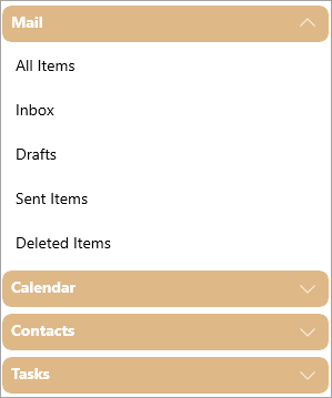 | Only one item in the Accordion control can be expanded at a time. |
| Collapsible |  | All items in the Accordion control can be collapsed at a time. |
| Any |  | Any item in the Accordion control can be expanded or collapsed. |
The following code illustrates how to set the expand mode to "Collapsible" for the Accordion control. This example uses the sample created in [Quick Start](/componentone/docs/winui/online-winui/winui-controls/accordion/accordion-quickstart).
**xml**
```xml
```
**csharp**
```csharp
accordion.ExpandMode = ExpandMode.Collapsible;
```