# C1TaskDialog Tasks Menu
## Content
In the **C1TaskDialog** **Tasks** menu you can quickly and easily customize the appearance and behavior of the [C1TaskDialog](/componentone/api/win/online-winpack/dotnet-framework-api/C1.Win.C1Win7Pack.4.8/C1.Win.C1Win7Pack.C1TaskDialog.html) component's dialog box.
To access the **C1TaskDialog** **Tasks** menu, click on the smart tag () in the upper right corner of the control. This will open the **C1TaskDialog** **Tasks** menu.
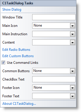
Options include:
* **Show Dialog**
Clicking the **Show Dialog** option displays the current dialog box. This option is useful as it allows you to preview the appearance of the dialog box without running your application.
* **Window Title**
Enter text in this text box to set the text that appears on the caption bar of the dialog box.
* **Main Icon**
This option sets the main icon displayed in the dialog box and in the upper-left corner of the dialog box's caption bar. Click this item's drop-down allow and choose an option. Options include **None** (default), **Shield**, **Information**, **Error**, and **Warning**.
* **Main Instruction**
Enter text in this text box to set the larger heading text that will be displayed at the top of the dialog box's content area.
* **Content**
Text entered in this area will be displayed below the Main Instruction and will typically consist of more detailed information or instructions. You can enter HTML links in this section as well.
* **Edit Radio Buttons**
Clicking this item will open the **C1TaskDialog.RadioButtons Collection Editor**. In this dialog box you can add radio buttons to the dialog box and customize the text displayed next to each button. If you add a radio button the dialog box will be previewed, to close the preview click in Visual Studio. See [RadioButtons Collection Editor](/componentone/docs/win/online-winpack/designtimesupport/c1taskdialogcollecti/radiobuttonscollecti) for more information.
* **Edit Custom Buttons**
Clicking this item will open the **C1TaskDialog.CustomButtons Collection Editor**. In this dialog box you can add custom buttons to the dialog box and customize the text displayed next to each button. See [CustomButtons Collection Editor](/componentone/docs/win/online-winpack/designtimesupport/c1taskdialogcollecti/custombuttonscollect) for more information.
* **Use Command Links**
When this check box is checked (default) custom buttons will appear as command links rather than standard buttons. Command links have a clean, lightweight appearance that allows for descriptive labels, and are displayed with either a standard arrow or custom icon, and an optional supplemental explanation. See [Command Links](/componentone/docs/win/online-winpack/workingwithwindows7c/workingwithc1taskdia/commandlinks) for more information.
* **Common Buttons**
Select this option to add standard buttons to the dialog box. Click the drop-down arrow and check the check boxes for the buttons you wish to include. Available buttons include **Ok**, **Yes**, **No**, **Cancel**, **Retry**, and **Close**. The default option is **None**.
* **CheckBox Text**
Text entered in this text box will be displayed next to a check box in the dialog box. If no text is entered (default), the check box will not be displayed in the dialog box.
* **Footer Icon**
This option sets the icon displayed in the footer area of the dialog box. Click this item's drop-down arrow and choose an option. Options include **None** (default), **Shield**, **Information**, **Error**, and **Warning**.
* **Footer Text**
Text entered in this section will be displayed in the footer area of the dialog box.
* **About C1TaskDialog**
Clicking the **About** item displays the C1TaskDialog control's **About** dialog box, which is helpful in finding the build number of the control.
You can also access some of these options in the component's context menu and more options in the Properties window.