# Appearance
## Content
This section provides a visual and descriptive overview of the settings available to customize the appearance of the SuperTooltip for WinForms controls.
C1SuperTooltip Background Gradient
You can customize the appearance of the C1SuperTooltip quickly and easily by changing the **BackgroundGradient** property. You can access the BackgroundGradient property at design time through the Properties window or by selecting the **Background Gradient** drop-down box from the **C1SuperTooltip Tasks** menu. By default the BackgroundGradient property is set to **Automatic**.
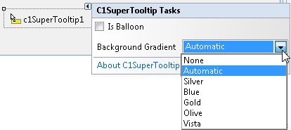
The following background gradients are available for **C1SuperTooltip**:
| Background Gradient | Preview |
| --- | --- |
| None |
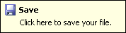 |
| Automatic |
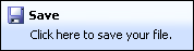 |
| Silver |
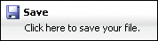 |
| Blue |
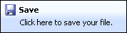 |
| Gold |
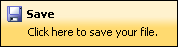 |
| Olive |
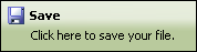 |
| Vista |
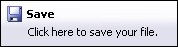 |
**C1SuperTooltip Shape**
By using the **IsBalloon** and **RoundedCorners** properties you can customize the appearance of the C1SuperToolTip.
You can access the IsBalloon and RoundedCorners properties through the Properties window. You can also access the IsBalloon property through the **C1SuperTooltip Tasks** menu.
The following shape settings are available for **C1SuperTooltip**:
| Shape Settings | Preview |
| --- | --- |
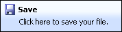
| IsBalloon = False RoundedCorners = False |
 |
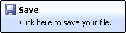
| IsBalloon = False RoundedCorners = True |
 |
| IsBalloon = True RoundedCorners = False |
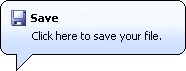 |
If both the IsBalloon and RoundedCorners properties are set to **False** (default), the Tooltip appears as a rectangle. If RoundedCorners is set to **True**, the ToolTip appears as a rounded rectangle. If IsBalloon is set to **True**, the ToolTip appears in a balloon shape.
**C1SuperTooltip Shadow**
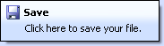
By setting the **Shadow** property you can determine whether a shadow will appear below a **C1SuperTooltip**. By default the Shadow property is set to **True**.
You can access the Shadow property through the Properties window.
The following shadow settings are available for **C1SuperTooltip**:
| Shape Settings | Preview |
| --- | --- |
| Shadow = True |
 |
| Shadow = False |
 |
You can change the appearance and behavior settings of your ToolTips two different ways: using the **C1SuperTooltip Editor** or using the C1SuperTooltip control, through its smart tag and the Properties window.
**Changing the settings in the C1SuperTooltip Editor**
In the **C1SuperTooltip Editor**, you can use the **Office** tab to add images, a title, a subtitle, and the body text of the ToolTip. C1SuperTooltip automatically creates all of the HTML code behind the ToolTip, saving you time and work. You can create the same ToolTip by entering all of your own HTML code on the **Html** tab of the editor if you choose not to have the editor do it for you. When using these two tabs, the changes you make and the settings you specify are applied only to the ToolTip for the control you have selected in your form.
The **Properties** tab, however, allows you to change the overall appearance and behavior of the ToolTip, which will be applied to all controls associated with it.
1. In your project, select the control for which you are creating a C1SuperTooltip.
2. In the Properties window, click the **ellipsis** button next to the **ToolTip on C1SuperTooltip1** property for the control to open the **C1SuperTooltip Editor**.
3. Select the **Properties** tab.
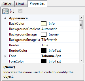
4. Set the following properties:
* Click the drop-down arrow next to the **BackColor** property, select the **Web** tab, and choose a color.
* Set the **BackgroundGradient** property to **None**. The background color will not appear if this property is set to a value other than **None**.
* Click the drop-down arrow next to the **ForeColor** property, select the **Web** tab, and choose a color.
* Set the **Shadow** property to **False**.
* Set the **Border** property to **False**.
* Expand the **Font** property node and set the **Size** to **14**.
5. To change the amount of time, in milliseconds, the ToolTip remains visible when the mouse hovers over each button, set the AutoPopDelay property to **1000**.
6. Run the project and mouse over the control with the associated ToolTip. The ToolTip will appear something like the following image, depending on the settings you used.

### Changing the settings using the C1SuperTooltip Control
You can use the C1SuperTooltip smart tag to determine the background gradient for the ToolTip and whether it appears within a balloon shape or a rectangular box. For more information, see [C1SuperTooltip Tasks and Context Menus](/componentone/docs/win/online-supertooltip/designtimesupport).
You can use the Visual Studio Properties window to change all of the C1SuperTooltip properties. This is the same list of properties you will find on the **Properties** tab of the **C1SuperTooltip Editor**.
1. Right-click the C1SuperTooltip control and select **Properties** to access the Properties window.
2. Set the desired properties.