# Tasks Menu
This topic provides info about the tasks menu in design time.
## Content
A smart tag represents a short-cut tasks menu that provides the most commonly-used properties in each control. You can invoke each control's tasks menu by clicking on the smart tag () in the upper-right corner of the control.
### C1SuperTooltip Tasks Menu
To access the **C1SuperTooltip Tasks** menu, click the smart tag in the upper-right corner of the C1SuperTooltip control. The **C1SuperTooltip Tasks** menu appears. You can set the **IsBalloon** and **BackgroundGradient** properties through the **C1SuperTooltip Tasks** menu.
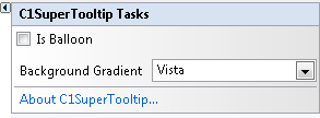
* **Is Balloon**
Check this checkbox if you want the ToolTip to appear within a balloon shape rather than in a rectangular box.
* Background Gradient
Specifies the background gradient for the ToolTip. You can choose **Automatic** (current system Visual Style), **Blue**, **Gold**, **None**, **Olive**, **Silver** or **Vista** (Microsoft Vista style).
* **About C1SuperTooltip**
Displays the **About C1SuperTooltip** dialog box containing the version number, along with licensing, registration and purchasing information, and additional online resources.
### C1SuperLabel Tasks Menu
To access the **C1SuperLabel Tasks** menu, click the smart tag in the upper-right corner of the C1SuperLabel control. The **C1Label Tasks** menu appears. By clicking **Edit label** you can open the **C1SuperLabel Editor**.
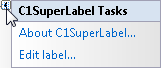
* **About C1SuperLabel**
Displays the **About C1SuperTooltip** dialog box containing the version number, along with licensing, registration and purchasing information, and additional online resources.
* **Edit label**
Opens the **C1SuperLabel Editor** so you can begin adding HTML code to create a C1SuperLabel.
### C1SuperErrorProvider Tasks Menu
To access the **C1SuperErrorProvider Tasks** menu, click the smart tag in the upper-right corner of the C1SuperErrorProvider control. The **C1SuperErrorProvider Tasks** menu appears.
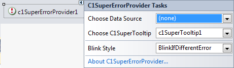
* Choose Data Source
Use this drop-down to select a data source that you can attach to a control and that you want to monitor for errors.
* Choose C1SuperTooltip
Click this drop-down and select a C1SuperTooltip to associate it with the error provider component. The C1SuperTooltip will be used for displaying the error description text. It must be set in order for the error message to appear when the mouse pointer hovers the error icon, although it can be blank. If it is blank, the error icon won't have the associated tool tip.
* Blink Style
Select the way you would like the default error message icon to appear: **BlinkIfDifferentError**, **AlwaysBlink**, or **NeverBlink**.
* About C1SuperErrorProvider
Displays the **About C1SuperTooltip** dialog box containing the version number, along with licensing, registration and purchasing information, and additional online resources.