# Editor
This topic provides info about the editors in design time.
## Content
The user can quickly configure C1SuperTooltip, C1SuperLabel and C1SuperErrorProvider at design time using the Editors. You can access the Editors through the Properties window.
### C1SuperTooltip Editor
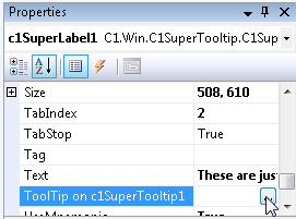
To access the **C1SuperTooltip Editor**, access the Properties window for the control that will contain the ToolTip and select the **ellipsis** button next to **ToolTip on C1SuperTooltip**, as in the image below. The **C1SuperTooltip Editor** appears.
The **C1SuperTooltip Editor** consists of a tabbed design pane on the left, where you can change the appearance and content of the ToolTip, and a preview pane on the right, where you can view changes that have been made to the ToolTip.
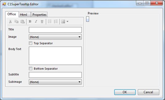
At design time, there are two ways you can create the content of a ToolTip: using the **Office** tab or using **Html** tab to manually enter your own HTML code. You can use the **Properties** tab to change the ToolTip's appearance and behavior settings.
### Office Tab
In the **C1SuperToolTip Editor** you can use the **Office** tab to add images, a title, a subtitle, and the body text of the ToolTip. C1SuperTooltip automatically creates all of the HTML code behind the ToolTip, saving you time and work. The various elements in the **Office** tab allow you to quickly customize the content of your ToolTip, for example as in the image below.
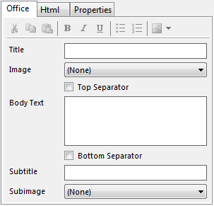
**Title**
This is the text that appears at the top of the ToolTip; you can add HTML code to customize the appearance of the title text.
**Image**
This is the image that appears to the left of the Title. You can add an image by clicking the drop-down arrow and selecting **Add image**. Images that you have added using the **Edit Image Collection Editor** are listed and can be added to the ToolTip.
**Top Separator**
By checking this check box, you will add the top separator to the ToolTip. The top separator is a horizontal, dark grey rule that appears between the ToolTip's title and the body text.
**Body Text**
The body text is the main content of the ToolTip; you can add HTML to customize the appearance of the body text.
**Bottom Separator**
By checking this check box, you will add the bottom separator to the ToolTip. The top separator is a horizontal, dark grey rule that appears between the ToolTip's body text and subtitle text.
**Subtitle**
This is text that appears below the ToolTip's body text; you can add HTML code to customize the appearance of the title text.
**Subimage**
This is the image that appears to the left of the subtitle. You can add an image by clicking the drop-down arrow and selecting **Add image**. Images that you have added using the Edit Image Collection Editor are listed and can be added to the ToolTip.
For more information about creating a ToolTip using the **Office** tab, see the [Creating C1SuperTooltips at Design Time](/componentone/docs/win/online-supertooltip/designtimesupport) topic.
### HTML Tab
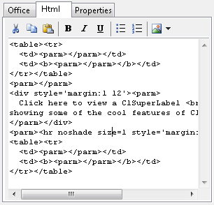
In the **Html** tab of the **C1SuperToolTip Editor** you can view and edit HTML code that reflects changes you have made in the **Office** tab. You can also use the **Html** tab to create a ToolTip by entering all of your own HTML code if you choose not to have the editor do it for you. By creating a ToolTip in the **Html** tab you have more control over each line of the ToolTip.
The **Html** tab provides a formatting toolstrip with the following buttons: **Cut**, **Copy**, **Paste**, **Bold**, **Italic**, **Underline**, **Bulleted List**, **Numbered List**, and **Insert Image**.
For more information about creating a ToolTip using the **Html** tab, see the [Adding a C1SuperTooltip using HTML](/componentone/docs/win/online-supertooltip/work-with-supertooltip) topic.
### Properties Tab
The **Properties** tab of the **C1SuperToolTip Editor** allows you to customize the overall appearance and behavior of the ToolTip, which will be applied to all controls associated with it. While the settings available in the **Properties** tab of the editor are the same as in the Properties window of the C1SuperTooltip, the advantage of the Properties tab is that you can quickly preview content and appearance changes in the Preview pane.
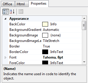
For more information about changing ToolTip appearance and behavior settings using the **Properties** tab, see the [Changing the C1SuperTooltip Appearance and Behavior Settings](/componentone/docs/win/online-supertooltip/work-with-supertooltip) topic.
### Preview Pane
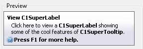
The **Preview** pane of the **C1SuperToolTip Editor** allows you to preview the ToolTip. The **Preview** pane appears on the right side of the **C1SuperToolTip Editor** and reflects any changes that you make to the ToolTip allowing you to more easily visualize and change the ToolTip's content and appearance.
### C1SuperLabel Editor
To access the **C1SuperLabel Editor**, select **Edit label** from the **C1SuperLabel Tasks** menu. The **C1SuperLabel Editor** appears.
Using the **C1SuperLabel Editor**, you can control the content and appearance of the **C1SuperLabel**. You can enter text and HTML code in the left-side text area of the **C1SuperLabel Editor** and preview the content in the right-side preview area, as in the example below.
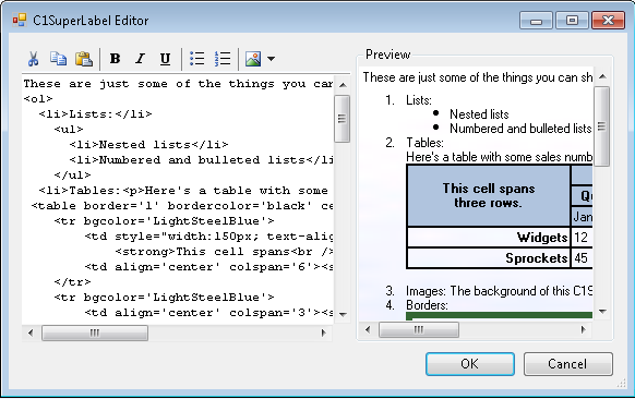
The **C1SuperLabel Editor** also provides a formatting toolstrip with the following buttons: **Cut**, **Copy**, **Paste**, **Bold**, **Italic**, **Underline**, **Bulleted List**, **Numbered List**, and **Insert Image**.
### Edit Image Collection Editor
You can add images to be used in the **C1SuperToolTip** components through the **Edit Image Collection** editor. You can access the **Edit Image Collection** editor through the Properties window of the **C1SuperTooltip** component and the **C1SuperLabel** control.
Accessing the Edit Image Collection editor from C1SuperTooltip
To open the **Edit Image Collection** editor select the C1SuperTooltip control and click the **ellipsis** button next to the Images property in the Properties window. The **Edit Image Collection** editor appears.
Accessing the Edit Image Collection editor from C1SuperLabel
To open the **Edit Image Collection** editor select the C1SuperLabel control and click the **ellipsis** button next to the Images property in the Properties window. The **Edit Image Collection** editor appears.
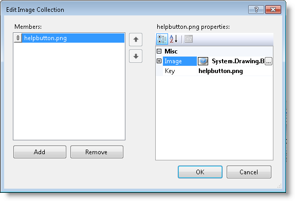
In the left pane of the **Edit Image Collection** editor you can see what image members have been added and can add and remove images from the collection. In the right pane you can view and change each image's properties, as in the image below.
Adding an image to **C1SuperTooltip** controls is easy; for more information see [Adding an Image to C1SuperTooltip](/componentone/docs/win/online-supertooltip/work-with-supertooltip) and [Adding an Image to C1SuperLabel](/componentone/docs/win/online-supertooltip/work-with-superlabel).