# Collapsible and Expandable Panels
## Content
The panels in [C1SplitContainer](/componentone/docs/win/online-splitcontainer/) can easily be collapsed or expanded by setting the [Collapsible](/componentone/docs/win/online-splitcontainer/) property to **True** (see [Adding a ToolTip to the Collapsed Splitter Panel](/componentone/docs/win/online-splitcontainer/splitcontainerforwin3/settingc1splitcontai/addingatooltiptothec)). Once the property is set, you can click on the expander button to collapse or expand the panels.
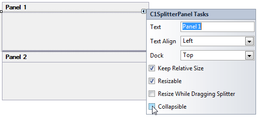
The following image illustrates Panel1's Collapsible property set to **True**:
When the Collapsible property is set to **True** you can enter text for the collapsed or collapsing tooltip using the [CollapsedToolTip](/componentone/docs/win/online-splitcontainer/) and [CollapsingToolTip](/componentone/docs/win/online-splitcontainer/) properties.
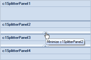
The following image shows the default tooltip when you hover over the expanded button:
When you hover over the expander button of a minimized panel the default tooltip text will read, expand panel.
## See Also
[SplitterPanel Scrolling](/componentone/docs/win/online-splitcontainer/splitterpanelbehavio/splitterpanelscrolli)