# ToolTip
This topic covers information related to configuring tooltips in ribbon control.
## Content
A Tooltip is a pop-up window with string that appears when you hold a cursor over an item in an application. The information in the window is usually a very brief description about the item's purpose.
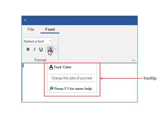
Every element in the **C1Ribbon** control has a **ToolTip** property, be it Ribbon Tab, Group, Group Items, QAT or Configuration Toolbar. The ribbon application below shows a tooltip on a ColorPicker when the cursor rests on it.
### Adding ToolTips via Designer
Tooltips can be added via the Text Menu of the floating toolbar of ribbon items, or from ToolTip property in the Properties window.
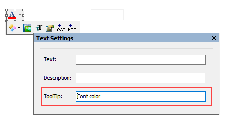
The tooltip for an item can also be added via the Properties window.
### Adding Rich ToolTips
You can add rich ToolTips in RibbonItems, RibbonGroups, and RibbonTabs using the **C1SuperTooltip** Editor. The user can click on the ToolTip property in the Properties window. This launches the **C1SuperTooltip** Editor.
In this topic, we will explain how to add a rich ToolTip to a **RibbonTab**. Complete the following steps to add a rich tooltip:
1. Select any **RibbonTab** to activate it. A list of the tab's properties will be revealed in the **Properties** window.
2. In the **Properties** window, locate the tab's **ToolTip** property and click the ellipsis (…) button. The **C1SuperTooltip** editor opens with the **Office** tab page in focus.
3. Complete the following tasks in the **Office** tab page:
1. Enter "ToolTip Tutorial" into the **Title** textbox.
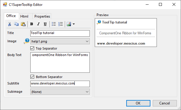
2. Click the **Image** drop-down and select Add Image to access the Open dialog box. Select a small image (an icon of 16x16 pixels is best) and click Open.
3. Check the **Top Separator** checkbox.
4. Type the following text into the **Body Text** textbox: "ComponentOne Ribbon for WinForms."
5. Check the **Bottom Separator** checkbox.
6. Type "[developer.mescius.com](http://developer.mescius.com)" into the Subtitle text box.
You can always view the **Preview** of the ToolTip in the right section of the **C1SuperTooltip** Editor.
4. Click the **Html** tab to bring its tab page into focus and then complete the following steps:
1. In the editor, delete the \ and \ tags that enclose "[developer.mescius.com](http://developer.mescius.com)".
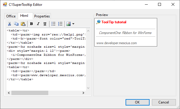
2. Select "ComponentOne Ribbon for WinForms" and press the Italic button.
3. Place your cursor in front of the title ("ToolTip Tutorial") and type \. Move your cursor to the end of the title and type \.
5. Click the Properties tab to bring its tab page into focus and then set the following properties:
* Set the Border property to True
* Set the BorderColor property to Red.
* Set the IsBalloon property to True.
* Set the IntialDelay property to "50". This means that the ToolTip will appear 50 milliseconds (.05 seconds) after a user hovers over the tab with the cursor.
6. Press OK to close the ToolTip Editor, then press OK to close the C1InputPanel Collection Editor. You can also use html table header cells (\ tags) in the tooltips. Note how the Preview changes when HTML changes are done.
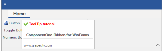
Once the project is built, hover over the **RibbonTab** with your cursor to make the **ToolTip** appear. The resulting ToolTip will resemble the image below:
### Adding ToolTips via Code
A user can also add a tooltip and rich tooltip to Ribbon Items programmatically using the TooTip property of the RibbonItem class. In the code snippet below, you will find an example of adding tooltip to ColorPicker.
```vbnet
Private Sub Form1_Load(sender As Object, e As EventArgs) Handles MyBase.Load
'Add RichTooltip for Color Picker using HTML code (Office Tab)
colorPicker.ToolTip = " | Font Color |
" & "
Change the color of your text " & "
 | " & " Press F1 for more help. |
"
End Sub
```
```csharp
private void Form1_Load(object sender, EventArgs e)
{
// Add richTooltip for Color Picker using HTML code
//(generated in the Office Tab of the Tooltip editor)
colorPicker.ToolTip = " | Font Color |
" +
"
Change the color of your text " +
"
| " +
" Press F1 for more help. |
";
}
``` |