# Icon
This topic covers information related to icon usage within ribbon control for representing different ribbon commands.
## Content
Icons are the visual representation of commands in a Ribbon, and can help the user easily navigate the application UI. The **Ribbon for WinForms** uses icons to display the different elements on the ribbon user interface. **C1Ribbon** uses C1Icon class, which is a part of **C1.Framework** namespace (both .NET and .NET Framework assemblies). **C1Icon** is a series of classes which allows to specify monochromatic icons that can be tinted and resized. These icons can be used internally in the controls. However, it also allows the customers to specify different icons through the API of the controls. The possible sources for creating icons can be Fonts, Vectors (Polygons or SVG) and Images. C1.Framework supports Bitmap, Vector, Font, Path, Polygon and Composite icon types. All the Ribbon elements support the [IconSet](/componentone/docs/win/online-ribbon/) property to define collection of images that should be used for different item size or DPI options.
The GIF below shows the Path, Font, Bitmap, Composite Icons and pressed Iconsets in the Ribbon control.
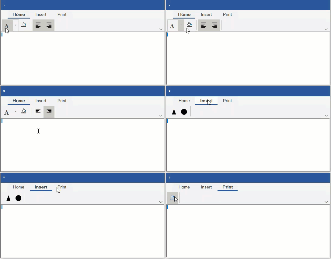
The different icons supported by C1Icon is listed in the table below:
| **Icon Type** | **Description** |
| --------- | ----------- |
| Bitmap Icon | BitmapIcon allows to wrap bitmap images from different sources. |
| Font Icon | FontIcon allows to use symbols from different fonts instead of images. Note that the Font icon cannot be resized automatically. |
| Path Icon | PathIcon allows to draw SVG paths (or XAML paths which have the same syntax). It rasterizes vector paths to bitmaps according to desired size and show bitmaps in UI. |
| Polygon Icon | PolygonIcon allows to draw polygons defined by points. |
| Composite Icon | Composite icons allow users to combine several icons into one. For example, the Ribbon Color Picker has a composite icon by default. |
| Vector Icon | Vector icons allows to represent an icon created from a vectorial definition. |
In **C1Ribbon** control, all Ribbon elements use the **IconSet** property to define set of icons of different sizes to use in a single UI element. For each element which supports images, the application can define one or more icons. For example, the application can define 16x16 icon for small view, 20x20 icon for medium view, 32x32 icon for large view and (optionally) icons of bigger size for HighDPI environments. At runtime, **C1Ribbon** will automatically select the most appropriate icon for the current item type and screen resolution. If there is no predefined icon of such size, then **C1Ribbon** will resize the most appropriate icon from the specified icon set.
The Icons can be set in the Ribbon items both via the designer as well as code.
## Implementation at Design-Time
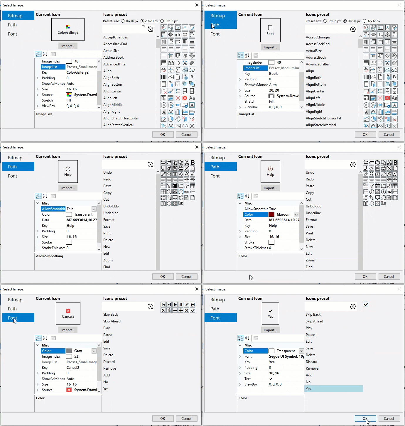
For every element in C1Ribbon, you can add an icon with the help of **Select Image** editor. This editor allows to add and edit **C1BimtapIcon** , **C1FontIcon** and **C1PathIcon**.
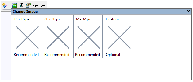
The Select Image editor opens when a user clicks one of the four options in the **Change Image** button in the floating toolbar of a ribbon item.
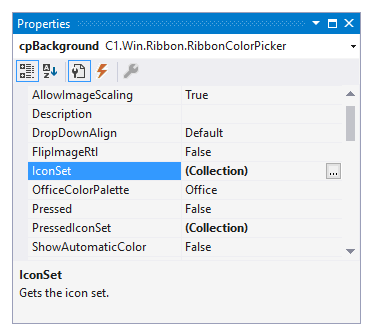
The user can also evoke the **Select Image** editor by clicking the **IconSet** property of an item in the **Properties** window.
The **Select Image** editor contains three panels. The first panel contains a menu of buttons for Bitmap, Path and Font icons. The second panel contains the **Current Icon** properties, while the third panel contains the **Icons preset**, where the user can choose different icons and specify different preset sizes (16x16 pixels, 20x20 pixels and 32x32 pixels). Clicking each button displays the Current Icon properties and Icon preset for that button. For example, clicking the Bitmap icon displays the Current Icon properties and Icon preset options for bitmap icons. With the Current Icon properties list, the user can change the color, size, stroke, font, etc. of an icon. Further, there is an **Import** button to import images for the icon. Once you have selected a suitable Bitmap, Font or Path icon and modified its properties, you can click the OK button to confirm adding the icon to the ribbon item.Note that design-time support via the Select Image editor isn't available for Vector and Composite Icons as of now.
## Implementation through Code
You can also add icons to elements in the Ribbon control using the C1BitmapIcon, C1FontIcon, C1VectorIcon, C1PathIcon and C1CompositeIcon classes.
To add a Bitmap icon, refer the code snippet below:
```vbnet
Public Sub AddBitapIcon()
'Clear the IconSet Collection before adding new IconSet
printButton.IconSet.Clear()
'Add Icon Sets for Print Button
'Large view
printButton.IconSet.Add(New C1BitmapIcon("P", New Size(32, 32), Color.Transparent, Image.FromFile("images\print32.png")))
'Medium View
printButton.IconSet.Add(New C1BitmapIcon("P", New Size(20, 20), Color.Transparent, Image.FromFile("images\print20.png")))
'Small View
printButton.IconSet.Add(New C1BitmapIcon("P", New Size(16, 16), Color.Transparent, Image.FromFile("images\print16.png")))
End Sub
```
```csharp
public void AddBitmapIcon()
{
//Clear the IconSet Collection before adding new IconSet
printButton.IconSet.Clear();
//Add Icons of different sizes to the Print Button IconSet using C1BitmapIcon
//These icons will be used as Button images depending on the size of the Ribbon
printButton.IconSet.Add(new C1BitmapIcon("P", new Size(32, 32), Color.Transparent, Image.FromFile(@"images\print32.png")));
printButton.IconSet.Add(new C1BitmapIcon("P", new Size(20, 20), Color.Transparent, Image.FromFile(@"images\print20.png")));
printButton.IconSet.Add(new C1BitmapIcon("P", new Size(16, 16), Color.Transparent, Image.FromFile(@"images\print16.png")));
}
```
To add a Path icon, refer the code snippet below:
```vbnet
Public Sub AddPathIcon()
'Add C1PathIcon to Button (Supports Scalable Vector Graphics)
triangleShape.Text = "Triangle"
circleShape.Text = "Circle"
triangleShape.IconSet.Add(New C1PathIcon("T", New Size(32, 32), Color.Black, "M150 0 L75 200 L225 200 Z"))
circleShape.IconSet.Add(New C1PathIcon("C", New Size(32, 32), Color.Black, "M24.5,12.5 C24.5,19.127417 19.127417,24.5 12.5,24.5 C5.872583,24.5 0.5,19.127417 0.5,12.5 C0.5,5.872583 5.872583,0.5 12.5,0.5 C19.127417,0.5 24.5,5.872583 24.5,12.5 z"))
End Sub
```
```csharp
public void AddPathIcon()
{
//Apply a vector icon to button image using C1PathIcon
triangleButton.IconSet.Add(new C1PathIcon("T", new Size(32,32), Color.Black, "M150 0 L75 200 L225 200 Z"));
circleButton.IconSet.Add(new C1PathIcon("C", new Size(32, 32), Color.Black, "M24.5,12.5 C24.5,19.127417 19.127417,24.5 12.5,24.5 C5.872583,24.5 0.5,19.127417 0.5,12.5 C0.5,5.872583 5.872583,0.5 12.5,0.5 C19.127417,0.5 24.5,5.872583 24.5,12.5 z"));
}
```
To add a Font icon, refer the code snippet below:
```vbnet
Public Sub AddFontIcon()
'Add FontIcon for Bold Button
Dim fontIconBold As C1FontIcon = New C1FontIcon()
fontIconBold.Size = New Size(20, 20)
fontIconBold.Text = "A"
fontIconBold.Font = New Font("Times New Roman", 16.0F, FontStyle.Bold)
'Add C1FontIcon
textEffects.IconSet.Add(fontIconBold)
End Sub
```
```csharp
public void AddFontIcon()
{
//Configure RibbonSplitButton
textEffectsButton.TextImageRelation = C1.Win.Ribbon.TextImageRelation.ImageBeforeText;
//Clear the IconSet collection before adding new IconSet
textEffectsButton.IconSet.Clear();
//Apply image to textEffects RibbonSplitButton using C1FontIcon
C1FontIcon fontIcon = new C1FontIcon();
fontIcon.Size = new Size(20, 20);
fontIcon.Text = "A";
fontIcon.Font = new Font("Times New Roman", 16.0f, FontStyle.Bold);
textEffectsButton.IconSet.Add(fontIcon);
}
```
To add a Composite Icon, refer the code snippet below:
```vbnet
Private Sub AddCompositeIcon()
Dim ci = New C1CompositeIcon()
ci.Size = New Size(16, 16)
Dim bmp = New C1BitmapIcon With {
.Size = New Size(16, 16),
.Source = Image.FromFile("images\FillTool.png")
}
ci.Icons.Add(bmp)
Dim pl = New C1PolygonIcon With {
.AllowSmoothing = False,
.Size = New Size(16, 16),
.IsClosed = True,
.Points = New PointF() {New PointF(0, 12), New PointF(15, 12), New PointF(15, 15), New PointF(0, 15)}
}
ci.Icons.Add(pl)
compositeFill.IconSet.Clear()
compositeFill.IconSet.Add(ci)
End Sub
```
```csharp
private void AddCompositeIcon()
{
// BackColor bmp + polygon
var ci = new C1CompositeIcon();
ci.Size = new Size(16, 16);
// first image
var bmp = new C1BitmapIcon
{
Size = new Size(16, 16),
Source = Image.FromFile(@"images\FillTool.png")
};
ci.Icons.Add(bmp);
// second image
var pl = new C1PolygonIcon
{
AllowSmoothing = false,
Size = new Size(16, 16),
IsClosed = true,
Points = new PointF[] { new PointF(0, 12), new PointF(15, 12), new PointF(15, 15), new PointF(0, 15) }
};
ci.Icons.Add(pl);
//Clear the IconSet Collection before adding new IconSet
compositeFill.IconSet.Clear();
//Add composite icon to fill button
compositeFill.IconSet.Add(ci);
}
```
To add iconsets for the pressed state, refer the following code:
```vbnet
Public Sub CreatePressedIconSet()
'Icon Set for Left Align Toggle Button
leftAlign.IconSet.Add(New C1BitmapIcon("B", New Size(32, 32), Color.Transparent, Image.FromFile("images\align_left.png")))
'Pressed Icon Set for Left Align Toggle Button
leftAlign.PressedIconSet.Add(New C1BitmapIcon("Bold-Pressed", New Size(32, 32), Color.Transparent, Image.FromFile("images\align_left_pressed.png")))
'Icon Set for Right Align Toggle Button
rightAlign.IconSet.Add(New C1BitmapIcon("B", New Size(32, 32), Color.Transparent, Image.FromFile("images\align-right.png")))
'Pressed Icon Set for Right Align Toggle Button
rightAlign.PressedIconSet.Add(New C1BitmapIcon("Bold-Pressed", New Size(32, 32), Color.Transparent, Image.FromFile("images\align_right_pressed.png")))
End Sub
```
```csharp
public void CreatePressedIconSet()
{
//IconSet for Left align Toggle Button
leftAlign.IconSet.Add(new C1BitmapIcon("LA", new Size(32, 32), Color.Transparent, Image.FromFile(@"images\align_left.png")));
//PressedIconSet for Left align Toggle Button
leftAlign.PressedIconSet.Add(new C1BitmapIcon("LA", new Size(32, 32), Color.Transparent, Image.FromFile(@"images\align_left_pressed.png")));
//IconSet for Right align Toggle Button
rightAlign.IconSet.Add(new C1BitmapIcon("RA", new Size(32, 32), Color.Transparent, Image.FromFile(@"images\align-right.png")));
//PressedIconSet for Right align Toggle Button
rightAlign.PressedIconSet.Add(new C1BitmapIcon("RA", new Size(32, 32), Color.Transparent, Image.FromFile(@"images\align_right_pressed.png")));
}
```
## Get Image from Icons
The Ribbon control lets you save the custom icon as image using the **GetItemImage** method of **C1Ribbon** class.
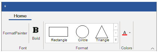
The **GetItemImage(C1.Win.Ribbon.RibbonItem item**) method gets an image rendered from the actual icon of the ribbon component. This method only works for visible ribbon.
To use the GetItemImage method, refer the following code:
```csharp
// Add a group named "Format" to the "Home" tab
RibbonGroup colorGroup = new RibbonGroup();
colorGroup.Text = "Colors";
homeTab.Groups.Add(colorGroup);
//Define a custom icon using C1PathIcon and C1CompositeIcon
var pathIcon = new C1PathIcon
{
AllowSmoothing = false,
Data = "M-2.7755575615628892e-17,18.89795939167988 h24 v5.142857098579968 h-24 z",
Size = new Size(16, 16),
Stroke = Color.Empty,
Color = Color.Red
};
var compositeIcon = new C1CompositeIcon();
compositeIcon.Icons.Add(new C1BitmapIcon("FontColor", new Size(16, 16), Color.Transparent, Image.FromFile(@"Images\FontColor.png")));
compositeIcon.Icons.Add(pathIcon);
compositeIcon.Size = new Size(16, 16);
RibbonColorPicker colorPicker = new RibbonColorPicker();
colorPicker.IconSet.Add(compositeIcon);
colorPicker.ToolTip = "Color Picker";
colorGroup.Items.Add(colorPicker);
//Save custom icon as image using either of the approaches:
//Approach 1: Get custom icon image using GetItemImage method of C1Ribbon
Image img1 = c1Ribbon1.GetItemImage(colorPicker);
img1.Save("colorPicker.png");
```
Another approach to get the custom icon image is using the **GetImage** method of **IconRenderer** class.
```csharp
//Approach 2: Get custom icon image using GetImage method of IconRenderer
var render = IconRenderer.CreateRenderer(colorPicker.IconSet[0]);
Image img2 = render.GetImage();
img2.Save("colorPicker_renderer.png");
```