# Gallery
This topic covers details about gallery in C1Ribbon.
## Content
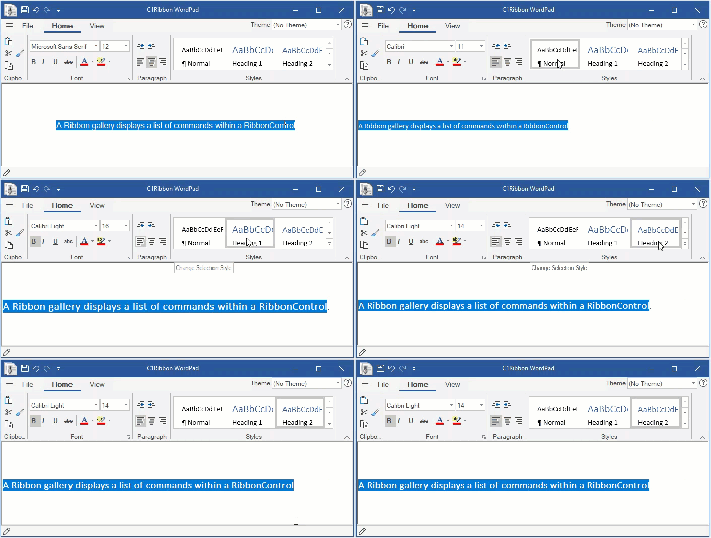
Gallery displays a collection of related commands in a Ribbon. The **Gallery** contains a list of clickable items. Each item when clicked shows the result visually on the selected text.
The GIF below illustrates how the text changes upon applying various Styles from the Gallery.
The image below shows a gallery item in the **C1Ribbon** control.
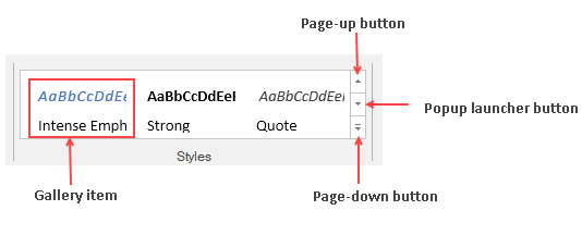
The **Ribbon Gallery** has a page-up and page-down button to scroll up and down the gallery. There is also a popup launcher button that opens a window with ribbon items.
### Configuring Gallery at Design-Time
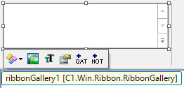
The **Ribbon Gallery** can be added at design-time using the **Ribbon Group Floating Toolbar** or **RibbonGroup Items Collection Editor**. Also, you can customize the look of the Ribbon Gallery using the **Ribbon Gallery Floating ToolBar** or by editing the properties of Gallery in the Properties Window. Refer this [topic](/componentone/docs/win/online-ribbon/concepts/designtimesupport/floatingtoolbar), for more information on floating toolbars. You can add items to Gallery using the **RibbonGallery Items Collection Editor** and **RibbonGallery MenuItems Collection Editor**. For more info on Collection Editors, refer this [topic](/componentone/docs/win/online-ribbon/concepts/designtimesupport/collectioneditors).
The image below shows the floating toolbar of Gallery.
### Adding Ribbon Gallery and Ribbon Gallery Items
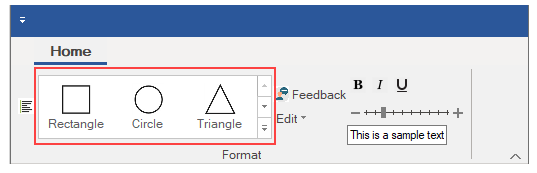
The user can also add **Gallery** and **Gallery items** in the C1Ribbon control through code using the RibbonGallery class and RibbonGalleryItem class. For instance, the code below depicts how to add a gallery of shapes to the Ribbon control.
```vbnet
' Add RibbonGallery ribbon item
Dim ribbonGallery As RibbonGallery = New RibbonGallery()
ribbonGallery.ToolTip = "Select a shape"
Dim ribbonGallery1 As RibbonGalleryItem = New RibbonGalleryItem("Rectangle", Image.FromFile("images\rect.png"))
Dim ribbonGallery2 As RibbonGalleryItem = New RibbonGalleryItem("Circle", Image.FromFile("images\circle.png"))
Dim ribbonGallery3 As RibbonGalleryItem = New RibbonGalleryItem("Triangle", Image.FromFile("images\triangle.png"))
Dim ribbonGallery4 As RibbonGalleryItem = New RibbonGalleryItem("Hexagon", Image.FromFile("images\hexagon.png"))
ribbonGallery.Items.Add(ribbonGallery1)
ribbonGallery.Items.Add(ribbonGallery2)
ribbonGallery.Items.Add(ribbonGallery3)
ribbonGallery.Items.Add(ribbonGallery4)
formatGroup.Items.Add(ribbonGallery)
```
```csharp
// Add RibbonGallery ribbon item
RibbonGallery ribbonGallery = new RibbonGallery();
ribbonGallery.ToolTip = "Select a shape";
RibbonGalleryItem ribbonGallery1 = new RibbonGalleryItem("Rectangle", Image.FromFile(@"images\rect.png"));
RibbonGalleryItem ribbonGallery2 = new RibbonGalleryItem("Circle", Image.FromFile(@"images\circle.png"));
RibbonGalleryItem ribbonGallery3 = new RibbonGalleryItem("Triangle", Image.FromFile(@"images\triangle.png"));
RibbonGalleryItem ribbonGallery4 = new RibbonGalleryItem("Hexagon", Image.FromFile(@"images\hexagon.png"));
ribbonGallery.Items.Add(ribbonGallery1);
ribbonGallery.Items.Add(ribbonGallery2);
ribbonGallery.Items.Add(ribbonGallery3);
ribbonGallery.Items.Add(ribbonGallery4);
formatGroup.Items.Add(ribbonGallery);
```
The snapshot of the resulting ribbon control is shown below:
The user can change the position of the image and text of each gallery item. You can place the image above, before or after the text using the **ImageAboveText**, **ImageBeforeText and ImageAfterText** properties of GalleryItemTextImageRelation enum.
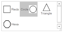
You can also assign the position of image and text of each item in the gallery via code:
```vbnet
' Specify the position of text And image for gallery items
ribbonGallery1.GalleryItemTextImageRelation = GalleryItemTextImageRelation.ImageBeforeText
ribbonGallery2.GalleryItemTextImageRelation = GalleryItemTextImageRelation.ImageAfterText
ribbonGallery3.GalleryItemTextImageRelation = GalleryItemTextImageRelation.ImageAboveText
ribbonGallery4.GalleryItemTextImageRelation = GalleryItemTextImageRelation.ImageBeforeText
```
```csharp
// Specify the position of text and image for gallery items
ribbonGallery1.GalleryItemTextImageRelation = GalleryItemTextImageRelation.ImageBeforeText;
ribbonGallery2.GalleryItemTextImageRelation = GalleryItemTextImageRelation.ImageAfterText;
ribbonGallery3.GalleryItemTextImageRelation = GalleryItemTextImageRelation.ImageAboveText;
ribbonGallery4.GalleryItemTextImageRelation = GalleryItemTextImageRelation.ImageBeforeText;
```
### Gallery Grouping
If you click on the popup launcher button, it displays a small window of gallery items, which are grouped by group names.
The image below shows the popup gallery window with items arranged in two groups, **Common** and **Extended**.
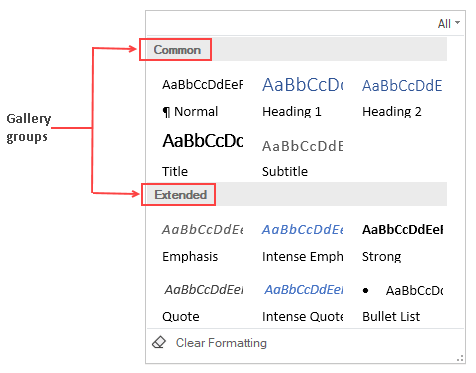
Grouping in gallery can be done at design time by assigning **GroupName** to each gallery item in the **RibbonGallery Items Collection Editor**.
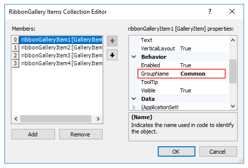
You can also assign group names to gallery items programmatically using the GroupName property of RibbonGalleryItem class. This is shown in the code snippet below:
```vbnet
'Add gallery items to groups
ribbonGallery1.GroupName = "Common"
ribbonGallery2.GroupName = "Common"
ribbonGallery3.GroupName = "Extended"
ribbonGallery4.GroupName = "Extended"
```
```csharp
// Assign group names for different gallery items
ribbonGallery1.GroupName = "Common";
ribbonGallery2.GroupName = "Common";
ribbonGallery3.GroupName = "Extended";
ribbonGallery4.GroupName = "Extended";
```
### Gallery Zooming
The **C1Ribbon** control supports zooming within the Gallery. The user can rest the cursor on each item and get a zoomed preview of that item image.
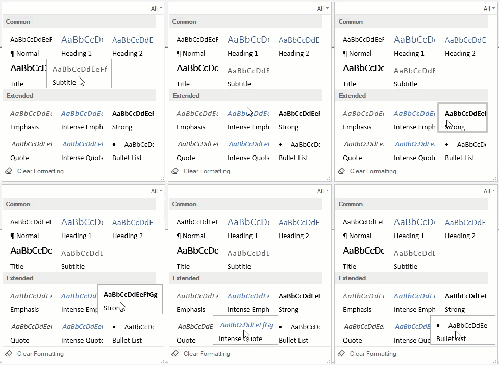
At design time, the zooming feature can be activated using the **AllowZooming** property of **Ribbon Gallery** in the **Properties** window. Note that for the zooming property to work, the **ItemSize** property of the Gallery should be less than the image size of each item.
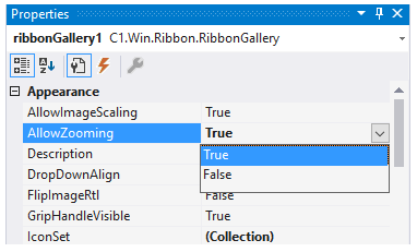
You can also add the zooming feature via code using the AllowZooming property of RibbonGallery class.
```vbnet
'Allow zooming in gallery
ribbonGallery.AllowZooming = True
```
```csharp
// Add zooming feature to gallery item image
ribbonGallery.AllowZooming = true;
```
### Gallery Filtering
The **C1Ribbon** control supports filtering in the ribbon gallery. It allows you to filter items by gallery groups. This is illustrated in the GIF below:
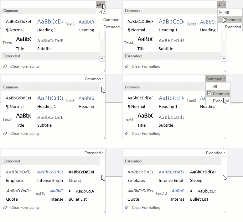
At design time, the filtering feature can be activated using the **AllowGroupFiltering** property of **Ribbon Gallery** in the **Properties** window.
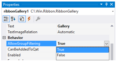
You can also add the filtering feature via code using the AllowGroupFiltering property of RibbonGallery class.
```vbnet
'Allow filtering in gallery groups
ribbonGallery.AllowGroupFiltering = True
```
```csharp
// Allow gallery filtering
ribbonGallery.AllowGroupFiltering = true;
```
## Owner-Drawn Gallery
With 'Owner-Drawn' feature, the items are not drawn with the default logic of Ribbon, rather they are drawn with a custom logic defined by the user of the application. This is useful in cases where complex customizations need to be performed. You can render the contents of the RibbonGallery as Owner Drawn by writing a handler for the **DrawItem** event. This event is raised as needed to display the contents of Gallery when its **OwnerDraw** property is set to True.
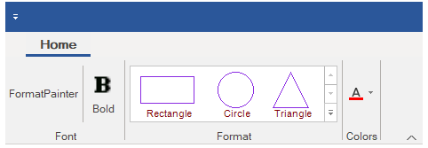
To create the owner-drawn RibbonGallery in the above illustration, follow the steps below:
1. Add the following code the **Form\_Load** event:
```csharp
//Set OwnerDraw property and bind DrawItem event
//to owner draw RibbonGallery items
ribbonGallery.OwnerDraw = true;
ribbonGallery.DrawItem += RibbonGallery_DrawItem;
```
2. Implement the **DrawItem** event:
```csharp
//Handle DrawItem event to owner draw RibbonGallery Items
private void RibbonGallery_DrawItem(object sender, C1.Win.Ribbon.DrawItemEventArgs e)
{
switch (e.Item.Name)
{
case "Rectangle":
Rectangle srect = new Rectangle(e.Bounds.X + 10, e.Bounds.Y + 10, 60, 30);
e.Graphics.DrawRectangle(new Pen(Color.BlueViolet), srect);
e.Graphics.DrawString("Rectangle", new Font("Arial", 8), new SolidBrush(Color.Maroon), new PointF(e.Bounds.X + 15, e.Bounds.Y + 45));
break;
case "Circle":
Rectangle crect = new Rectangle(e.Bounds.X + 25, e.Bounds.Y + 5, 40, 40);
e.Graphics.DrawEllipse(new Pen(Color.BlueViolet), crect);
e.Graphics.DrawString("Circle", new Font("Arial", 8), new SolidBrush(Color.Maroon), new PointF(e.Bounds.X + 30, e.Bounds.Y + 45));
break;
case "Triangle":
Point point1 = new Point(e.Bounds.X + 35, e.Bounds.Y + 5);
Point point2 = new Point(e.Bounds.X + 15, e.Bounds.Y + 45);
Point point3 = new Point(e.Bounds.X + 55, e.Bounds.Y + 45);
Point[] curvePoints = { point1, point2, point3 };
e.Graphics.DrawPolygon(new Pen(Color.BlueViolet), curvePoints); e.Graphics.DrawString("Triangle", new Font("Arial", 8), new SolidBrush(Color.Maroon), new PointF(e.Bounds.X + 15, e.Bounds.Y + 45));
break;
}
}
```