# Ribbon Item Group
This topic covers details about ribbon item group in C1Ribbon.
## Content
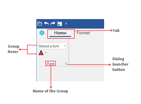
All Ribbon Tabs contain Item Groups that can keep many Items together. When a new Tab is added in the C1Ribbon control, it already has a default Group. If the user wants to add more Item Groups, then it can be done by clicking the **Actions** menu of the floating toolbar of the Ribbon Tab. The user can also add a Group with the help of the **RibbonGroup Collection Editor** of Ribbon Tab in Properties window.
The image below depicts a Ribbon Item Group.
### Adding Groups to Tabs at Design Time
You can add Groups to tabs in the designer using the **Tab Floating ToolBar**. Refer this [topic](/componentone/docs/win/online-ribbon/concepts/designtimesupport/floatingtoolbar) for more information about floating toolbars. The user can also add groups to the tabs using **Groups** property of **RibbonTab** in the **Properties** window. Clicking on the ellipsis next to the **Groups** Property launches the **RibbonGroup Collection Editor**. For more explanation about the Collection Editors, refer this [topic](/componentone/docs/win/online-ribbon/concepts/designtimesupport/collectioneditors).
### Adding Groups to Tabs through Code
The user can also add the Ribbon Item Group programmatically with the Groups property of RibbonTab class and the Text property of RibbonGroup class. This is shown in the code below:
```vbnet
' Add a group to the Home tab
Dim fontStyle As New RibbonGroup()
' Label the group
fontStyle.Text = "Font"
homeTab.Groups.Add(fontStyle)
```
```csharp
// Add a group named "Font" to the "Home" tab
RibbonGroup fontStyle = new RibbonGroup();
fontStyle.Text = "Font";
homeTab.Groups.Add(fontStyle);
fontStyle.HasLauncherButton = true;
```
### Adding Launcher Button
A user can add a dialog box launcher button to the Ribbon group using the floating toolbar as shown in the image below.
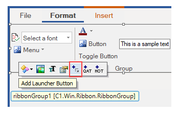
You can also add a launcher button using the **HasLauncherButton** and **LauncherEnabled** properties of RibbonGroup in the **Properties** window. Further, you can also add a launcher button programmatically using the HasLauncherButton property of the RibbonGroup class as shown in the code snippet below:
```vbnet
' Add launcher button
fontStyle.HasLauncherButton = True
```
```csharp
// Add launcher button
fontStyle.HasLauncherButton = true;
```