# Quick Access Toolbar
This topics covers details about the QuickAcess Toolbar in C1Ribbon.
## Content
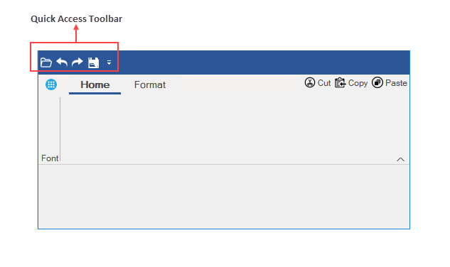
The **Quick Access Toolbar** (**QAT**) is a customizable toolbar, which contains a set of quickly accessible commands. It is located on the top left corner of the Ribbon control, and can be displayed up or down the ribbon.
The following image shows a Ribbon with a QAT of four **Ribbon** button items (**Open**, **Undo**, **Redo** and **Save**).
### Configuring QAT through Designer
In the designer, the Quick Access Toolbar (QAT) can be customized in just a few clicks. You can configure QAT from the **Items** and **MenuItems** from the **Qat** property in the **Properties** window of **C1Ribbon**.
Further, you can add existing items to the QAT by clicking on the ellipsis, which launches the **QAT Items Collection Editor** or **QAT MenuItems Collection Editor.** To know more about collection editors, refer this [topic](/componentone/docs/win/online-ribbon/concepts/designtimesupport/collectioneditors).
You can add the existing items of the Ribbon control to QAT from the [Floating Toolbars](/componentone/docs/win/online-ribbon/concepts/designtimesupport/floatingtoolbar) of other elements by clicking theicon. The GIF below demonstrates the addition of Numeric box into the QAT using its floating toolbar.
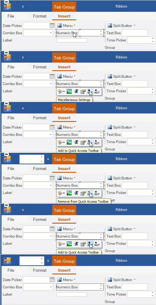
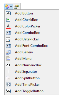
Note that you can also add new elements in the **RibbonQat** using its own floating toolbar. Refer [Using Floating Toolbar](/componentone/docs/win/online-ribbon/concepts/designtimesupport/floatingtoolbar) topic to know more.
### Adding Items to QAT via Code
The ribbon buttons can also be added to the QAT programmatically by setting the Items property of the RibbonQat class. This is depicted in the code below:
```vbnet
' Add Items to the quick action toolbar
Dim openImage As Image = Image.FromFile("images\open.png")
customRibbon.Qat.Items.Add(New RibbonButton("Open", openImage))
Dim undoImage As Image = Image.FromFile("images\undo.png")
customRibbon.Qat.Items.Add(New RibbonButton("Undo", undoImage))
Dim redoImage As Image = Image.FromFile("images\redo.png")
customRibbon.Qat.Items.Add(New RibbonButton("Repeat", redoImage))
```
```csharp
// Add Items to the Quick Access Toolbar
Image openImage = Image.FromFile(@"images\open.png");
customRibbon.Qat.Items.Add(new RibbonButton("Open", openImage));
Image undoImage = Image.FromFile(@"images\undo.png");
customRibbon.Qat.Items.Add(new RibbonButton("Undo", undoImage));
Image redoImage = Image.FromFile(@"images\redo.png");
customRibbon.Qat.Items.Add(new RibbonButton("Repeat", redoImage));
Image saveImage = Image.FromFile(@"images\save-file-icon.png");
customRibbon.Qat.Items.Add(new RibbonButton("Save", saveImage));
```
### Moving the Quick Access Toolbar
A user can move the QAT between two possible locations, above and below the ribbon control. By default, the QAT is located above the ribbon control. In order to move it down the ribbon, the user can set theBelowRibbon property to True at design time in the Properties Window.
The QAT can also be added below the Ribbon control programmatically using the BelowRibbon property of RibbonQat class as shown below:
```vbnet
'Add Quick Access Toolbar below the Ribbon control
customRibbon.Qat.BelowRibbon = True
```
```csharp
//Add Quick Access Toolbar below the Ribbon control
customRibbon.Qat.BelowRibbon = true;
```
### Customizing QAT Menu
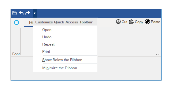
A user can add commands to drop-down menu of the QAT item. This menu will include some commands that the user might want to add to the Quick Access Toolbar.
The image below shows a Ribbon QAT drop-down menu with commands (**Open, Undo, Repeat** and **Print**).
At design time, the user can display the Customize Quick Access Toolbar dropdown menu by setting the **MenuVisible** property in the **Properties** Window to True. Further, the user can click on the **QAT MenuItems Collection Editor** to add buttons on the dropdown menu.
The user can also add the dropdown menu to QAT programmatically using MenuVisible property and MenuItems property of RibbonQat class as shown below:
```vbnet
' Add items to the Menu dropdown of QAT
customRibbon.Qat.MenuItems.Add(New RibbonButton("Open", openImage))
customRibbon.Qat.MenuItems.Add(New RibbonButton("Undo", undoImage))
customRibbon.Qat.MenuItems.Add(New RibbonButton("Repeat", redoImage))
customRibbon.Qat.MenuItems.Add(New RibbonButton("Print", printImage))
```
```csharp
//Add items to the Menu dropdown of QAT
customRibbon.Qat.MenuVisible = true;
customRibbon.Qat.MenuItems.Add(new RibbonButton("Open", openImage));
customRibbon.Qat.MenuItems.Add(new RibbonButton("Undo", undoImage));
customRibbon.Qat.MenuItems.Add(new RibbonButton("Repeat", redoImage));
customRibbon.Qat.MenuItems.Add(new RibbonButton("Print", printImage));
```
When a command in the QAT MenuItem collection is clicked, it is simply added to the QAT without triggering any associated event. To trigger the event specified for the button, the user must click the corresponding button on the QAT. However, the custom buttons triggers associated events directly from the QAT dropdown.
Ribbon allows you to add custom buttons to the QAT dropdown using [CustomMenuButtons](/componentone/docs/win/online-ribbon/) property of [QatCustomButtonCollection](/componentone/docs/win/online-ribbon/) class. The image below shows **Undo** and **Save** custom menu buttons added in the QAT dropdown.
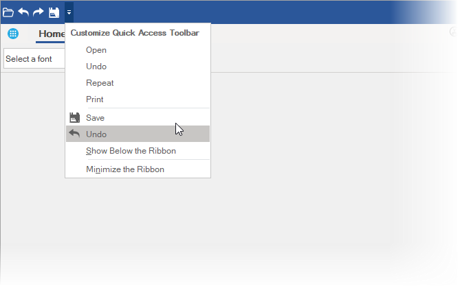
The following code illustrates adding two custom buttons named **Save** and **Undo** to the QAT drowdown.
```csharp
customRibbon.Qat.CustomMenuButtons.Add(new RibbonButton("Save", saveImage));
customRibbon.Qat.CustomMenuButtons.Add(new RibbonButton("Undo", undoImage));
```
Additionally, you can add both menu items and custom buttons to the QAT dropdown through the design time. The image below shows the property through which you can add custom buttons to the QAT dropdown.
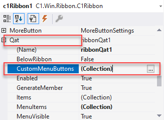
Follow the below steps to add custom buttons to the QAT dropdown.
1. In the Properties window of the C1Ribbon control, navigate to the **Qat** **\| CustomMenuButtons**.
2. Click the ellipses next to CustomMenuButtons or MenuItems to open respective collection editors.
3. In the collection editor, click the **Add** button to add button as members of the collections in the QAT dropdown.
4. Set the required properties like **Name**, **Text**, **Icon**, **Tooltip**, etc., for the button added to the collection.
5. Click **OK**.
### Hiding Predefined Items from the QAT Toolbar
Ribbon supports hiding the predefined menu items from the Ribbon QAT drop-down. These menu items which appear on clicking the Ribbon drop-down are "**Show Above the Ribbon**" and "**Minimize the Ribbon**" as shown in the following image.
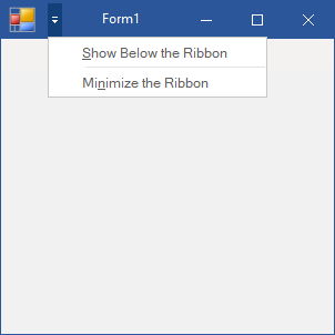
By default, both these options are displayed when you click the QAT drop-down. However, you can choose to hide them. You can set the ShowBelowItem property of the RibbonQat class to false to hide the **Show Below the Ribbon** QAT menu item and ShowMinimizeItem property of the **RibbonQat** class to false to hide the **Minimize the Ribbon** QAT menu item from the Ribbon QAT drop-down as shown in the following code:
```vbnet
C1Ribbon.Qat.ShowBelowItem=False
C1Ribbon.Qat.ShowMinimizeItem=False
```
```csharp
C1Ribbon.Qat.ShowBelowItem=false;
C1Ribbon.Qat.ShowMinimizeItem=false;
```
>type=note
> Note: This feature of Ribbon QAT is supported only in .NET Framework.