# C1ToolBar Toolbar
Get started with Menus and Toolbars for WinForms. Create versatile menus and docking/floating toolbars. See more in documentation here.
## Content
The **C1ToolBar** toolbar appears for the [C1ToolBar](/componentone/docs/win/online-menus-toolbar/) control. To expose the [C1ToolBar](/componentone/docs/win/online-menus-toolbar/) toolbar slide your cursor in the top left area of the [C1ToolBar](/componentone/docs/win/online-menus-toolbar/) control. The **Open** button appears for the [C1ToolBar](/componentone/docs/win/online-menus-toolbar/) toolbar.
### Opening and Closing the C1ToolBar Toolbar
To open the [C1ToolBar](/componentone/docs/win/online-menus-toolbar/) toolbar, click on the  button. To close the [C1ToolBar](/componentone/docs/win/online-menus-toolbar/)toolbar, click on the  button.
The [C1ToolBar](/componentone/docs/win/online-menus-toolbar/) toolbar consists of the following command buttons:
| Toolbar Button | Description |
| --- | --- |
|  | **Add new command link/command**: Adds a new command after the current command to the toolbar. |
|  | **Edit command links**: Opens the **C1CommandLink Collection Editor** for you to edit the command links. |
|  | **Edit toolbar appearance**:Opens the C1ToolBar **appearance** dialog box where you can set the general appearance properties for the **C1ToolBar** control. |
|  | **Edit toolbar layout**: Opens the **Layout** dialog box where you can set the layout properties for the **C1ToolBar** control. |
|  | **Edit miscellaneous toolbar properties**: Opens the **Miscellaneous** dialog box for the **C1ToolBar** control where you can apply behavior settings to the **C1ToolBar** control. |
### Add Command Links
Clicking the **Add Command Links** button adds a new command after the current command. It displays the **Link to Command** designer below the new command so you can easily edit the new command without leaving the design surface.
### Edit Command Links
Clicking on the **Edit Command Links** button opens the **C1CommandLink Collection Editor** where you can add or remove command links and edit the commandlink's properties.
### Edit Toolbar Appearance
Clicking on the **Edit toolbar appearance** button opens the **Appearance** dialog box where you can modify the appearance properties for the [C1ToolBar](/componentone/docs/win/online-menus-toolbar/) control.
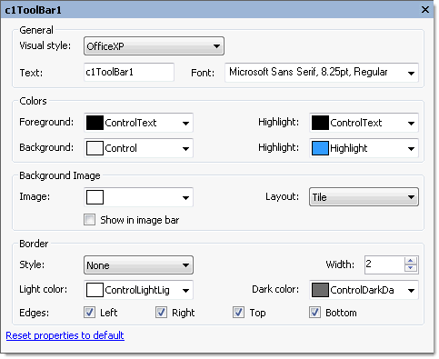
The following table defines the items included in the **Appearance** dialog box for the [C1ToolBar](/componentone/docs/win/online-menus-toolbar/) control:
| Item | Description |
| --- | --- |
| **_General_** | |
| **Visual style** | The **Visual style** drop-down box contains the following items for you to select from to change the style of the C1ToolBar control: **Custom**, **System**, **Office2007Blue**, **Office2007Black**, **Office2007Silver**, **Office2003Blue**, **Office2003Olive**, **Office2003Silver**, **OfficeXP**, **Classic**, and **WindowsXP**. |
| **Text** | The **Text** textbox displays the text name that appears on the selected toolbar button. To rename the text name for the toolbar button, select the text in the **Text** textbox and type the desired text name. |
| **Font** | The **Font** drop-down box opens the **Font** dialog box where you can modify the Font style properties for the **C1ToolBar** control. |
| **_Colors_** | |
| **Foreground** | The **Foreground** drop-down list box contains the Custom, System, and Web colors for you to select from to set the Foreground color for the **C1ToolBar** control. |
| **Highlight (ForeHiColor)** | The **Highlight** drop-down list box contains the Custom, System, and Web colors for you to select from to set the forecolor of the highlighted button for the **C1ToolBar** control. |
| **Background** | The **Background** drop-down list box contains the Custom, System, and Web colors for you to select from to set the back color of the highlighted button in the **C1ToolBar** control. |
| **Highlight (BackHiColor)** | The **Background** drop-down list box contains the Custom, System, and Web colors for you to select from to set the back color of the highlighted item in the **C1TopicBar** control. |
| **_Background image_** | |
| **Image** | The **Image** drop-down box opens an **Open** dialog box where you can apply the background image used for the **C1ToolBar** control. |
| **Layout** | The **Layout** drop-down box opens a list of layout items (None, Tile, Center, Stretch, and Zoom) for you to select from that gets the background image layout for the **C1ToolBar** control. |
| **Show in image bar** | The **Show in image bar** check box indicates whether to show background image in image bar when the toolbar's style is Drop-downMenu. (**True**, if selected; **False**, if deselected) |
| **_Border_** | |
| **Style** | The **Style** drop-down box includes a list of border style items for you to select from to set the border style for the **C1ToolBar**. |
| **Width** | The **Width** NumericUpDown control sets the width for the border around the **C1ToolBar**. |
| **Light color** | The **Light color** drop down box contains the Custom, System, and Web colors for you to select from to set the light color for the border around the **C1ToolBar** control. |
| **Dark color** | The **Dark color** drop down box contains the Custom, System, and Web colors for you to select from to set the dark color for the border around the **C1ToolBar** control. |
| **Edges** | The **Edges** check boxes (Left, Right, Top, and Bottom) let you specify which edge of the border to apply the border style to. |
| **Reset properties to default** | Selecting the **Reset properties to default** item resets the modified **C1ToolBar** properties back to their default values. |
### Edit Toolbar Layout
Clicking on the **Edit Toolbar Layout** button opens the **Layout** dialog box where you can modify the layout properties for the [C1ToolBar](/componentone/docs/win/online-menus-toolbar/) control.
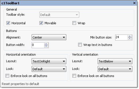
The following table defines the items included in the **Layout** dialog box for the [C1ToolBar](/componentone/docs/win/online-menus-toolbar/) control:
| Item | Description |
| --- | --- |
| **_General_** | |
| **Toolbar style** | The **Toolbar style** drop-down box contains the two values (Default and Drop-downMenu) of the ToolBarStyle property for you to select from to set the toolbar's style. |
| **Horizontal** | The **Horizontal** check box indicates whether to set the orientation of the **C1ToolBar** to horizontal. (**True**, if selected; **False**, if deselected). |
| **Movable** | The **Moveable** check box indicates whether the toolbar can be moved by the user. (**True**, if selected; **False**, if deselected) |
| **Wrap** | The **Wrap** check box indicates whether to wrap the toolbar or show a \\"More...\\" button if not all items fit on a single line. (**True**, if selected; **False**, if deselected) |
| **_Buttons_** | |
| **Alignment** | The **Alignment** drop-down box gets the Left, Right, or Center button alignment for vertical toolbars. |
| **Minimum button size** | The **Minimum button size** gets or sets the minimum size (width and height) of button in the toolbar. |
| **Button width** | The **Button width** gets or sets the width for all buttons (applies to horizontal toolbars only; if 0, buttons are individually sized). |
| **Wrap text in buttons** | The **Wrap text in buttons** check box gets or sets the value indicating whether to wrap text in links when the [C1ToolBar.ButtonWidth](/componentone/docs/win/online-menus-toolbar/) is greater than zero and the text doesn't fit. |
| **_Horizontal orientation_** | |
| **Layout** | The **Layout** drop-down box contains the following members to set the [C1ToolBar.ButtonLayoutHorz](/componentone/docs/win/online-menus-toolbar/) property of the **C1ToolBar** class: Default, Image, Text, and TextAndImage. |
| **Look** | The **Look** drop-down box contains the following members to set the [C1ToolBar.ButtonLookHorz](/componentone/docs/win/online-menus-toolbar/) property of the **C1ToolBar** class: TextAbove, TextBelow, TextOnLeft, and TextOnRight. |
| **Enforce look on all buttons** | The **Enforce look on all buttons** check box gets the specified look for all of the buttons in horizontal orientation. |
| **_Vertical orientation_** | |
| **Layout** | The **Layout** drop-down box contains the following members to set the [C1ToolBar.ButtonLayoutVert](/componentone/docs/win/online-menus-toolbar/) property of the **C1ToolBar** class: Default, Image, Text, and TextAndImage. |
| **Look** | The **Look** drop-down box contains the following members to set the [C1ToolBar.ButtonLookVert](/componentone/docs/win/online-menus-toolbar/) property of the **C1ToolBar** class: TextAbove, TextBelow, TextOnLeft, and TextOnRight. |
| **Enforce look on all buttons** | The **Enforce look on all buttons** check box gets the specified look for all of the buttons in vertical orientation. |
| **Reset properties to default** | Selecting the **Reset properties to default** item resets the modified **C1ToolBar**'s layout properties back to their default values. |
### Edit Miscellaneous Properties
Clicking on the **Edit Miscellaneous Properties** button opens the [C1ToolBar](/componentone/docs/win/online-menus-toolbar/) dialog box where you can edit miscellaneous properties for the [C1ToolBar](/componentone/docs/win/online-menus-toolbar/) control.
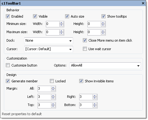
The following table defines the fields included in the [C1ToolBar](/componentone/docs/win/online-menus-toolbar/) dialog box for the C1ToolBar control:
| Item | Description | |
| --- | --- | --- |
| **_Behavior_** | | |
| **Enabled** | | The **Enabled** check box indicates whether the **C1ToolBar** will be enabled at run time. (**True**, if selected; **False**, if deselected) |
| **Visible** | | The **Visible** check box indicates whether the **C1ToolBar** control will be shown at run time. (**True**, if selected; **False**, if deselected) |
| **AutoSize** | | The **AutoSize** check box indicates whether the toolbar automatically adjusts its size to fit all items. (**True**, if selected; **False**, if deselected) |
| **Show tooltips** | | The **Show tooltips** check box gets or sets the value indicating whether to show ToolTip texts when the mouse cursor is over the toolbar button. |
| **Minimum size** | | The **Minimum size** field includes a Width and Height NumericUpDown controls for specifying the minimum width and height size for the **C1ToolBar** control. |
| **Maximum size** | | The **Maximum size** field includes a Width and Height NumericUpDown controls for specifying the maximum width and height size for the **C1ToolBar** control. |
| **Dock** | | The **Dock** drop-down box contains items for you to select from to define which border of the **C1ToolBar** control is bound to the container. |
| **Close More menu on item click** | | The **Close More menu on item click** check box gets or sets the value indicating whether the menu that is automatically created when some items do not fit on the toolbar closes when an item on that menu is clicked. |
| **Cursor** | | The **Cursor** drop-down box opens a list of different cursor items for you to set the type of cursor that appears when the pointer moves over the **C1ToolBar** control. |
| **Use wait cursor** | | The **Use wait cursor** check box indicates whether to use wait cursor. |
| **_Customization_** | | |
| **customize button** | The **customize button** check box indicates whether to show the customize button. (**True**, if selected; **False**, if deselected) | |
| **Options** | The **Options** drop-down box contains the following members to set the value of the [C1ToolBar.CustomizeOptions](/componentone/docs/win/online-menus-toolbar/) property of the **C1ToolBar** class: AllowAddItem, AllowAll, AllowDelete, AllowNone, AllowRemoveItem, and AllowToggleCustomizeButton. | |
| **_Design_** | | |
| **Generate member** | The **Generate member** check box indicates whether to generate the member for the **C1ToolBar** control. (**True**, if selected; **False**, if deselected) | |
| **Locked** | The **Locked** check box indicates whether the **C1ToolBar** is locked. (**True**, if selected; **False**, if deselected) | |
| **Show invisible items** | The **Show invisible items** check box indicates whether to show invisible buttons in the **C1ToolBar** control. (**True**, if selected; **False**, if deselected) | |
| **Margin** | The **Margin** specifies the space between the **C1ToolBar** control and another control's margin. | |
| **Reset properties to default** | Selecting the **Reset properties to default** item resets the modified **C1ToolBar**'s miscellaneous properties back to their default values. | |
| | | |
## See Also
[Menus and Toolbars Overview](/componentone/docs/win/online-menus-toolbar/menusandtoolbarsover)