# C1CommandMenu Toolbar
Get started with Menus and Toolbars for WinForms. Create versatile menus and docking/floating toolbars. See more in documentation here.
## Content
The [C1CommandMenu](/componentone/docs/win/online-menus-toolbar/) toolbar appears for the submenu items in the [C1CommandMenu](/componentone/docs/win/online-menus-toolbar/) of the [C1MainMenu](/componentone/docs/win/online-menus-toolbar/) and [C1ToolBar](/componentone/docs/win/online-menus-toolbar/) controls.
### Exposing the C1CommandMenu Toolbar
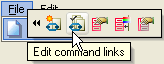
To expose the [C1CommandMenu](/componentone/docs/win/online-menus-toolbar/) toolbar, select the [C1CommandMenu](/componentone/docs/win/online-menus-toolbar/) item and its submenu items in the [C1ToolBar](/componentone/docs/win/online-menus-toolbar/) or [C1MainMenu](/componentone/docs/win/online-menus-toolbar/) control, and click on the open button, , to open the floating [C1CommandMenu](/componentone/docs/win/online-menus-toolbar/) toolbar like the following image:
### C1CommandMenu Toolbar Buttons
The [C1CommandMenu](/componentone/docs/win/online-menus-toolbar/) toolbar consists of the following command buttons:
| Toolbar Button | Description |
| --- | --- |
|  | **Add new command link/command**: Adds an empty command link and opens the **Link to Command** dialog box for you to create a new command/command link for the empty command. |
|  | **Edit command links**: Opens the **C1CommandLink Collection Editor** with the current command link in the Members list box for you to edit. |
|  | **Edit command properties**: Opens the **C1CommandMenu Command** properties dialog box where you can modify the selected command's properties. |
|  | **Edit menu appearance**: Opens the **C1CommandMenu Appearance** dialog box where you can modify the appearance properties for the selected command. |
|  | **Edit side caption properties**: Opens the **C1CommandMenu FormCaption** properties dialog box where you can modify the properties for the side caption in the selected menu and its submenus. |
### Insert command link
Clicking on the **Add new command link/command** button adds an empty command link and opens the **Link to Command** dialog box for you to create a new command/command link for the empty command.
### Edit command links
Clicking on the **Edit command links** button opens the **C1CommandLink Collection Editor** with the current command link in the Members list box for you to edit.
### Edit command properties
Clicking on the **Edit command properties** button opens the **C1CommandMenu Command** properties dialog box where you can modify the selected command's properties.
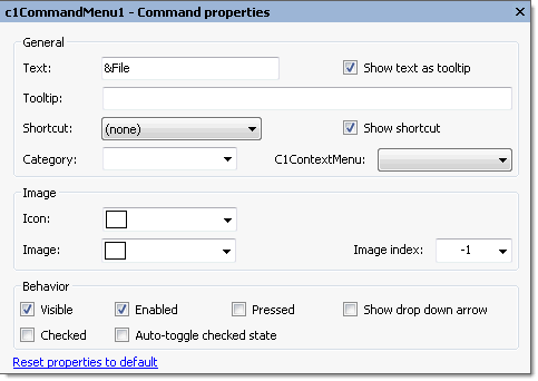
The following table defines the items included in the **C1CommandMenu Command** properties dialog box:
| Item | Description |
| --- | --- |
| **_General_** | |
| **Text** | The **Text** textbox displays the text name that appears on the selected command. To rename the text name for the command, select the text in the Text textbox and type the desired text name. |
| **Show text as tooltip** | The **Show text as Tooltip** check box displays the value of the [C1Command.Text](/componentone/docs/win/online-menus-toolbar/) property as the ToolTip when the check box is selected. |
| **Tooltip** | The **Tooltip** textbox displays ToolTip that appears on the selected command. If there is no ToolTip defined, then the ToolTip textbox is empty. To modify or create a ToolTip, enter text in the ToolTip textbox. |
| **Shortcut** | The **Shortcut** drop-down box displays a list of keys for you to select from to associate a keyboard shortcut with the selected command. |
| **Show shortcut** | The **Show shortcut** check box indicates whether the shortcut for the selected command will be shown. The [C1Command.ShowShortCut](/componentone/docs/win/online-menus-toolbar/) is enabled by default. |
| **Category** | The **Category** drop-down list box displays the category for the selected command. |
| **C1ContextMenu** | The **C1ContextMenu** drop-down list box displays the name(s) of the C1ContextMenu(s) so you can easily select the C1ContexMenu you want to associate with the selected command. |
| **_Image_** | |
| **Icon** | The **Icon** drop-down list box opens an **Open** dialog box for you to locate the icon to attach to the selected command. |
| **Image** | The **Image** drop-down list box displays the current image attached to the selected command. Clicking on the drop-down arrow opens the **Open** dialog box where you can locate the image you would like to associate with the selected command. |
| **Image Index** | The **Image** **index** drop-down list box displays the index value of the command image. |
| **_Behavior_** | |
| **Visible** | The **Visible** check box indicates whether the selected command will be shown at run time. By default, the [C1Command.Visible](/componentone/docs/win/online-menus-toolbar/) property is set to **True**. |
| **Enabled** | The **Enabled** check box indicates whether the selected command will be enabled at run time. By default, the [C1Command.Enabled](/componentone/docs/win/online-menus-toolbar/) property is set to **True**. |
| **Pressed** | The **Pressed** check box indicates whether the selected command is pressed. By default, the [C1Command.Pressed](/componentone/docs/win/online-menus-toolbar/) property is set to **True**. |
| **Show drop down arrow** | The **Show drop down arrow** check box indicates whether or not to show the drop down arrow when the selected command is in a toolbar. |
| **Checked** | The **Checked** check box indicates whether or not the command is checked. |
| **Auto-toggle checked state** | The **Auto-toggle checked state** check box indicates whether the [C1Command.Checked](/componentone/docs/win/online-menus-toolbar/) property is toggled automatically when this command in invoked. |
| **Reset properties to default** | Selecting the **Reset properties to default** item resets the modified C1CommandMenu Command properties back to their default values. |
### Edit menu appearance
Clicking on the **Edit menu appearance** button opens the **C1CommandMenu Appearance** dialog box where you can modify the appearance properties for the selected command.
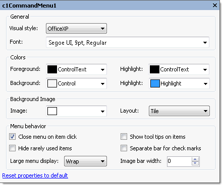
The following table defines the items included in the **C1CommandMenu Appearance** properties dialog box:
| Item | Description |
| --- | --- |
| **_General_** | |
| **Visual style** | The **Visual style** drop-down box contains the following items for you to select from to change the style of the menu control: **Custom**, **System**, **Office2007Blue**, **Office2007Black**, **Office2007Silver**, **Office2003Blue**, **Office2003Olive**, **Office2003Silver**, **OfficeXP**, **Classic**, and **WindowsXP**. |
| **Font** | The **Font** drop-down box opens the Font dialog box where you can modify the Font style properties for the menu. |
| **_Colors_** | |
| **Foreground** | The **Foreground** drop-down list box contains the Custom, System, and Web colors for you to select from to set the Foreground color for the menu control. |
| **Highlight (Foreground)** | The **Highlight** drop-down box contains the Custom, System, and Web colors for you to select from to set the text color of the highlighted item. |
| **Background** | The **Background** drop-down box contains the Custom, System, and Web colors for you to select from to set the base background color of the menu. |
| **Highlight (Background)** | The **Highlight** drop-down list box contains the Custom, System, and Web colors for you to select from to set the base back color of the highlighted item in the menu. |
| **_Background Image_** | |
| **Image** | The **Image** drop-down box opens an Open dialog box where you can apply the background image used for the command. |
| **Layout** | The **Layout** drop-down box opens a list of layout items (None, Tile, Center, Stretch, and Zoom) for you to select from that gets the background image layout for the menu. |
| **_Menu behavior_** | |
| **Close menu on item click** | When the **Close menu on item click** check box is selected, it closes the submenu item after it's clicked at run time. |
| **Show tooltips on items** | When the **Show tooltips on items** check box is selected, it displays the ToolTips on the menu items at run time. |
| **Hide rarely used items** | When the **Hide rarely used items** check box is selected, it hides the rarely used menu items at run time. |
| **Separate bar for check marks** | When the **Separate bar for check marks** check box is selected, it shows check marks instead of images in a separate bar. |
| **Large menu display** | When the **Large menu display** check box is selected, it determines the way the large menus (when all items cannot fit in one column) are displayed. |
| **Image bar width** | When the **Image bar width** check box is selected, it gets or sets the width of the image/check box bar in the menu. If set to 0, the width is calculated automatically. |
| **Reset properties to default** | Selecting the **Reset properties to default** item resets the modified **C1CommandMenu** appearance properties back to their default values. |
### Edit side caption properties
Clicking on the **Edit side caption properties** button opens the **C1CommandMenu FormCaption** properties dialog box where you can modify the properties for the side caption in the selected menu and its submenus.
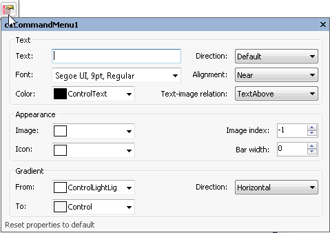
The following table defines the items included in the **C1CommandMenu FormCaption** dialog box:
| Item | Description |
| --- | --- |
| **_Text_** | |
| **Text** | The **Text** textbox displays the text name that appears in the side caption of the selected C1CommandMenu. To rename the text name for the side caption, select the text in the Text textbox and type the desired text name. |
| **Direction** | The **Direction** drop-down box displays a list box that contains different values (Default, Horizontal, VerticalLeft, VerticalRight) for the text direction in the SideCaption for you to select from. |
| **Font** | The **Font** drop-down box opens the Font dialog box where you can modify the Font style properties for the SideCaption. |
| **Alignment** | The **Alignment** drop-down box displays a list box that contains the text alignment options (near, far, or center) for you to select from to specify the text alignment in the SideCaption. |
| **Color** | The **Color** drop-down box displays custom, web, and system colors for you to select from to set the text color of the SideCaption. |
| **Text-image relation** | The **Text-image relation** drop-down box displays a list box that contains different values (TextAbove, TextBelow, TextOnLeft, TextOnRight) for the text layout in the SideCaption for you to select from. |
| **_Appearance_** | |
| **Image** | The **Image** gets or sets the image for the SideCaption. |
| **Image index** | The **Image index** gets or sets the index of the image for the SideCaption in the [C1CommandHolder.ImageList](/componentone/docs/win/online-menus-toolbar/). |
| **Icon** | The **Icon** drop-down box opens the Open dialog box where you can select the icon for the SideCaption. |
| **Bar width** | The **Bar width** gets or sets the width of the image/check box bar in the menu. If set to 0, the width is calculated automatically. |
| **_Gradient_** | |
| **From** | The **From** drop-down box opens the custom, web, and system colors for you to choose from to set the beginning color of the gradient for the SideCaption. |
| **To** | The **To** drop-down box opens the custom, web, and system colors for you to choose from to set the ending color of the gradient for the SideCaption. |
| **Direction** | The **Direction** drop-down box includes different gradient directions (horizontal, vertical, forward diagonal, or backward diagonal) for you to set the type of gradient direction in the SideCaption. |
| **Reset properties to default** | Selecting the **Reset properties to default** item resets the modified **C1CommandMenu** FormCaption properties back to their default values. |
## See Also
[C1DockingTab Toolbars](/componentone/docs/win/online-menus-toolbar/designtimesupport/c1commandsmartdesign/smartdesignerfloatin/c1dockingtabtoolbars)