# Style Cells
## Content
List gives you various ways to control the display characteristics of individual cells. The following sections discuss how to apply styling to cells in the List.
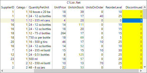
The following image shows how you can customize the appearance of the List control by styling the cells.
## Style by Cell Status
List enables you to apply styling to individual cells based on their status value. Each cell in the list has a status value which identifies its disposition.
The following image showcases styling applied to the cells in the List control.
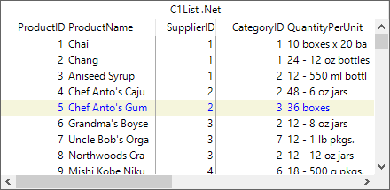
To apply stying to cells by status, you can use the Style class to define a style. Then, you can use the **AddCellStyle** method of the C1List class to apply the defined style to the list cells. The AddCellStyle method allows you to set the cell status through the **CellStyleFlag** parameter which provides the following options:
| **Option** | **Description** |
| --- | --- |
| AllCells | Applies to all cells. |
| CurrentCell | Applies to the current cell. |
| MarqueeRow | Applies to cells in a highlighted row marquee. |
| NormalCell | Applies to cells without status conditions. |
| SelectedRow | Applies to cells in a selected row. |
The following code snippet demonstrates how to apply styling to the cells in a selected row by setting the CellStyleFlag parameter to **SelectedRow**.
```csharp
//create a new style for selected row
var selCS = new Style();
selCS.BackColor = Color.Beige;
selCS.ForeColor = Color.Blue;
//apply it to the SelectedRow Status
c1List1.AddCellStyle(CellStyleFlag.SelectedRow, selCS);
```
## Style Cells by Content
You can apply styling to particular cells, based upon their displayed contents. To do so, you can use **AddRegexCellStyle** method of the **C1List** class. This method has parameters that allows you to set cell status through the **CellStyleFlag** parameter. Besides, you can also define a pattern, called a regular expression, which is tested against the displayed value of each cell.
The following image shows the List control after applying styling to the cells based on the displayed contents.
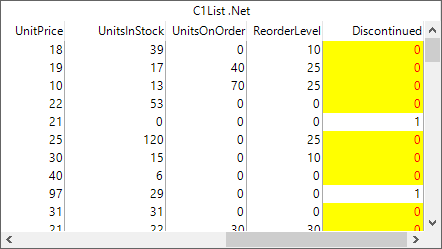
The following code demonstrates how to style cells by content. This example uses the sample created in the [Quick Start](/componentone/docs/win/online-list/listforwinformsquick) topic. Here, we have applied styling to the cells in **Discontinued** column field, where the stored values are equal to 0.
```csharp
//create a new style for discontinued products
var discontinuedCS = new Style();
discontinuedCS.BackColor = Color.Yellow;
discontinuedCS.ForeColor = Color.Red;
//apply the style
c1List1.Splits[0].DisplayColumns["Discontinued"].AddRegexCellStyle(CellStyleFlag.AllCells, discontinuedCS, "0");
```
## Style Cells by Custom Criteria
List enables you to style cells by status and content. However, there might be a case where regular expressions are insufficient to express your formatting requirements. For such cases, you can define your own custom styling by using **FetchCellStyle** event of the C1List class. The FetchCellStyle event can be used to customize fonts and colors on a per-cell basis. Besides, this event can also be used to apply formatting to one cell based upon the values of other cells, or even other controls. The FetchCellStyle event gets fired for the columns that have the FetchStyle property set to **true**.
The following image shows the List control after applying custom styling to the cells.
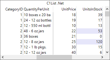
Use the following code to apply custom formatting to the cells in the List control. This example uses the sample created in the [Quick Start](/componentone/docs/win/online-list/listforwinformsquick) topic. In this example, we have set the background color of the cells to lavender where the **UnitsInStock** value is greater than 50.
1. Set **FetchStyle** property of the C1List class to true and subscribe to the **FetchCellStyle** event for applying custom formatting.
```csharp
//enable firing of FetchCellStyle for this column
c1List1.Splits[0].DisplayColumns["UnitsInStock"].FetchStyle = true;
//handle fetch cellstyle
c1List1.FetchCellStyle += C1List1_FetchCellStyle;
```
2. Add the following code to the **C1List\_FetchCellStyle** event handler.
```csharp
private void C1List1_FetchCellStyle(object sender, FetchCellStyleEventArgs e)
{
if (c1List1.Splits[0].DisplayColumns[e.Col].Name != "UnitsInStock") return;
//change forecolor of cells that have value greater than 50
int N;
N = int.Parse(c1List1.Columns[e.Col].CellText(e.Row));
if (N > 50)
{
e.CellStyle.BackColor = Color.Lavender;
}
}
```