# Data Presentation
## Content
List provides a variety of data translation techniques which can be used to present data in various forms. Data translation feature is ideally suited for displaying numeric codes or cryptic abbreviations in a form that makes sense to end users. For example, country codes can be rendered as proper names or even as pictures of their respective flags. The numbers 0, 1, and 2 may be displayed as Yes, No, and Maybe. Additionally, the actual values (0, 1, 2) or the translated values (Yes, No, Maybe) may be displayed as radio buttons in a cell or in a drop-down combo box.
You can use the ValueItemCollection class to specify alternate text or even pictures to be displayed in place of the underlying data values. Each ValueItem object contains a collection and properties that define the association between an underlying data value and its visual representation within the grid. It supports two main properties: [Value](/componentone/api/win/online-list/dotnet-api/C1.Win.List.10/C1.Win.List.ValueItem.Value.html) and [DisplayValue](/componentone/api/win/online-list/dotnet-api/C1.Win.List.10/C1.Win.List.ValueItem.DisplayValue.html). The **Value** property represents the underlying data value, whereas the **DisplayValue** property represents the visual representation of the data.
## Specify Text-to-Text Translation
With List, you can translate text to display character codes or complete names.
The following image demonstrates an example where **Country** field is represented by short character codes.
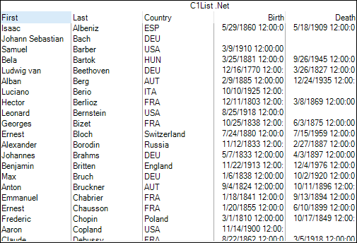
To display the character codes as complete names, add the value items to the ValueItemCollection for the specified column and set Translate property of the ValueItems class to **true** as demonstrated in the following code snippet. In this example we have added the values items for specified countries to be displayed in the Country column.
```csharp
ValueItemCollection v = this.c1List1.Columns["Country"].ValueItems.Values;
//add value items
v.Add(new ValueItem("Spain", "ESP"));
v.Add(new ValueItem("Germany", "DEU"));
v.Add(new ValueItem("United States", "USA"));
v.Add(new ValueItem("Hungary", "HUN"));
v.Add(new ValueItem("Austria", "AUT"));
v.Add(new ValueItem("Italy", "ITA"));
v.Add(new ValueItem("France", "FRA"));
//sets the Translate property
this.c1List1.Columns["Country"].ValueItems.Translate = true;
```
Besides, you can also use the **ValueItem Collection Editor** to set the display values for the actual values.
Follow the given steps for specifying data translations using the **ValueItem Collections Editor**.
1. Click the ellipsis button (...) next to the **Columns** in the **Properties** window to open the **C1DataColumn Collection Editor** (in .NET edition), or **C1List Designer** (in .NET Framework Edition).
2. Expand the **ValueItems** node to expose the ValueItems Collection items.
3. Click on the ellipsis button next to the **Values** node to open the **ValueItem Collection Editor**.
4. Click the **Add** button in the left pane to add ValueItem objects. Then, specify the **Value** and **DisplayValue** for each ValueItem in the right pane.
5. Click **OK** and close the **ValueItem Collection Editor**.
## Specify Text-to-Picture Translation
The same techniques used to specify text-to-text translations can also be used for text-to-picture translations. The only difference is that you need to set bitmaps as display values instead of typing a string.
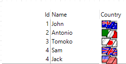
The following code demonstrates how to display bitmap images in the List control by using the DisplayValue property for the items and then adding the value items to the ValueItemCollection. In this example, we have displayed country flag images for each country in the **Country** field of the list.
```csharp
ValueItem Item;
Item = new ValueItem();
ValueItemCollection values = this.c1List1.Columns[0].ValueItems.Values;
Item.Value = "Canada";
Item.DisplayValue = Image.FromFile("canada.bmp");
values.Add(Item);
Item = new ValueItem();
Item.Value = "Italy";
Item.DisplayValue = Image.FromFile("italy.bmp");
//adds value item
values.Add(Item);
Item = new ValueItem();
Item.Value = "United States";
Item.DisplayValue = Image.FromFile("usa.bmp");
values.Add(Item);
Item = new ValueItem();
Item.Value = "Japan";
Item.DisplayValue = Image.FromFile("japan.bmp");
values.Add(Item);
Item = new ValueItem();
Item.Value = "Australia";
Item.DisplayValue = Image.FromFile("australia.bmp");
values.Add(Item);
//set Translate property of the list
this.c1List1.Columns["Country"].ValueItems.Translate = true;
```
You can also set the height and alignment of the image using [ItemHeight](/componentone/api/win/online-list/dotnet-framework-api/C1.Win.List.4.8/C1.Win.List.ListBase.C1ListBase.ItemHeight.html) of C1List class and [VerticalAlignment](/componentone/api/win/online-list/dotnet-api/C1.Win.List.10/C1.Win.List.Style.VerticalAlignment.html) property of the [Style](/componentone/api/win/online-list/dotnet-api/C1.Win.List.10/C1.Win.List.Style.html) class, respectively.
Alternatively, you can also use the **ValueItem Collection Editor** to set bitmaps as display values in the same way. You can do so by clicking the **ellipsis (...)** button next to the **DisplayValue** option, and selecting a bitmap to be used for data translation. For more information on **ValueItem Collection Editor**, see, [ValueItem Collection Editor](/componentone/docs/win/online-list/designtimesupport/collectioneditors#valueitem-collection-editor).
## Display both Text and Picture
Once you have configured the ValueItemCollection object to perform text-to-picture translations for a column, you can display both the Value string and the DisplayValue bitmap within the same cell. You can do so by setting [AnnotatePicture](/componentone/api/win/online-list/dotnet-api/C1.Win.List.10/C1.Win.List.ValueItems.AnnotatePicture.html) property of the ValueItems class to **true**.
The following image shows the List control after displaying both, text and picture in the Country field.
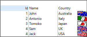
Use the following code to display both, text and picture in a column.
```csharp
this.c1List1.Columns["Country"].ValueItems.AnnotatePicture = true;
```
In the above mentioned example, the text is displayed as it is stored in the database without formatting. However, you can display both, a picture and formatted text. To achieve this, you can use **FormatText** event of the **C1List** class to translate the text, and then use the ValueItemCollection object to associate the translated text (not the underlying data value) with a picture. For more information on FormatText event, see [Custom Format](/componentone/docs/win/online-list/format) topic.
## Display Boolean Values as Checkboxes
List enables you to display boolean values as in-cell checkboxes by setting the value of Presentation property of the ValueItems class to **Checkbox** using the [PresentationEnum](/componentone/api/win/online-list/dotnet-api/C1.Win.List.10/C1.Win.List.PresentationEnum.html) enumeration. This enumeration specifies how the ValueItems are rendered.
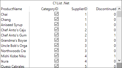
The following code snippet shows how to display in-cell checkboxes in the List control by setting **Presentation** property to **Checkbox**.
```csharp
//show checkboxes
c1List1.Columns[1].ValueItems.Presentation = C1.Win.List.PresentationEnum.CheckBox;
```
Alternatively, you can also use the **ValueItem Collection Editor** to set the Presentation property to Checkbox. For more information, see [ValueItem Collection Editor](/componentone/docs/win/online-list/designtimesupport/collectioneditors#valueitem-collection-editor).
## Display Allowable Values as Radio Buttons
If the number of allowable values for a column is relatively small, you may want to consider a radio button presentation. The following image shows the list control with in-cell radio buttons.
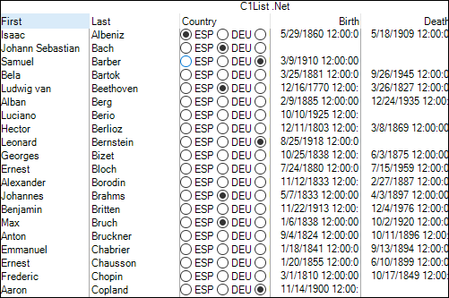
To display in-cell radio buttons, set the value of Presentation property of the **ValueItems** class to **RadioButton** as shown in the following code snippet.
```csharp
c1List1.Columns["Country"].ValueItems.Presentation = PresentationEnum.RadioButton;
```
By default, if the underlying data does not match any of the available values, none of the radio buttons get selected for a given cell. However, you can display a specific value as selected option by passing its index using [DefaultItem](/componentone/api/win/online-list/dotnet-api/C1.Win.List.10/C1.Win.List.ValueItems.DefaultItem.html) property of the ValueItems class as demonstrated in the following code.
```csharp
c1List1.Columns["Country"].ValueItems.DefaultItem = 5;
```
Alternatively, you can also use the ValueItem Collection Editor to set the Presentation property to RadioButton. For more information, see [ValueItem Collection Editor](/componentone/docs/win/online-list/designtimesupport/collectioneditors#valueitem-collection-editor).