# Create Rich ToolTips for InputPanel Items

Add rich tool tips for items in the form-like control InputPanel. Award-Winning Suite of Controls for .NET Development. Read the documentation to know more.

## Content


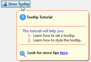
InputPanel provides a ToolTip Editor which lets you create rich tooltips for input components. This topic describes how you can use this editor to create a rich tooltip for the InputButton component at design time and through code.
![Rich tooltip](https://cdn.mescius.io/document-site-files/images/4e65bab9-2efa-46a9-bc67-a45339527116/images/rich-tooltip.png)

### At Design Time

1.  Click InputPanel smart tag (![smart tag](https://cdn.mescius.io/document-site-files/images/4e65bab9-2efa-46a9-bc67-a45339527116/images/smart-tag.png)) to open the **InputPanel Tasks** menu.
2.  Click the **Add New Item** combo box to select a component to be added, say InputButton.<br />**Observe**: The InputButton component is added to the input panel.
3.  Select the InputButton and go to **Properties** window.
4.  Locate the **ToolTipText** property and click the ellipsis button.
5.  The **ToolTipText** **Editor** opens with the **Office** tab page in focus.
6.  Complete the following tasks in the **Office** tab page:
    1.  Set the **Title**, say "ToolTip Tutorial".
    2.  Click the **Image** drop-down and select **(Add Image...)** to display the **Open** dialog box. Browse to select a small icon size image (preferably, 16x16 pixels) and click **Open**.
    3.  To display a separator between tooltip title and the body text, check the **Top Separator** checkbox.
    4.  Type the tooltip main text into the **Body Text** text box.
    5.  To display a separator between the body text and subtitle, check the **Bottom Separator** box.
    6.  Type in the subtitle in **SubTitle** textbox. You can also add a subtitle image using the **Subimage** dropdown.<br />**Observe**: The **Preview** pane displays a preview of the tooltip. 
	> type=note
	> **Note**: You can also style title, body text and subtitle texts using the quick toolbar given on the top of Office tab.![Preview Tooltip](https://cdn.mescius.io/document-site-files/images/4e65bab9-2efa-46a9-bc67-a45339527116/images/preview-tooltip.png)
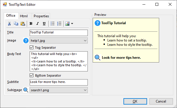
7.  Switch to the **Html** tab to get an HTML view of customization done so far. You can further customize the tooltip by editing the HTML part. In this example, we have enclosed a part of body text in `<font color="blue"></font>`tag to change the text color to blue. Also, we have enclosed a part of subtitle in `<a href = "[developer.mescius.com](http://developer.mescius.com)"></a>` tags to create a hyperlink.
8.  Switch to the **Properties** tab and set some properties for further customization of tooltip. In this example, we have performed the following steps:
    1.  Set the **Border** property to **True**.
    2.  Set the **BorderColor** property to **RedOrange**.
    3.  Set the **Opacity** property to **80%**.
9.  Click **OK** to close the **ToolTip Editor**.
10.  Press F5 key to build the project.<br />**Observe**: Hover the mouse over input button to display the rich tooltip.

### At Runtime

1.  Create an InputButton and add it to the InputPanel.
2.  Set the **Text** property of <span data-popup-content="This class is available in \u003ca href=\u0022/componentone/docs/win/online-inputpanel/\u0022\u003e.NET\u003c/a\u003e and \u003ca href=\u0022/componentone/docs/win/online-inputpanel/\u0022\u003e.NET Framework\u003c/a\u003e." data-popup-title="InputButton" data-popup-theme="ui-tooltip-green qtip-green">InputButton</span>, say "ToolTip Tutorial". **csharp**
    
    ```csharp
    // Create an instance of InputButton to show tooltip on it. 
     InputButton btn = new InputButton();
    btn.Text = "ToolTip Tutorial";
    // Add it to InputPanel.
     c1InputPanel1.Items.Add(btn);
    ```
    
    **vbnet**
    
    ```vbnet
    ' Create an instance of InputButton to show tooltip on it.
    Dim btn As InputButton = New InputButton()
    btn.Text = "ToolTip Tutorial"
    ' Add it to InputPanel
    c1InputPanel1.Items.Add(btn)
    ```
    
3.  Set the **ToolTipText** property of the button. You can also use the HTML string to create a tooltip with title, subtitles etc. as shown in the code below. **csharp**
    
    ```csharp
    btn.ToolTipText = @"<table>
        <tr>
        <td><parm><img src='res://help1.jpg'></parm></td>
        <td><b><parm>Tooltip Tutorial</parm></b></td>
        </tr></table>
        <parm><hr noshade size=1 style='margin:2' color=#ff4500></parm>
        <div style='margin:1 12'><parm>
        <font color = 'blue'>This tutorial will help you: </font><br>
        <ol><li> Learn how to set a tooltip.</li><li>Learn how to style the tooltip.</li></ol>
        </parm></div>
        <parm><hr noshade size=1 style='margin:2' color =#ff4500></parm>
        <table><tr>
        <td><parm><img src ='res://search1.png'></parm></td> +
        <td><b><parm>Look for more tips <i><a href='http://developer.mescius.com>here</a></i>.</parm></b></td>
        </tr></table>";
    ```
    
    **vbnet**
    
    ```vbnet
    btn.ToolTipText = @"<table>
          <tr>
          <td><parm><img src='res://help1.jpg'></parm></td>
          <td><b><parm>Tooltip Tutorial</parm></b></td>
          </tr></table>
          <parm><hr noshade size=1 style='margin:2' color=#ff4500></parm>
          <div style='margin:1 12'><parm>
          <font color = 'blue'>This tutorial will help you: </font><br>
          <ol><li> Learn how to set a tooltip.</li><li>Learn how to style the tooltip.</li></ol>
          </parm></div>
          <parm><hr noshade size=1 style='margin:2' color =#ff4500></parm>
          <table><tr>
          <td><parm><img src ='res://search1.png'></parm></td> +
          <td><b><parm>Look for more tips <i><a href='http://developer.mescius.com>here</a></i>.</parm></b></td>
          </tr></table>"
    ```
    
4.  Customize appearance of the tooltip by using various properties of the <span data-popup-content="This property is available in \u003ca href=\u0022/componentone/docs/win/online-inputpanel/\u0022\u003e.NET\u003c/a\u003e and \u003ca href=\u0022/componentone/docs/win/online-inputpanel/\u0022\u003e.NET Framework\u003c/a\u003e." data-popup-title="ToolTipSettings" data-popup-theme="ui-tooltip-green qtip-green">ToolTipSettings</span> class. **csharp**
    
    ```csharp
    // Customize the tooltip
     c1InputPanel1.ToolTipSettings.RoundedCorners = true;
    c1InputPanel1.ToolTipSettings.IsBalloon = true;
    c1InputPanel1.ToolTipSettings.Border = true;
    c1InputPanel1.ToolTipSettings.BorderColor = Color.OrangeRed;
    c1InputPanel1.ToolTipSettings.Opacity = 80;  
    ```
    
    **vbnet**
    
    ```vbnet
    ' Customize the tooltip    
    
    c1InputPanel1.ToolTipSettings.RoundedCorners = True
    c1InputPanel1.ToolTipSettings.IsBalloon = True
    c1InputPanel1.ToolTipSettings.Border = True
    c1InputPanel1.ToolTipSettings.BorderColor = Color.OrangeRed
    c1InputPanel1.ToolTipSettings.Opacity = 80
    ```
    

## See Also

[Quick Start](/componentone/docs/win/online-inputpanel/inputpanelforwinformsquickstart)

[InputPanel for WinForms Samples](/componentone/docs/win/online-inputpanel/inputpanelforwinformssamples)