# Validation
InputPanel provides validation feature to alert invalid inputs. Award-Winning Suite of Controls for .NET Development. Read the documentation to know more.
## Content
InputPanel displays a default red frame automatically around an input component whenever user provides an invalid input. Appearance of the default red frame can be customized by using the **ErrorFrameColor** and **ErrorFrameThickness** properties of the C1InputPanel class. For more information, see [Customize Error Frame](/componentone/docs/win/online-inputpanel/appearanceandstyle).
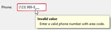
In addition to the visual alert, you can also provide a text alert for invalid input. InputPanel has an **ErrorText** property that displays the specified string as a popup error when you move the mouse over the input component.
**csharp**
```csharp
mtb.Mask = "(000)000-0000";
mtb.ErrorText = "
"
```
## See Also
[Appearance and Style](/componentone/docs/win/online-inputpanel/appearanceandstyle)
[Keyboard Navigation](/componentone/docs/win/online-inputpanel/keyboardnavigation)