# Layout
What's the best part of InputPanel? Its flow functionality, so you don't have to individually move each control or realign. Award-Winning Suite of Controls for .NET Development. Read the documentation to know more.
## Content
## Define Flow of InputPanel Components
Input components, by default, are stacked one in each row. You can change the layout flow for the input components using **Break** property of the input components. This property originally comes from the InputComponent base class which is inherited by these components and accepts values from the **BreakType** enumeration. The enumeration lets you add the next component to same row, new row, new column or to the left edge of the new row by setting the Break property to **None**, **Row**, **Column** and **Group** respectively.
**csharp**
```csharp
// Set the break type to group
inputCheckBox1.Break = BreakType.Group;
```
**vbnet**
```vbnet
' Set the break type to group
inputCheckBox1.Break = BreakType.Group
```
## Create Multiple Columns
Multiple columns can be created within a group using the abovementioned Break property of the input components. A new column is created when **Break** property of a component is set to **Column**. You can also add separator to divide the columns clearly by adding the InputSeparator component. For vertical separation, you need to rotate the separator by 90 degrees using the context menu option **Rotate 90°** and set its **Break** property to **Column**.
**csharp**
```csharp
// Set the break type to group
inputCheckBox1.Break = BreakType.Column;
// Rotate the separator by 90 degrees
inputSeparator1.Break = BreakType.Column;
inputSeparator1.ElementWidth = 1;
inputSeparator1.Height = 132;
inputSeparator1.HorizontalAlign = C1.Win.InputPanel.InputContentAlignment.Center;
inputSeparator1.Name = "inputSeparator1";
inputSeparator1.VerticalAlign = C1.Win.InputPanel.InputContentAlignment.Spread;
inputSeparator1.Width = 7;
```
**vbnet**
```vbnet
' Set the break type to group
inputCheckBox1.Break = BreakType.Column
' Rotate the separator by 90 degrees
inputSeparator1.Break = BreakType.Column
inputSeparator1.ElementWidth = 1
inputSeparator1.Height = 132
inputSeparator1.HorizontalAlign = C1.Win.InputPanel.InputContentAlignment.Center
inputSeparator1.Name = "inputSeparator1"
inputSeparator1.VerticalAlign = C1.Win.InputPanel.InputContentAlignment.Spread
inputSeparator1.Width = 7
```
## Create Horizontal Groups or Sections
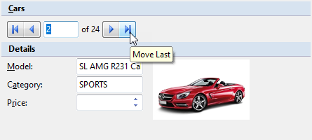
The InputPanel control provides InputGroupHeader component to create separate horizontal groups in a form. You can set the header text by setting **Text** property of the component. You can also use separator, a horizontal line to divide the InputPanel fields into sections by adding the InputSeparator component.
**csharp**
```csharp
// Add a group header to create horizontal groups
InputGroupHeader grphdr = new InputGroupHeader();
c1InputPanel1.Items.Add(grphdr);
grphdr.Text = "&Cars";
// Add a separator for horizontal sectioning
InputSeparator sepLine = new InputSeparator();
c1InputPanel2.Items.Add(sepLine);
```
**vbnet**
```vbnet
' Add a group header to create horizontal groups
Dim grphdr As InputGroupHeader = New InputGroupHeader()
c1InputPanel1.Items.Add(grphdr)
grphdr.Text = "&Cars"
' Add a separator for horizontal sectioning
Dim sepLine As InputSeparator = New InputSeparator()
c1InputPanel2.Items.Add(sepLine)
```
### Indent Sub-items within InputGroup
The InputPanel control also handles layout for inner elements within the InputGroupHeader component. The InputGroupHeader components have a content area with padding, so inner elements are automatically indented.
### Align Elements within InputGroup
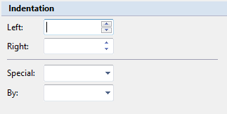
The InputPanel control provides **Width** property of each component which can be used to align elements within a group. In most of the scenarios, fields in an input panel are placed along with a label describing each of them. So, you can use Width property of the InputLabel component to align elements within a group. When the label width for all the fields is common, the components representing the fields automatically get aligned. Also, when label width is set, the label wraps and its height is adjusted to fit the text.
**csharp**
```csharp
// Set the width of all labels to same value
inputLabel1.Width = 50;
inputLabel2.Width = 50;
inputLabel3.Width = 50;
inputLabel4.Width = 50;
```
**vbnet**
```vbnet
' Set the width of all labels to same value
inputLabel1.Width = 50
inputLabel2.Width = 50
inputLabel3.Width = 50
inputLabel4.Width = 50
```
## Arrange InputPanel Components
The most common use case of the InputPanel control is to create forms containing different types of fields that are represented by various components. To make these forms readable and attractive, you need to arrange the components in a presentable manner with appropriate spacing and structure. This section discusses various ways you can employ to get a proper arrangement of components.
### Use alignment
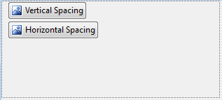
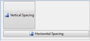
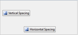
Each input component of the InputPanel control can be resized using **Height** and **Width** property. You can set the **VerticalAlign** property and **HorizontalAlign** property to position the element inside component to center, far, near, etc. For instance, if we set the Height property of InputButton component to 100, the button element also stretches itself to occupy the component. However you can set the VerticalAlign property of the button component to Center to create vertical space around the element. Similarly, HorizontalAlign property can be used to achieve horizontal spacing.
| **Original State** | **inputButton1.Height = 100** **inputButton2.Width = 300** | **inputButton1.VerticalAlign = Center** **inputButton2.HorizontalAlign = Center** |
| --- | --- | --- |
|  |  |  |
**csharp**
```csharp
// Set height and width of the components
inputButton1.Height = 100;
inputButton2.Width = 300;
// Set vertical and horizontal alignment of the components
inputButton1.VerticalAlign = InputContentAlignment.Center;
inputButton2.HorizontalAlign = InputContentAlignment.Center;
```
**vbnet**
```vbnet
' Set height and width of the components
inputButton1.Height = 100
inputButton2.Width = 300
' Set vertical and horizontal alignment of the components
inputButton1.VerticalAlign = InputContentAlignment.Center
inputButton2.HorizontalAlign = InputContentAlignment.Center
```
### Use padding
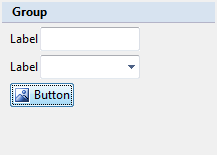
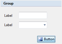
By default, components that are added to InputPanel control has very less space between them as **Padding** for these controls is set to '**0**'. You can set the Top, Bottom, Left and Right padding of the control to create appropriate space between them.
| **Without Padding** | **With Padding** |
| --- | --- |
|  |  |
**csharp**
```csharp
// Set padding of the input components
inputLabel1.Padding = new Padding(5, 20, 20, 10);
inputLabel2.Padding = new Padding(5, 0, 20, 0);
inputTextBox1.Padding = new Padding(0, 10, 0, 0);
inputButton1.Padding = new Padding(120, 22, 0, 0);
```
**vbnet**
```vbnet
' Set padding of the input components
inputLabel1.Padding = New Padding(5, 20, 20, 10)
inputLabel2.Padding = New Padding(5, 0, 20, 0)
inputTextBox1.Padding = New Padding(0, 10, 0, 0)
inputButton1.Padding = New Padding(120, 22, 0, 0)
```
### Use child spacing
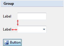
By default, elements of the components added to a **InputPanel** control are in close proximity to one another. You can specify Height and Width in **ChildSpacing** property of the C1InputPanel class to give vertical and horizontal space between the child elements. Once the ChildSpacing property is set, all components added to the page conform to that setting, hence giving you a uniform spacing scheme for your panel. However, you can still change the spacing of individual components by manipulating their **Padding** property.
| **Without Child Spacing** | **With Child Spacing** |
| --- | --- |
|  |  |
**csharp**
```csharp
// Set child spacing property
c1InputPanel1.ChildSpacing = new Size(20, 20);
```
**vbnet**
```vbnet
' Set child spacing property
c1InputPanel1.ChildSpacing = New Size(20, 20)
```
## See Also
[Keyboard Navigation](/componentone/docs/win/online-inputpanel/keyboardnavigation)