# Appearance and Style
InputPanel, the form-like control can be styled, and its appearance enhanced. Award-Winning Suite of Controls for .NET Development. Read the documentation to know more.
## Content
InputPanel provides eight predefined visual styles and a customizable visual style, so that you can easily achieve one of the most acceptable look and feel for your form.
You can set these visual styles using [VisualStyle](/componentone/docs/win/online-inputpanel/) property of the [C1InputPanel](/componentone/docs/win/online-inputpanel/) class. This property accepts values from [VisualStyle](/componentone/docs/win/online-inputpanel/) enumeration. Setting the **VisualStyle** property on the InputPanel control also handles the gradients and borders of the components included in the InputPanel.
> type=note
> **Note**: VisualStyle is not supported in InputPanel control of .NET edition. So VisualStyles are only applicable to .Net Framework edition. **csharp**
```csharp
// Set the visual style
c1InputPanel1.VisualStyle = VisualStyle.Office2010Black;
```
**vbnet**
```vbnet
' Set the visual style
c1InputPanel1.VisualStyle = VisualStyle.Office2010Black
```
Following table covers all the possible values of the VisualStyle property and the resultant look of the control.
| **VisualStyle** | **Description** | **Snapshot** |
| --- | --- | --- |
| Custom | You can use styles and appearance properties to customize the control. | 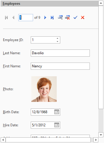 Custom Visual Style |
| Office2007Black | The style matches Office2007 Black color scheme. | 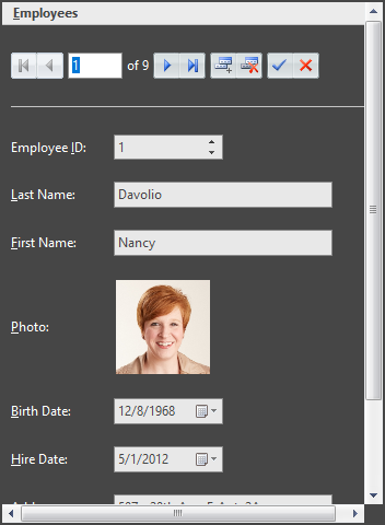 Office 2007 Black |
| Office2007Blue | The style matches Office2007 Blue color scheme. | 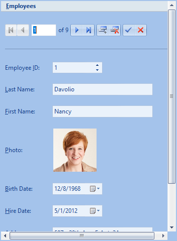 Office 2007 Blue |
| Office2007Silver | The style matches Office2007 Silver color scheme. | 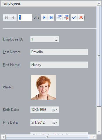 Office 2007 Silver |
| System (Default) | The style matches the current system settings. | |
| Office2010Blue | The style matches Office2010 Blue color scheme. | 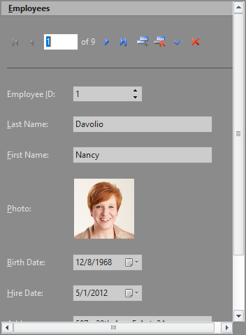 Office 2010 Black |
| Office2010Black | The style matches Office2010 Black color scheme. | 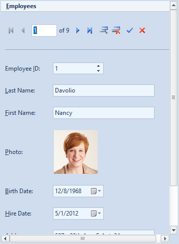 Office 2010 Blue |
| Office2010Silver | The style matches Office2010 Silver color scheme. | 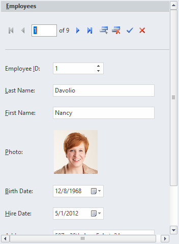 Office 2010 Silver |
| Windows7 | The styles matches Windows7 color scheme. | 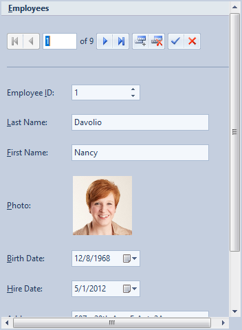 Windows 7 |
In addition to these visual styles, you can use **C1ThemeController** to apply other themes to the **InputPanel** control. You could also create your own theme using the **ThemeDesigner**. For more information on the **C1ThemeController**, see the [Themes for WinForms](https://developer.mescius.com/componentone/docs/win/online-themes/overview.html) documentation.
### Adding a Background Image
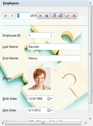
To add a background image to the InputPanel control, you can use **BackgroundImage** property of the C1InputPanel class. At design time, click the ellipsis button next to this property to open a **Select Resource** dialog. The dialog lets you select the source of image which can either be a project resource or can be imported from the system. You can also set the layout of image to center, stretch, tile etc. by using the **BackgroundImageLayout** property.
**csharp**
```csharp
// Set the background image
c1InputPanel1.BackgroundImage = Image.FromFile(@"C:\Resources\sample-image.jpeg");
// Set the image layout
c1InputPanel1.BackgroundImageLayout = ImageLayout.Center;
```
**vbnet**
```vbnet
' Set the background image
c1InputPanel1.BackgroundImage = Image.FromFile("C:\Resources\sample-image.jpeg")
' Set the image layout
c1InputPanel1.BackgroundImageLayout = ImageLayout.Center
```
### Customize Error Frame
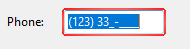
By default, InputPanel displays a red error frame around a field which receives an invalid input from the user. You can customize this error frame to change its color by using the **ErrorFrameColor** property of the C1InputPanel class. You can also change the frame thickness by using the **ErrorFrameThickness** property.
| **Default Error Frame** | **Customized Error Frame** |
| --- | --- |
|  |  |
**csharp**
```csharp
// Set the color of error frame
c1InputPanel1.ErrorFrameColor = Color.Chartreuse;
// Set the thickness of error frame
c1InputPanel1.ErrorFrameThickness = 5;
```
**vbnet**
```vbnet
' Set the color of error frame
c1InputPanel1.ErrorFrameColor = Color.Chartreuse
' Set the thickness of error frame
c1InputPanel1.ErrorFrameThickness = 5
```
## See Also
[Walkthroughs](/componentone/docs/win/online-inputpanel/walkthroughs)