# Customize Text
FlexGrid for WinForms provides various ways to customize text. Set margins, show vertical text and do more with grid text. Learn more about text styling here.
## Content
FlexGrid lets you customize text in various ways such as changing its font, margin, orientation, alignment, effects and so on. This topic caters to various aspects of text styling by taking a particular row object. However, if you wish to use an existing [built-in style](/componentone/docs/win/online-flexgrid/features/styling-and-appearance/built-in-styles) or want to create your own [custom style](/componentone/docs/win/online-flexgrid/features/styling-and-appearance/flexgrud-styles/custom-styles) to re-use it, see the corresponding topics.
## Change Font
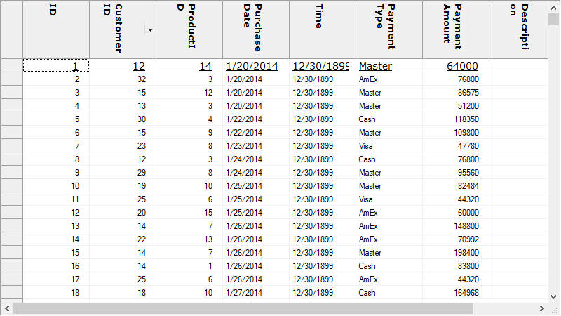
To change font of text in a particular row or column object, you can use **Font** property of its CellStyle. Following code shows how to change font of the WinForms FlexGrid row.
```csharp
//Apply the custom style to a particular row
c1FlexGrid1.Rows[1].StyleNew.Font = new Font("verdana", 10, FontStyle.Underline);
c1FlexGrid1.Rows[0].StyleNew.Font = new Font("verdana", 10, FontStyle.Bold);
```
```vbnet
'Apply the custom style to a particular row
c1FlexGrid1.Rows(1).StyleNew.Font = new Font("verdana", 10, FontStyle.Underline)
c1FlexGrid1.Rows(0).StyleNew.Font = new Font("verdana", 10, FontStyle.Bold)
```
However, if you want to change font of the whole grid, you can set Font property of the C1FlexGrid class. Following code shows how to change font of the entire WinForms FlexGrid.
```csharp
// Change the font of whole grid content
c1FlexGrid1.Font = new Font("verdana", 10, FontStyle.Italic);
```
```vbnet
' Change the font of whole grid content
c1FlexGrid1.Font = New Font("verdana", 10, FontStyle.Italic)
```
## Set Margin
To set margin on text of a particular row or column, you can set **Margins** property of the **CellStyle**. Use the code below to change margins in WinForms FlexGrid row.
```csharp
// Set right side margin
c1FlexGrid1.Rows[1].StyleNew.Margins.Right = 10;
```
```vbnet
' Set right side margin
c1FlexGrid1.Rows(1).StyleNew.Margins.Right = 10
```
## Set Vertical Text
To change the orientation and display a text as vertical text, you can set [TextDirection](/componentone/api/win/online-flexgrid/dotnet-api/C1.Win.FlexGrid.10/C1.Win.FlexGrid.CellStyle.TextDirection.html) property of CellStyle of the object. Also, to display the vertical text properly, you may have to adjust height of the target cells depending upon the text length. Below code lets you set vertical text in the WinForms FlexGrid row.
```csharp
// Set the text direction for contents of a row
c1FlexGrid1.Rows[1].StyleNew.TextDirection = TextDirectionEnum.Down;
//Set the row height to display the vertical text
c1FlexGrid1.Rows[1].Height = 60;
```
```vbnet
' Set the text direction for contents of a row
c1FlexGrid1.Rows(1).StyleNew.TextDirection = TextDirectionEnum.Down
'Set the row height to display the vertical text
c1FlexGrid1.Rows(1).Height = 60
```
## Wrap Text
To wrap a text which is longer than the available cell width, you can set the WordWrap property of its **CellStyle** to **true**. Following code demonstrates how to apply text wrap in the WinForms FlexGrid row.
```csharp
// Wrap the text of a particular row according to the cell width
c1FlexGrid1.Rows[1].StyleNew.WordWrap = true;
```
```vbnet
' Wrap the text of a particular row according to the cell width
c1FlexGrid1.Rows(1).StyleNew.WordWrap = True
```
## Display Trimmed Text
To display trimmed text when text is longer than the cell width, set Trimming property of the style which takes its values from **StringTrimming** enumeration. Use the code below to trim the long text to display ellipsis character in the WinForms FlexGrid row.
```csharp
// Trim the long text to display an ellipsis character at the end
c1FlexGrid1.Rows[1].StyleNew.Trimming = StringTrimming.EllipsisCharacter;
```
```vbnet
' Trim the long text to display an ellipsis character at the end
c1FlexGrid1.Rows(1).StyleNew.Trimming = StringTrimming.EllipsisCharacter
```
## Align Text
You can set the text alignment or position of the text with respect to cell by using the **TextAlign** property. The property accepts values from the **TextAlignEnum** enumeration.
Use the code below to apply text alignment on the WinForms FlexGrid row.
```csharp
// Set the text alignment
c1FlexGrid1.Rows[1].StyleNew.TextAlign = TextAlignEnum.LeftCenter;
```
```vbnet
' Set the text alignment
c1FlexGrid1.Rows(1).StyleNew.TextAlign = TextAlignEnum.LeftCenter
```
## Apply Text Effect
To set various effects on the text, you can use the **TextEffect** property which accepts its values from **TextEffectEnum** enumeration.
Apply text on the WinForms FlexGrid row using the following code.
```csharp
// Set the text to appear raised
c1FlexGrid1.Rows[1].StyleNew.TextEffect = TextEffectEnum.Raised;
```
```vbnet
' Set the text alignment
c1FlexGrid1.Rows(1).StyleNew.TextAlign = TextAlignEnum.LeftCenter
```