# Built-in Options
FlexGrid for WinForms provides various built-in options including visual styles and built-in styles to customize the appearance. Know more about using built-in options.
## Content
## Visual Styles
FlexGrid provides six built-in visual styles so that you can easily customize the appearance of FlexGrid based on any of the Microsoft Office 2007 and 2010 themes. These visual styles can be accessed through **VisualStyle** property of the C1FlexGrid class. Apart from MS Office based visual styles, you can also set this property to Custom and System. When set to **Custom**, the grid does not apply any visual styles and uses the grid properties for rendering. When the property is set to **System**, the grid renders its appearance based on current system settings.
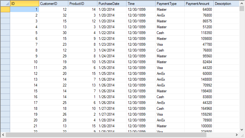
The property can be set using designer as well as through code. To set the property at design time, click smart tag to open the **C1FlexGrid Tasks** menu and select a visual style from the **VisualStyle** combobox. To apply visual style in the WinForms FlexGrid through code, use the code below.
```csharp
// Set the visual style to Office 2010 Blue scheme
c1FlexGrid1.VisualStyle = VisualStyle.Office2010Blue;
```
```vbnet
' Set the visual style to Office 2010 Blue scheme
c1FlexGrid1.VisualStyle = VisualStyle.Office2010Blue
```
## Styles Collection
FlexGrid provides built-in collection of styles for predefined cell types and states such as normal cells, fixed cells, focused cells and, so on. You can use these built-in styles at design time as well as through code. In design view, you can access these styles through the [C1FlexGrid Style Editor](/componentone/docs/win/online-flexgrid/quick-start/design-time-support/editors#c1flexgrid-style-editor) which can be opened by clicking **Styles...** option in Tasks menu. This collection of styles is represented by the [CellStyleCollection](/componentone/api/win/online-flexgrid/dotnet-api/C1.Win.FlexGrid.10/C1.Win.FlexGrid.CellStyleCollection.html) class which can be accessed through **Styles** property of the **C1FlexGrid** class. Each built-in style is an object of the CellStyle class and holds various properties such as **BackColor**, **DataType**, and **Format**.
Following code shows how to use the styles from Styles collection of the WinForms FlexGrid.
```csharp
// Set properties of built-in cell style Normal
c1FlexGrid1.Styles["Normal"].BackColor = Color.Azure;
c1FlexGrid1.Styles["Normal"].ForeColor = Color.BlueViolet;
// Set backcolor of Fixed cells
c1FlexGrid1.Styles["Fixed"].BackColor = Color.Aqua;
```
```vbnet
' Set properties of built-in cell style Normal
c1FlexGrid1.Styles("Normal").BackColor = Color.Azure
c1FlexGrid1.Styles("Normal").ForeColor = Color.BlueViolet
' Set backcolor of Fixed cells
c1FlexGrid1.Styles("Fixed").BackColor = Color.Aqua
```
You can also add your own custom styles to Styles collection by using the **Add** method. For more information about how to create and apply custom styles to grid cells, see [Custom Styles](/componentone/docs/win/online-flexgrid/features/styling-and-appearance/flexgrud-styles/custom-styles).