# Sparklines

Sparkline is the miniature chart visually representing series of values to show trend such as periodic fluctuations. Learn how to add sparklines in FlexGrid.

## Content

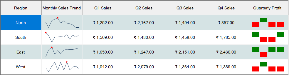
Sparklines are the miniature charts visually representing a series of values to show trends such as periodic fluctuations, or to highlight maximum or minimum values of the data series. In grids, sparklines are specially useful as they easily fit in a single cell and can help identify the data patterns at a glance.
![Add sparkline](https://cdn.mescius.io/document-site-files/images/2f10b028-0ae8-4c29-a102-4d67578c339b/images/sparkline.png)

FlexGrid for WinForms lets you display sparklines in columns by setting ShowSparkline property of the <span data-popup-content="This class is available in both \u003ca href=\u0022/componentone/docs/win/online-flexgrid/\u0022\u003e.NET Framework\u003c/a\u003e and \u003ca href=\u0022/componentone/docs/win/online-flexgrid/\u0022\u003e.NET\u003c/a\u003e." data-popup-title="Column" data-popup-theme="ui-tooltip-green qtip-green">Column</span> class to **true**. You can also set the type of sparkline using **SparklineType** property of the <span data-popup-content="This class is available in both \u003ca href=\u0022/componentone/docs/win/online-flexgrid/\u0022\u003e.NET Framework\u003c/a\u003e and \u003ca href=\u0022/componentone/docs/win/online-flexgrid/\u0022\u003e.NET\u003c/a\u003e." data-popup-title="Sparkline" data-popup-theme="ui-tooltip-green qtip-green">Sparkline</span> class. FlexGrid supports three types of sparklines which are:

* **Line**: Similar to line chart, line sparkline indicates change in values over a period of time with the help of a line.
* **Column**: Similar to column charts, column sparkline uses vertical columns to demonstrate pattern across different categories.
* **Win/Loss**: Similar to column sparkline, win/loss sparkline uses vertical columns to represent values. However, it does not indicate the magnitude and is generally used to indicate the binary data.

To display the data markers on sparkline, you can set the **ShowMarkers** property to **true**. The **Sparkline** class also provides properties to highlight the <span data-popup-content="This property is available in both \u003ca href=\u0022/componentone/docs/win/online-flexgrid/\u0022\u003e.NET Framework\u003c/a\u003e and \u003ca href=\u0022C1.Win.FlexGrid.5~C1.Win.FlexGrid.Sparkline~ShowFirst.html\u0022\u003e.NET\u003c/a\u003e." data-popup-title="first" data-popup-theme="ui-tooltip-green qtip-green">first</span>, <span data-popup-content="This property is available in both \u003ca href=\u0022/componentone/docs/win/online-flexgrid/\u0022\u003e.NET Framework\u003c/a\u003e and \u003ca href=\u0022C1.Win.FlexGrid.5~C1.Win.FlexGrid.Sparkline~ShowLast.html\u0022\u003e.NET\u003c/a\u003e." data-popup-title="last" data-popup-theme="ui-tooltip-green qtip-green">last</span>, <span data-popup-content="This property is available in both \u003ca href=\u0022/componentone/docs/win/online-flexgrid/\u0022\u003e.NET Framework\u003c/a\u003e and \u003ca href=\u0022C1.Win.FlexGrid.5~C1.Win.FlexGrid.Sparkline~ShowHigh.html\u0022\u003e.NET\u003c/a\u003e." data-popup-title="highest" data-popup-theme="ui-tooltip-green qtip-green">highest</span>, <span data-popup-content="This property is available in both \u003ca href=\u0022/componentone/docs/win/online-flexgrid/\u0022\u003e.NET Framework\u003c/a\u003e and \u003ca href=\u0022C1.Win.FlexGrid.5~C1.Win.FlexGrid.Sparkline~ShowLast.html\u0022\u003e.NET\u003c/a\u003e." data-popup-title="lowest" data-popup-theme="ui-tooltip-green qtip-green">lowest</span> or <span data-popup-content="This property is available in both \u003ca href=\u0022/componentone/docs/win/online-flexgrid/\u0022\u003e.NET Framework\u003c/a\u003e and \u003ca href=\u0022C1.Win.FlexGrid.5~C1.Win.FlexGrid.Sparkline~ShowNegative.html\u0022\u003e.NET\u003c/a\u003e." data-popup-title="negative" data-popup-theme="ui-tooltip-green qtip-green">negative</span> data points by displaying them in different format. You can even style the sparklines using the **Styles** property.

Below code shows how to add sparkline to the WinForms FlexGrid columns.

```csharp
// Set properties to display WinLoss Sparkline
   c1FlexGrid1.Cols[2].ShowSparkline = true;
c1FlexGrid1.Cols[2].Sparkline.SparklineType = SparklineType.WinLoss;
c1FlexGrid1.Cols[2].Sparkline.Styles.SeriesColor = Color.Green;
c1FlexGrid1.Cols[2].Sparkline.ShowNegative = true;
```

```vbnet
' Set properties to display WinLoss Sparkline
    c1FlexGrid1.Cols(2).ShowSparkline = True
c1FlexGrid1.Cols(2).Sparkline.SparklineType = SparklineType.WinLoss
c1FlexGrid1.Cols(2).Sparkline.Styles.SeriesColor = Color.Green
c1FlexGrid1.Cols(2).Sparkline.ShowNegative = True      
```

## See Also

**Documentation**

[Editors](/componentone/docs/win/online-flexgrid/features/Edit/cell-editors)