# Group
FlexGrid for WinForms lets you group the grid data into a hierarchical structure that can expand and collapse. Know more about grouping in this topic.
## Content
Grouping refers to organizing the grid data into a hierarchical structure where rows with common column value are displayed as a group. The feature also lets you expand or collapse the groups to facilitate easier analysis of grid data.
In FlexGrid, grouping can be achieved through code as well as through user interaction via column context menu and **FlexGridGroupPanel** control. This topic discusses these ways and additional operations related to grouping.
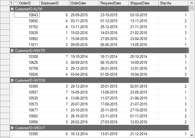
## Grouping through Code
FlexGrid provides GroupDescriptions property to describe how data source items are grouped in the grid. This property accepts the instance of any collection which implements **IList** interface (e.g. List) as its value. The items of the collection describe grouping using a property name as the criterion.
Following code shows how to apply grouping in the WinForms FlexGrid through code.
```csharp
// Group data by CustomerID
c1FlexGrid1.GroupDescriptions = new List() { new GroupDescription("CustomerID") };
```
```vbnet
' Group data by CustomerID
c1FlexGrid1.GroupDescriptions = New List(Of GroupDescription)() From {
New GroupDescription("CustomerID")
}
```
## Grouping through Group Panel
FlexGrid also lets you create groups at runtime using an extension control named C1FlexGridGroupPanel which is provided by the **C1.Win.C1FlexGrid.GroupPanel** assembly.
To achieve grouping in FlexGrid at runtime, add the C1FlexGridGroupPanel control to the form and bind it with the grid to be bound using **FlexGrid** property of the **C1FlexGridGroupPanel** class. Once a grid is bound to the group panel control, you can drag and drop the columns to panel in order to group the grid by that column. To create a nested hierarchy of dragged columns, you can drag multiple columns in the desired order. You can also set the maximum number of groups allowed within FlexGrid using **MaxGroups** property of the C1FlexGridGroupPanel class. By default, all the created groups appear in the expanded state. To change this setting and display the groups in collapsed state by default, you can set the **AutoExpandAllGroups** property to **false**. The group panel control also provides the **Text** property to display a string when no columns are dropped on the panel.
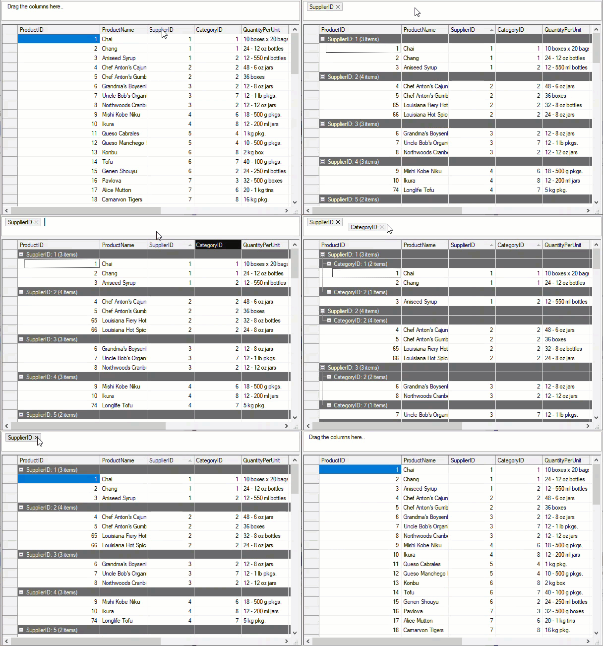
Use the code below to apply grouping in WinForms FlexGrid through the FlexGridGroupPanel control.
```csharp
C1FlexGridGroupPanel c1FlexGridGroupPanel = new C1FlexGridGroupPanel();
c1FlexGridGroupPanel.Bounds = new System.Drawing.Rectangle(0,0, 650, 150);
this.Controls.Add(c1FlexGridGroupPanel);
// Setting C1FlexGridGroupPanel's general properties
c1FlexGridGroupPanel.FlexGrid = c1FlexGrid1;
c1FlexGridGroupPanel.Text = "Drag the columns here..";
c1FlexGridGroupPanel.MaxGroups = 5;
c1FlexGridGroupPanel.AutoExpandAllGroups = true;
```
```vbnet
Dim c1FlexGridGroupPanel As C1FlexGridGroupPanel = New C1FlexGridGroupPanel()
c1FlexGridGroupPanel.Bounds = New Drawing.Rectangle(0, 0, 650, 150)
Me.Controls.Add(c1FlexGridGroupPanel)
' Setting C1FlexGridGroupPanel's general properties
c1FlexGridGroupPanel.FlexGrid = c1FlexGrid1
c1FlexGridGroupPanel.Text = "Drag the columns here.."
c1FlexGridGroupPanel.MaxGroups = 5
c1FlexGridGroupPanel.AutoExpandAllGroups = True
```
## Grouping through Context Menu
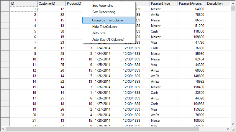
FlexGrid provides support for column context menu at run-time to facilitate quick actions related to column operations. One of these context menu options is **Group By This Column**. You can use this context menu option to group the grid data by any of the columns at run-time. Once grouping is applied, you also get the **Ungroup** option to remove grouping. To enable the column context menu, you need to set **ColumnContextMenuEnabled** property provided by the C1FlexGrid class to **true**. By default, this property is set to false.
```csharp
// Enable column context menu
c1FlexGrid1.ColumnContextMenuEnabled = true;
```
```vbnet
' Enable column context menu
c1FlexGrid1.ColumnContextMenuEnabled = True
```
## Hide Empty Groups
Hide Empty Groups improves data visibility in `C1.Win.FlexGrid` by automatically hiding empty groups and their associated subtotals when working with grouped data.
### Behavior
When filtering is applied, groups that do not contain any visible rows are automatically hidden, reducing visual clutter and enhancing readability.
Associated subtotals for these groups are also hidden.
This behavior updates dynamically as filtering conditions change.
### Usage
The following example enables the HideEmptyGroups behavior:
```auto
var flexGrid = new C1.Win.FlexGrid.C1FlexGrid();
flexGrid.HideEmptyGroups = true;
```
>type=note
> ### Notes
>
> * Applies only when data is grouped
> * Has no effect if grouping is not enabled
> * Affects both group rows and their subtotals
> * No additional configuration is required
### Performance Consideration
Evaluating group visibility during filtering may affect performance when working with large datasets or a high number of groups.
## Grouping and More..
Apart from the default features, grouping in FlexGrid comes with many other options to give you ample flexibility to meet your requirements.
* Use the **SubtotalPosition** property to change the position of group row which gets displayed above the group by default.
* Set the **HideGroupedColumns** property to **true** to hide the columns by which grid is grouped.
* Change the format of group header by using the **GroupHeaderFormat** property. By default, the group row displays a string of **"{name}:{value}**" format.
* Set the **C1FlexGrid.AllowMerging** property to **AllowMergingEnum.Nodes** to spill the long group header content into the adjacent empty cells. For more information, see [Handle Text in Node Rows](/componentone/docs/win/online-flexgrid/features/merge/handle-spilling-text#handle-text-in-node-rows).
* Display aggregate value of columns in group header by using **Aggregate** property of the Column class.
* Use **AllowSorting** property to sort the groups based on their values.
* Use the **GridTree.Style** property to customize the appearance of outline tree that shows the grouping in FlexGrid. For more information, see [Style the Tree Grid](/componentone/docs/win/online-flexgrid/features/tree-grid/custom-tree).
## See Also
**Documentation**
[Summary](/componentone/docs/win/online-flexgrid/features/group/summaries)
[Tree Grid](/componentone/docs/win/online-flexgrid/features/tree-grid)
**Blog**
[Add Dynamic Grouping to your WinForms Data Grid](https://www.grapecity.com/blogs/add-dynamic-grouping-to-winforms-data-grid)