# Cell Formating
FlexGrid for WinForms supports conditional formatting and owner drawn cells including usual ways to format cells. Learn more about cell formatting here.
## Content
## Cell Content
To control how content of the cells is formatted and displayed, set the Format property of Row or Column object to format string similar to the ones that are used with **String.Format** property in the .NET framework. For instance, the sample code below formats the third column as Date and fourth column as Currency.
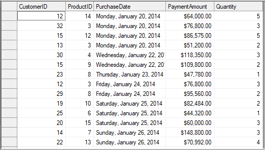
```csharp
//Set short date format
c1FlexGrid1.Cols[3].Format = "D";
//Set currency format
c1FlexGrid1.Cols[4].Format = "c";
```
```vbnet
'Set short date format
c1FlexGrid1.Cols(3).Format = "D"
'Set currency format
c1FlexGrid1.Cols(4).Format = "c"
```
FlexGrid also provides design time option to set the **Format** property through the **Format String** dialog. You can access the Format String dialog by clicking **Ellipsis** button against the **Format String** field in **Column Tasks** menu. Or, you can also use the Format property in **C1FlexGrid Column Editor**.
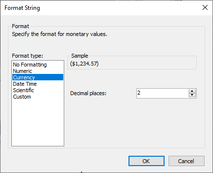
Note that **Format String** dialog is specific to column and changes the **Format** property of the selected column only.
## Cell Appearance
FlexGrid provides CellStyle objects to handle the appearance aspects of cells such as alignment, font, colors, borders, and so on. The grid has **Styles** property that holds the collection of styles used to format the grid. This collection has some built-in members that define the appearance of grid elements, such as fixed and scrollable cells, selection, focus cell, and so on. You can change these styles to modify the appearance of grid.
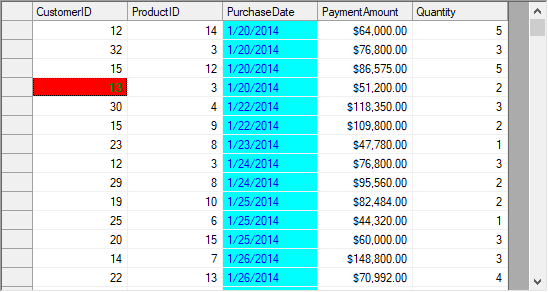
Although, changing the built-in styles is the simplest way to change appearance of the grid, you can also create your own custom styles and assign them to cells, rows, or columns.
Use the code below to change appearance of the WinForms FlexGrid cells.
```csharp
//Customizing built-in style
CellStyle cs = c1FlexGrid1.Styles.Focus;
cs.Font = new Font(c1FlexGrid1.Font, FontStyle.Bold);
cs.ForeColor = Color.Green;
cs.BackColor = Color.Red;
//Creating a custom style
CellStyle cs1 = c1FlexGrid1.Styles.Add("NewStyle");
cs1.BackColor = Color.Aqua;
cs1.ForeColor = Color.Blue;
//Assigning the custom style
c1FlexGrid1.Cols[3].Style = cs1;
```
```vbnet
Dim cs As CellStyle = c1FlexGrid1.Styles.Focus
cs.Font = New Font(c1FlexGrid1.Font, FontStyle.Bold)
cs.ForeColor = Color.Green
cs.BackColor = Color.Red
Dim cs1 As CellStyle = c1FlexGrid1.Styles.Add("NewStyle")
cs1.BackColor = Color.Aqua
cs1.ForeColor = Color.Blue
c1FlexGrid1.Cols(3).Style = cs1
```
## Conditional Formatting
To format a cell according to its content, you need to create a new style and apply it to the cells satisfying a particular condition using SetCellStyle() method. For instance, to highlight the values greater than a specified value, you can format the cells containing them using different style.
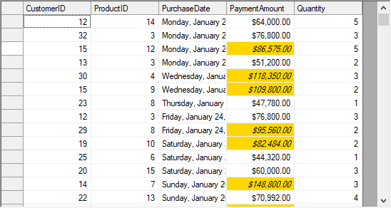
Following code shows how to apply conditional formatting on WinForms FlexGrid cells.
```csharp
CellStyle cs;
// Create a custom style for large values
cs = c1FlexGrid1.Styles.Add("LargeValue");
cs.Font = new Font(Font, FontStyle.Italic);
cs.BackColor = Color.Gold;
for (int row = 1; row < c1FlexGrid1.Rows.Count; row++)
if (Convert.ToDouble(c1FlexGrid1[row, 4]) > 80000)
c1FlexGrid1.SetCellStyle(row, 4, cs);
```
```vbnet
Dim cs As CellStyle
cs = c1FlexGrid1.Styles.Add("LargeValue")
cs.Font = New Font(Font, FontStyle.Italic)
cs.BackColor = Color.Gold
For row As Integer = 1 To c1FlexGrid1.Rows.Count - 1
If Convert.ToDouble(c1FlexGrid1(row, 4)) > 80000 Then
c1FlexGrid1.SetCellStyle(row, 4, cs)
End If
Next
```
## Owner Drawn Cell
The above sections explain how you can customize FlexGrid cells to change the appearance of grid using CellStyle objects. However, for further customization of grid cells such as rendering gradient background, custom graphics etc., you can use **DrawMode** property and **OwnerDrawCell** event of the C1FlexGrid class.
The **DrawMode** property determines whether or not the **OwnerDrawCell** event is fired. The event allows you to override every visual aspect of the cell. You can change the text and image to be displayed in the cell by setting the **e.Text** and **e.Image** parameters in the event handler. You can also change the style that is used to display the cell by setting the **e.Style** property.
Note that you should not modify properties of the Style parameter as it might affect other cells. Instead, assign a new **CellStyle** object to the Style parameter. For example, instead of setting e.Style.ForeColor = Color.Red, assign a whole new style to the parameter using **e.Style = c1FlexGrid1.Styles["RedStyle"]**.
You can also use your own drawing code to draw into the cell, and even combine your custom code with calls to the **e.DrawCell** method. For example, you can paint the cell background using GDI calls and then call e.DrawCell to display the cell borders and content.
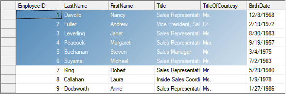
In the example below, WinForms FlexGrid uses a gradient brush to paint the background of the selected cell range. First, the sample code sets the **DrawMode** property to **OwnerDraw**, and then declares a **LinearGradientBrush** object.
```csharp
System.Drawing.Drawing2D.LinearGradientBrush m_GradientBrush;
private void Form1_Load(object sender, EventArgs e)
{
// Brush to use with owner-draw cells
m_GradientBrush = new System.Drawing.Drawing2D.LinearGradientBrush(ClientRectangle, Color.SteelBlue, Color.White, 45);
// Use owner-draw to add gradients
c1FlexGrid1.DrawMode = C1.Win.C1FlexGrid.DrawModeEnum.OwnerDraw;
}
private void C1FlexGrid1_OwnerDrawCell(object sender, C1.Win.C1FlexGrid.OwnerDrawCellEventArgs e)
{
// Draw the selected cell background using gradient brush
if (c1FlexGrid1.Selection.Contains(e.Row, e.Col))
{
// Draw the background
e.Graphics.FillRectangle(m_GradientBrush, e.Bounds);
// Let the grid draw the content
e.DrawCell(C1.Win.C1FlexGrid.DrawCellFlags.Content);
// We are done drawing this cell
e.Handled = true;
}
}
```
```vbnet
Private m_GradientBrush As Drawing.Drawing2D.LinearGradientBrush
Private Sub Form1_Load(ByVal sender As Object, ByVal e As EventArgs)
' Brush to use with owner-draw cells
m_GradientBrush = New Drawing.Drawing2D.LinearGradientBrush(ClientRectangle, Color.SteelBlue, Color.White, 45)
' Use owner-draw to add gradients
c1FlexGrid1.DrawMode = C1.Win.C1FlexGrid.DrawModeEnum.OwnerDraw
End Sub
Private Sub C1FlexGrid1_OwnerDrawCell(ByVal sender As Object, ByVal e As C1.Win.C1FlexGrid.OwnerDrawCellEventArgs)
' Draw the selected cell background using gradient brush
If c1FlexGrid1.Selection.Contains(e.Row, e.Col) Then
' Draw the background
e.Graphics.FillRectangle(m_GradientBrush, e.Bounds)
' Let the grid draw the content
e.DrawCell(C1.Win.C1FlexGrid.DrawCellFlags.Content)
' We are done drawing this cell
e.Handled = True
End If
End Sub
End If
End Sub
```