# Header and Footer
FlexGrid for WinForms supports adding header and footer to its columns and also provides properties for their styling. Learn more about column header and footer.
## Content
Column header refers to the fixed row/s on the top of the grid which contains a caption string, sort glyph etc.
In FlexGrid, by default, the top row with zero index is allocated for the column header. However, you can span the header to other rows as well by specifying them as fixed. To set more than one rows as fixed, you need to set the **Fixed** property of RowCollection class to an integer greater than 1.
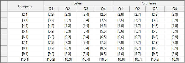
## Set Header Text
FlexGrid, when in bound mode, reads the field names from the data source and renders them as column header text. However, you can explicitly set **Caption** property of the Row class to overwrite field name string from the data source. In case of unbound grid as well, the **Caption** property specifies the header text. Note that this property sets the value of cells in the default header row at zero index. To set value in the other fixed row cells, you need to use the usual value allocation ways of FlexGrid. For more information on how to set cell values, see [Set Value in Cell](/componentone/docs/win/online-flexgrid/concepts/cell).
Specify the header rows and set the header text in WinForms FlexGrid using the code below.
```csharp
// Set two rows as column header rows
c1FlexGrid1.Rows.Fixed = 2;
// Set header and sub-header for the first column
c1FlexGrid1.Cols[1].Caption = "Column Header 1";
c1FlexGrid1[1, 1] = "Column Sub-header 1";
```
```vbnet
' Set two rows as column header rows
c1FlexGrid1.Rows.Fixed = 2
' Set header and sub-header for the first column
c1FlexGrid1.Cols(1).Caption = "Column Header 1"
c1FlexGrid1(1, 1) = "Column Sub-header 1"
```
## Merge Column Header
FlexGrid provides the **AllowMerging** property for **Row** object which specifies whether it is allowed to merge cells in a particular row (in this case, the header row) or not. Once you have allowed merging in the header row, set either AllowMerging or AllowMergingFixed property of C1FlexGrid class to **FixedOnly**. Availability of these two properties in the FlexGrid control offers you more flexibility to implement multiple logics related to merging. For more information on merging cells, see [Merge](/componentone/docs/win/online-flexgrid/features/merge).
Use the code below to merge column headers in the WinForms FlexGrid.
```csharp
// Allow merging on the header row
c1FlexGrid1.Rows[0].AllowMerging = true;
// Set AllowMerging or AllowMergingFixed property of the grid to merge fixed rows only.
// c1FlexGrid1.AllowMerging = C1.Win.C1FlexGrid.AllowMergingEnum.FixedOnly;
c1FlexGrid1.AllowMergingFixed = C1.Win.C1FlexGrid.AllowMergingEnum.FixedOnly;
```
```vbnet
' Allow merging on the header row
c1FlexGrid1.Rows(0).AllowMerging = True
' Set AllowMerging or AllowMergingFixed property of the grid to merge fixed rows only.
' c1FlexGrid1.AllowMerging = C1.Win.C1FlexGrid.AllowMergingEnum.FixedOnly
c1FlexGrid1.AllowMergingFixed = C1.Win.C1FlexGrid.AllowMergingEnum.FixedOnly
```
## Wrap Column Header Text
To wrap the text in column header, access the CellStyle item "**Fixed**" of the CellStyleCollection class and set its WordWrap property to **true**. Note that to view the wrapped text properly, you need to adjust the row height or just call the AutoSizeRow() method to automatically resize the row according to the text length.
Use the code below to wrap header text of the WinForms FlexGrid columns.
```csharp
//Set column caption
c1FlexGrid1.Cols[3].Caption = "Large Text for Column Header Text Wrapping";
//Set row height
c1FlexGrid1.Rows[0].Height = 50;
//Set word wrapping for fixed rows and columns
c1FlexGrid1.Styles["Fixed"].WordWrap = true;
```
```vbnet
'Set column caption
c1FlexGrid1.Cols(3).Caption = "Large Text for Column Header Text Wrapping"
'Set row height
c1FlexGrid1.Rows(0).Height = 50
'Set word wrapping for fixed rows and columns
c1FlexGrid1.Styles("Fixed").WordWrap = True
```
## Style Column Header
To style the column header, you can access the **CellStyle** item "**Fixed**" of the **CellStyleCollection** class and set various styling related properties for same such as **Font**, **ForeColor**, and **TextEffect**.
Customize column header of the WinForms FlexGrid using the code below.
```csharp
//Set font of the header text
c1FlexGrid1.Styles["Fixed"].Font = new Font("Tahoma", 10, FontStyle.Bold);
//Set forecolor of the header text
c1FlexGrid1.Styles["Fixed"].ForeColor = Color.Aqua;
//Set backcolor of the header text
c1FlexGrid1.Styles["Fixed"].BackColor = Color.Blue;
//Apply text effect on the header text
c1FlexGrid1.Styles["Fixed"].TextEffect = C1.Win.C1FlexGrid.TextEffectEnum.Raised;
```
```vbnet
' Set font of the header text
c1FlexGrid1.Styles("Fixed").Font = New Font("Tahoma", 10, FontStyle.Bold)
' Set forecolor of the header text
c1FlexGrid1.Styles("Fixed").ForeColor = Color.Aqua
' Set backcolor of the header text
c1FlexGrid1.Styles("Fixed").BackColor = Color.Blue
' Apply text effect on the header text
c1FlexGrid1.Styles("Fixed").TextEffect = C1.Win.C1FlexGrid.TextEffectEnum.Raised
```
## Set Column Footer
Column Footer, refers to the last row of the grid which displays additional information about the whole column. Most common use of column footer is to show the summary of column data.
In FlexGrid, you can create the column footer by using **Footers** property of the **C1FlexGrid** class. FlexGrid lets you choose whether to scroll the footer along with rows or keep it fixed at the bottom of the grid by using **Fixed** property of the Footers class. This class also provides the **Descriptions** property which accesses the FooterDescription collection to set the additional information such as **Caption**. To display aggregate result in the column footer through various aggregate functions, you must access the AggregateDefinition collection using **Aggregates** property of the **FooterDescription** class. Aggregate functions can be specified using the Aggregate property which accepts values from AggregateEnum enumeration.
Following code shows how to add a column footer in the WinForms FlexGrid.
```csharp
// Add footer to the column
c1FlexGrid1.Footers.Descriptions.Add(new C1.Win.C1FlexGrid.FooterDescription() { Caption = "Total" });
// Apply aggregates in the footer
c1FlexGrid1.Footers.Descriptions[0].Aggregates.Add(new C1.Win.C1FlexGrid.AggregateDefinition()
{ Column = 4, Aggregate = C1.Win.C1FlexGrid.AggregateEnum.Sum });
```
```vbnet
' Add footer to the column
C1FlexGrid1.Footers.Descriptions.Add(New FooterDescription() With {
.Caption = "Total"
})
' Apply aggregates in the footer
C1FlexGrid1.Footers.Descriptions(0).Aggregates.Add(New AggregateDefinition() With {
.Column = 4,
.Aggregate = AggregateEnum.Sum
})
```
## See Also
**Documentation**
[Row Header](/componentone/docs/win/online-flexgrid/concepts/basic-row-operations/row-header)
**Blog**
[Summarizing data using column footers in Winforms](https://www.grapecity.com/blogs/summarizing-data-using-column-footers-in-winforms)