# WinForms Bar and Column Charts
Compare categorical data using WinForms Bar chart. Learn more about it in ComponentOne FlexChart documentation.
## Content
## WinForms Bar Chart
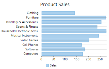
**Bar charts** compare categorical data through the horizontal bars, where length of each bar represents the value of the corresponding category. Y-axis in these charts is a category axis. For example, sales of various product categories can be well presented through a bar chart.
## WinForms Column Chart
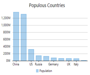
**Column charts** are simply vertical version of bar charts and they use X- axis as a category axis. Though bar charts and column charts can be used interchangeably, column charts are preferred where number of values is too large to be accommodated on an X-axis while bar charts are preferred in the case of long category titles which are difficult to fit on an X-axis or in the case of large number of categories. For example, population share of different countries across the globe is good example that can be demonstrated using a column chart.
| **Bar Chart** | **Column Chart** |
| --------- | ------------ |
|  |  |
## Create a WinForms Bar or Column Chart
With FlexChart, you can create a bar chart and a column chart by setting the ChartType property of FlexChart class to **Bar** or **Column**. This property accepts the values from **ChartType** enumeration of C1.Chart namespace.
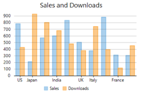
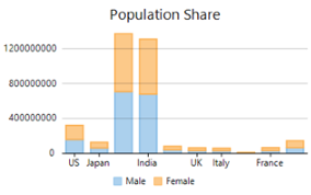
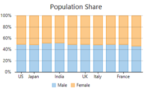
FlexChart also provides options to cluster and stack the bar and column charts. While cluster is simply created by adding the multiple series with same base category to the chart, stacking can be done by setting the Stacking property of FlexChart class to **Stacked** or **Stacked100pc**. Stacked charts are used for demonstrating the part-to-whole relationship that is, for displaying the cumulative values of categories. For example, population of each gender in different countries can be presented by a stacked column chart. On the other hand, stacked 100 charts are used to present the percentage share of the values.
| **Clustered Column Chart** | **Stacked Column Chart** | **Stacked 100 Column Chart** |
| ---------------------- | -------------------- | ------------------------ |
|  |  |  |
To create a bar or column chart using FlexChart:
**At design-time**
1. Right click the FlexChart control on form to open the Properties window.
2. Navigate to the ChartType property and set its value to "Bar" or "Column".
3. Set the data source using the DataSource property.
4. Configure X-axis and Y-axis values by setting the BindingX and Binding property respectively.
**Using code**
To create a WinForms bar chart through code, the first step after initializing the control is to clear the default series and add a new series using the **Add** method. Set up the data source through the **DataSource** property and configure the X and Y axes by setting the **BindingX** and **Binding** property. You also need to set up the chart by setting the **ChartType** property and other required properties.
```csharp
this.flexChart1.Series.Clear();
//Setting FlexChart ChartType to Bar
this.flexChart1.ChartType = ChartType.Bar;
//Setting FlexChart's Header
this.flexChart1.Header.Content = "Product Sales";
//Passing data in FlexChart
this.flexChart1.DataSource = GetData();
//Binding FlexChart's AxisX to 'Beverages' so their Unit Price appear in Horizontal axis
this.flexChart1.BindingX = "Beverages";
//Creating and adding a series in FlexChart for Unit Price
var items = new Series
{
Name = "Unit Price",
Binding = "Unit Price",
};
this.flexChart1.Series.Add(items);
```
```vbnet
' Method for initializing FlexChart
Protected Sub SetupChart()
#Region "setupchart"
Me.flexChart1.Series.Clear()
'Setting FlexChart ChartType to Bar
Me.flexChart1.ChartType = ChartType.Bar
'Setting FlexChart's Header
Me.flexChart1.Header.Content = "Product Sales"
'Passing data in FlexChart
Me.flexChart1.DataSource = GetData()
'Binding FlexChart's AxisX to 'Beverages' so their Unit Price appear in Horizontal axis
Me.flexChart1.BindingX = "Beverages"
'Creating and adding a series in FlexChart for Unit Price
Dim items As Series = New Series() With {
.Name = "Unit Price",
.Binding = "Unit Price"
}
Me.flexChart1.Series.Add(items)
```
Note that the above sample code uses a custom method named GetData to supply data. You can set up the data source as per your requirements.
```csharp
public DataTable GetData()
{
// create a datatable
DataTable dt = new DataTable("Product Comparison");
// add columns to the datatable
dt.Columns.Add("Beverages", typeof(string));
dt.Columns.Add("Unit Price", typeof(int));
dt.Columns.Add("Units In Stock", typeof(int));
dt.Columns.Add("Units On Order", typeof(int));
// add rows to the datatable
dt.Rows.Add("Tea", 18, 39, 40);
dt.Rows.Add("Coffee", 19, 17, 70);
dt.Rows.Add("Cocktail", 10, 13, 30);
dt.Rows.Add("Mock Tail", 22, 53, 20);
dt.Rows.Add("Soft Drink", 21, 120, 70);
dt.Rows.Add("Mineral Water", 25, 90, 40);
return dt;
}
```
```vbnet
' Method for creating data for FlexChart
Private sales As New List(Of SeasonSale)()
Public Function GetData() As DataTable
' create a datatable
Dim dt As New DataTable("Product Comparison")
' add columns to the datatable
dt.Columns.Add("Beverages", GetType(String))
dt.Columns.Add("Unit Price", GetType(Integer))
dt.Columns.Add("Units In Stock", GetType(Integer))
dt.Columns.Add("Units On Order", GetType(Integer))
' add rows to the datatable
dt.Rows.Add("Tea", 18, 39, 40)
dt.Rows.Add("Coffee", 19, 17, 70)
dt.Rows.Add("Cocktail", 10, 13, 30)
dt.Rows.Add("Mock Tail", 22, 53, 20)
dt.Rows.Add("Soft Drink", 21, 120, 70)
dt.Rows.Add("Mineral Water", 25, 90, 40)
Return dt
End Function
```
## Configure Column and Bar Cluster Size
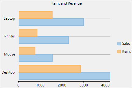
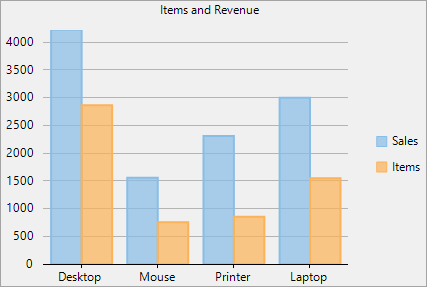
Clustering in charts typically refers to how data points that are close together are grouped or spaced. In Bar Charts and Column Charts, you can adjust the space between the clusters of bars by using the **ClusterSize** property of the **FlexChart** class.
The **ClusterSize** property determines how much visual space the bars and columns cluster take up on the plot area. You can set the size of clusters in terms of percentage and absolute value (i.e., in pixels) using the **Percentage** and **Absolute** enum constants, respectively. These constants belong to the **ElementSizeType** enumeration, which specifies the size type for the **ElementSize** object. You can increase the gap between the clusters by setting a lower value or decrease it by setting a higher value for the enum constants.
| **Bar Chart Cluster Size** | **Column Chart Cluster Size** |
| ---------------------- | ------------------------- |
|  |  |
To set bar or column cluster size of a bar or column chart in percentage, use the following code:
```csharp
flexChart1.Options.ClusterSize = new C1.Chart.ElementSize() { SizeType = C1.Chart.ElementSizeType.Percentage, Value = 80 };
```
```vbnet
FlexChart1.Options.ClusterSize = New C1.Chart.ElementSize() With {
.SizeType = C1.Chart.ElementSizeType.Percentage,
.Value = 80
}
```
Similarly, you can choose to set absolute value for the cluster size of the chart by setting the **SizeType** property to **ElementSizeType.Absolute**.