# Styles
Understand how to use the Styles property to customize the appearance of the DataFilter control.
## Content
The C1DataFilter class provides Styles property that can be used to customize the appearance of the DataFilter control and its elements. It is of type DataFilterTheme class. Styling is applied to DataFilter control using different classes for different elements of the control. The following image depicts several UI elements of the DataFilter control such as buttons, filters, checkboxes, editors, header, filter captions and scrollbars and the classes used to style these elements.
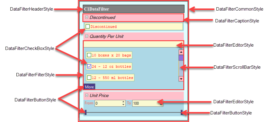
The **DataFilterTheme** class provides several properties to handle styling of the DataFilter control and the above mentioned elements. Each of these properties is of a specific class type and is used to style a specific element of the DataFilter control. These properties are described below:
### Common
This property is of the type DataFilterCommonStyle class. The appearance of the DataFilter control, such as its background color, padding, margins, border thickness and the border color can be changed using **Common** property of the **DataFilterTheme** class. The following code shows an example of DataFilter control styling:
```vbnet
'Styling the DataFilter
c1DataFilter1.Styles.Common.BackColor = Color.LightCyan
c1DataFilter1.Styles.Common.Border = 5
c1DataFilter1.Styles.Common.Padding = New C1.Framework.Thickness(10, 10)
```
```csharp
//Styling the DataFilter
c1DataFilter1.Styles.Common.BackColor = Color.LightCyan;
c1DataFilter1.Styles.Common.Border = 5;
c1DataFilter1.Styles.Common.Padding = new C1.Framework.Thickness(10, 10);
```
### Header
This property is of type DataFilterHeaderStyle class. It can be used to customize the appearance of the control’s header. The following code shows an example of control header styling:
```vbnet
'Styling the DataFilter control's header
c1DataFilter1.Styles.Header.Font = New Font(FontFamily.GenericSerif, 10!, FontStyle.Bold)
c1DataFilter1.Styles.Header.BackColor = Color.Gray
c1DataFilter1.Styles.Header.ForeColor = Color.GhostWhite
c1DataFilter1.Styles.Header.BorderColor = Color.Black
c1DataFilter1.Styles.Header.Border = 1
```
```csharp
//Styling the DataFilter control's header
c1DataFilter1.Styles.Header.Font = new Font(FontFamily.GenericSerif, 10f, FontStyle.Bold);
c1DataFilter1.Styles.Header.BackColor = Color.Gray;
c1DataFilter1.Styles.Header.ForeColor = Color.GhostWhite;
c1DataFilter1.Styles.Header.BorderColor = Color.Black;
c1DataFilter1.Styles.Header.Border = 1;
```
### Filter
In the DataFilter control, corresponding to each filter, an accordion tab is added which contains the controls used to filter the data-aware control by a specific field. This accordion tab is referred to as a Filter element. The appearance of these filter elements can be customized using this property which is of type DataFilterFilterStyle class. The following code shows an example of filter element styling:
```vbnet
'Styling the Filters
c1DataFilter1.Styles.Filter.BackColor = Color.LightBlue
c1DataFilter1.Styles.Filter.ForeColor = Color.Tomato
```
```csharp
//Styling the Filters
c1DataFilter1.Styles.Filter.BackColor = Color.LightBlue;
c1DataFilter1.Styles.Filter.ForeColor = Color.Tomato;
```
### FilterCaption
The FilterCaption element consists of the filter’s caption (filter’s header text) and the expand/collapse glyph which is shown next to it to show/hide the filter’s contents. This property is of type DataFilterCaptionStyle class and can be used to customize appearance of the filter header text and the expand/collapse glyphs. The following code shows an example of FilterCaption elements styling.
```vbnet
'Styling the filter captions
c1DataFilter1.Styles.FilterCaption.BackColor = Color.Pink
c1DataFilter1.Styles.FilterCaption.Font = New Font(FontFamily.GenericSansSerif, 10!, FontStyle.Italic)
c1DataFilter1.Styles.FilterCaption.Glyph.Collapsed.Hot.BackColor = Color.LightPink
c1DataFilter1.Styles.FilterCaption.Glyph.Expanded.Hot.BackColor = Color.HotPink
c1DataFilter1.Styles.FilterCaption.Glyph.Collapsed.Pressed.BorderColor = Color.LightBlue
c1DataFilter1.Styles.FilterCaption.Glyph.Expanded.Pressed.BorderColor = Color.Blue
```
```csharp
//Styling the filter captions
c1DataFilter1.Styles.FilterCaption.BackColor = Color.Pink;
c1DataFilter1.Styles.FilterCaption.Font = new Font(FontFamily.GenericSansSerif, 10f, FontStyle.Italic);
c1DataFilter1.Styles.FilterCaption.Glyph.Collapsed.Hot.BackColor = Color.LightPink;
c1DataFilter1.Styles.FilterCaption.Glyph.Expanded.Hot.BackColor = Color.HotPink;
c1DataFilter1.Styles.FilterCaption.Glyph.Collapsed.Pressed.BorderColor = Color.LightBlue;
c1DataFilter1.Styles.FilterCaption.Glyph.Expanded.Pressed.BorderColor = Color.Blue;
```
### CheckBox
The CheckBox element consists of a checkbox and a text which is displayed next to it. This property is of type DataFilterCheckBoxStyle class and allows you to customize general appearance of the CheckBox element (background color, foreground color, border thickness etc) and the appearance of the checked, unchecked and indeterminate glyphs (which represents the three states of a checkbox) when the mouse cursor is not on them, when the mouse cursor is hovered over them and when the mouse button is pressed. The following code shows an example of CheckBox element styling:
```vbnet
'Styling the Checkbox
c1DataFilter1.Styles.CheckBox.Glyph.Checked.BorderColor = Color.Blue
c1DataFilter1.Styles.CheckBox.Glyph.Checked.Hot.BackColor = Color.LightBlue
c1DataFilter1.Styles.CheckBox.Glyph.Unchecked.BorderColor = Color.DarkGreen
c1DataFilter1.Styles.CheckBox.Glyph.Unchecked.Pressed.BackColor = Color.Green
c1DataFilter1.Styles.CheckBox.Glyph.Indeterminate.BorderColor = Color.Orange
```
```csharp
//Styling the Checkbox
c1DataFilter1.Styles.CheckBox.Glyph.Checked.BorderColor = Color.Blue;
c1DataFilter1.Styles.CheckBox.Glyph.Checked.Hot.BackColor = Color.LightBlue;
c1DataFilter1.Styles.CheckBox.Glyph.Unchecked.BorderColor = Color.DarkGreen;
c1DataFilter1.Styles.CheckBox.Glyph.Unchecked.Pressed.BackColor = Color.Green;
c1DataFilter1.Styles.CheckBox.Glyph.Indeterminate.BorderColor = Color.Orange;
```
### Button
The buttons present in the DataFilter control, such as the buttons which represent the upper and the lower thumbs of the range sliders in the RangeFilter and the “More” button appearing in the ChecklistFilter when the value of the DisplayedItems property is less than the count of items in its ItemSource property, can be styled with this property. This property is of type DataFilterButtonStyle class. Different styles can be applied to button depending on whether the mouse cursor is outside the button, over it or mouse button is in pressed state. The following code shows an example of button styling:
```vbnet
'Styling the Buttons
c1DataFilter1.Styles.Button.BackColor = Color.DarkSlateBlue
c1DataFilter1.Styles.Button.ForeColor = Color.White
c1DataFilter1.Styles.Button.Hot.BackColor = Color.LightBlue
c1DataFilter1.Styles.Button.Pressed.BackColor = Color.BlueViolet
```
```csharp
//Styling the Buttons
c1DataFilter1.Styles.Button.BackColor = Color.DarkSlateBlue;
c1DataFilter1.Styles.Button.ForeColor = Color.White;
c1DataFilter1.Styles.Button.Hot.BackColor = Color.LightBlue;
c1DataFilter1.Styles.Button.Pressed.BackColor = Color.BlueViolet;
```
### ScrollBar
If the height of the ChecklistFilter is exhausted and all the checklist items are not able to fit into the available space, a scrollbar is shown in order to view all the checklist items. You can use the ScrollBar property to style the scrollbar buttons (the up and down arrows) and the scrollbar thumb (the movable bar).This property is of type DataFilterScrollBarStyle class. The following code shows an example of scrollbar styling:
```vbnet
'Styling the scroll bars
c1DataFilter1.Styles.ScrollBar.BackColor = Color.LightSteelBlue
c1DataFilter1.Styles.ScrollBar.BorderColor = Color.Orange
c1DataFilter1.Styles.ScrollBar.Buttons.BackColor = Color.LightPink
c1DataFilter1.Styles.ScrollBar.Thumb.BackColor = Color.MediumPurple
c1DataFilter1.Styles.ScrollBar.Thumb.Hot.BackColor = Color.Purple
```
```csharp
//Styling the scroll bars
c1DataFilter1.Styles.ScrollBar.BackColor = Color.LightSteelBlue;
c1DataFilter1.Styles.ScrollBar.BorderColor = Color.Orange;
c1DataFilter1.Styles.ScrollBar.Buttons.BackColor = Color.LightPink;
c1DataFilter1.Styles.ScrollBar.Thumb.BackColor = Color.MediumPurple;
c1DataFilter1.Styles.ScrollBar.Thumb.Hot.BackColor = Color.Purple;
```
### Editor
The range editors and the search box editor can be styled using Editor property of the DataFilterTheme class and is of type DataFilterEditorStyle class. The following code shows an example of editor styling in the DataFilter control.
```vbnet
'Styling the Editors
c1DataFilter1.Styles.Editor.BackColor = Color.LightGoldenrodYellow
c1DataFilter1.Styles.Editor.Hot.BackColor = Color.LightGray
```
```csharp
//Styling the Editors
c1DataFilter1.Styles.Editor.BackColor = Color.LightGoldenrodYellow;
c1DataFilter1.Styles.Editor.Hot.BackColor = Color.LightGray;
```