# Layouts
## Content
DashboardLayout supports the following three types of layouts which determine the way child containers are arranged in your application. DashboardLayout allows you to set these layout types using its LayoutType property. This property accepts the values from LayoutType enumeration.
### Flow Layout
DashboardLayout allows you to set the layout type to flow layout using its LayoutType property of C1DashboardLayout class. This layout arranges its contents in horizontal or vertical flow direction. The flow direction of the contents can be specified by using the **FlowDirection** property which accepts the values from **FlowDirection** enumeration. The possible values for this enumeration are as follows; LeftToRight, TopDown, RightToLeft and BotttomUp.
By default, the **FlowDirection** property is set to **LeftToRight**. Therefore, when a control is dragged on the flow layout, the newly created child container positions itself on the upper left corner. When you add more controls to the layout, child containers get created and placed in left to right direction. As soon as the width of DashboardLayout has exhausted, the child containers automatically get wrapped and shift to the next row. In case you do not want the child containers to wrap, you can set the value of the **WrapContent** property to **False**.
In flow layout, the control allows you to stop laying the controls in a particular row and start from the new row using the **SetFlowBreak** property.
>type=note
> Note that the flow layout reverses its flow direction in Right-to-Left (RTL) layouts i.e. when **RightToLeft** property is set to **True**.
The following image shows controls arranged in flow layout with **FlowDirection** property set to **RightToLeft**.
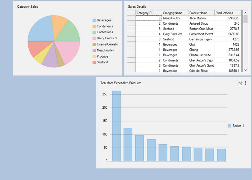
The flow layout can be accessed with the help of the **FlowLayoutControl** property which returns an instance of **FlowLayoutPanel** class. This instance is used to set the properties of flow layout. The following code illustrates some of the properties of the flow layout:
```csharp
c1DashboardLayout1.LayoutType = LayoutType.Flow;
c1DashboardLayout1.FlowLayoutControl.FlowDirection = FlowDirection.RightToLeft;
c1DashboardLayout1.FlowLayoutControl.WrapContents = true;
c1DashboardLayout1.FlowLayoutControl.SetFlowBreak((Control)c1DashboardLayout1.Items[0].ItemContainer, true);
```
```vbnet
c1DashboardLayout1.LayoutType = LayoutType.Flow
c1DashboardLayout1.FlowLayoutControl.FlowDirection = FlowDirection.RightToLeft
c1DashboardLayout1.FlowLayoutControl.WrapContents = True
c1DashboardLayout1.FlowLayoutControl.SetFlowBreak(CType(c1DashboardLayout1.Items(0).ItemContainer, True, Control))
```
To create a DashboardLayout using flow layout, see [Creating Dashboard with Flow Layout](/componentone/docs/win/online-dashboardlayout/walkthroughs/creatingdashboardwithflowlayout) topic.
### Grid Layout
DashboardLayout allows you to set the layout type to grid layout using its LayoutType property of C1DashboardLayout class. When you set the layout type to Grid, the grid layout gets attached to the DashboardLayout control. The grid layout divides the C1DashboardLayout container into rows and columns. By default, there are three columns and two rows in the grid layout. However, you can increase the column and row count using the **ColumnCount** and **RowCount** properties of the **TableLayoutPanel** class.
In grid layout, any control you drag on the DashboardLayout control is placed in one of the cells. As soon as you drag a control, a child container of type **Panel** gets created to hold the control. By default, this child container is not docked in the cell, but you can dock the child container to occupy the complete space of the cell. When all the cells in the grid are occupied and a new control is dragged then the layout expands. It either adds a new row/column depending on the **GrowStyle** property to accommodate the control. The **GrowStyle** property accepts one of the following values from the **TableLayoutPanelGrowStyle** enumeration:
* **AddRows** : Adds new row to accommodate the control
* **AddColumns**: Adds new column to accommodate the control
* **FixedSize**: Does not allow adding a new row or column. Therefore, the row count and column count is not altered and the new control does not get added. An attempt to add another control throws an exception.
By default, grid layout expands to add new rows. Moreover, this layout also supports cell merging, wherein a child container can span multiple rows and columns. The cell merging is enabled by setting the **RowSpan** and **ColumnSpan** properties of the child container available in the designer.
The following image shows controls arranged in grid layout with GrowStyle property set to TableLayoutPanelGrowStyle.AddRows.
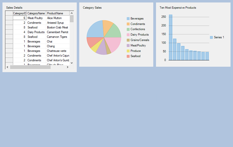
The grid layout can be accessed by using the **GridLayoutControl** property of the C1DashboradLayout class. This property returns an instance of the [TableLayoutPanel](https://docs.microsoft.com/en-us/dotnet/api/system.windows.forms.tablelayoutpanel?redirectedfrom=MSDN&view=windowsdesktop-6.0&viewFallbackFrom=netcore-3.1) class. This instance is further used to set the properties of grid layout as illustrated in the following code:
```csharp
// Set Grid layout
_gridLayout.LayoutType = LayoutType.Grid;
// Setting the properties of grid layout
_gridLayout.GridLayoutControl.GrowStyle = TableLayoutPanelGrowStyle.AddRows;
```
```vbnet
' Set Grid layout
_gridLay.LayoutType = LayoutType.Grid
' Setting the properties of grid layout
_gridLay.GridLayoutControl.GrowStyle = TableLayoutPanelGrowStyle.AddRows
```
To create a DashboardLayout using grid layout, see [Creating Dashboard with Grid Layout](/componentone/docs/win/online-dashboardlayout/walkthroughs/creatingdashboardwithgridlayout) topic.
### Grid Layout Smart Tag
In grid layout, the control provides you with a smart tag using which you can easily perform the following actions:
* **Add Column**: Allows you to add column in the grid layout
* **Add Row**: Allows you to add rows in the grid layout
* **Remove Last Column**: Removes the last column
* **Remove Last Row**: Removes the last row
* **Edit Rows and Columns**: Opens "Column and Row Styles" window that lets you set the size of individual rows and columns. It allows you to set the size of a row or column in one of the following ways:
* **Absolute**: In an absolute number of pixels
* **Percentage**: As a percentage of the parent container
* **AutoSize**: Sizes the row or column to fit its contents (rows or columns)
### Row and Column Sizing
Dashboard also allows you to set the row and column sizes in code using **RowStyles** and **ColumnStyles** properties of the **TableLayoutPanel** class. When the grid layout arranges its rows/columns, it assigns priorities to RowStyles or ColumnStyles for each row or column in the following order:
* First priority is given to the rows or columns with RowStyles or ColumnStyles set to Absolute, and their fixed heights or widths are allocated.
* Then, rows or columns with RowStyles or ColumnStyles set to AutoSize are sized to their contents.
* Remaining space is divided among rows or columns with RowStyles or ColumnStyles set to Percent.
The rows and columns can be resized using the resize handle in the form designer.
For more information, see [TableLayoutPanel](https://docs.microsoft.com/en-us/dotnet/api/system.windows.forms.tablelayoutpanel?redirectedfrom=MSDN&view=netcore-3.1) class for exploring other properties of grid layout.
### Split Layout
DashboardLayout allows you to set the layout type to split layout which allows you to add multiple panels to the layout. When the DashboardLayout control is added to the form, by default its [LayoutType](/componentone/docs/win/online-dashboardlayout/) is set to **Split**.
The following image shows controls arranged in split layout.
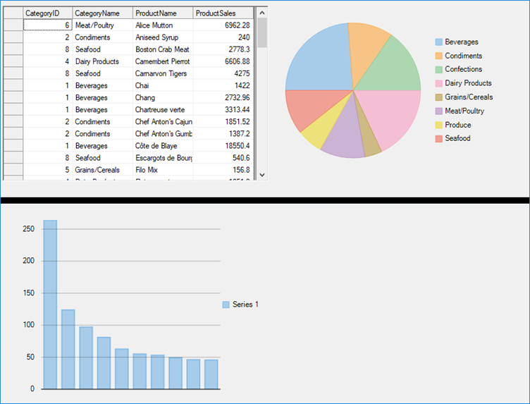
The split layout can be accessed by using the **SplitLayoutControl** property of C1DashboradLayout class. This property returns an instance of C1SplitContainer class which is further used to set the properties of split layout as shown in the following code:
```csharp
c1DashboardLayout1.SplitLayoutControl.SplitterColor = Color.Black;
c1DashboardLayout1.SplitLayoutControl.SplitterWidth = 10;
c1DashboardLayout1.SplitLayoutControl.LineBelowHeader = false;
```
```csharp
c1DashboardLayout1.SplitLayoutControl.SplitterColor = Color.Black;
c1DashboardLayout1.SplitLayoutControl.SplitterWidth = 10;
c1DashboardLayout1.SplitLayoutControl.LineBelowHeader = false;
```
To create a DashboardLayout using split layout, see [Creating Dashboard with Split Layout](/componentone/docs/win/online-dashboardlayout/walkthroughs/creatingdashboardwithsplitlayout) topic.
### Split Layout Smart Tag
Clicking on the split layout’s smart tag opens up its task menu with which you can add panels to the split layout. On adding the first panel to the split layout, it fills the entire layout’s space and adding the second panel splits the panel horizontally and adds a horizontal splitter bar that separates the two panels. However, you can change this behavior and split the panel vertically. To create a vertical split, set the first panel’s [Dock](/componentone/docs/win/online-dashboardlayout/) property to **Left**.
The created panels are of the type C1SplitterPanel. You can edit the panels with the help of split layout’s Panels property or with the help of **Edit Panels** option in the split layout’s smart tag. The split layout contains the following four elements:
* **C1SplitterPanel**: The panel inside the split layout
* **Splitter Bar**: The divider that separates the two panels
* **Panel Header**: The header that appears as a rectangular title bar above each panel
* **Expander button**: Appears when the Collapsible property of the C1SplitterPanel is true
### Positioning Panels
The position of C1SplitterPanel can easily be controlled by the **Dock** property. The C1SplitterPanel can be docked to the top, left, right or bottom on the container to which the C1SplitterPanel has been assigned. The last panel in the panel collection behaves a little different as the applied properties on the panel are ignored and its **Dock** property is set to **Fill**.
You can change the specific properties of a child container i.e. C1SplitterPanel as shown in the following code:
```csharp
_splitLayout.SplitLayoutControl.Panels[0].Collapsible = true;
_splitLayout.SplitLayoutControl.Panels[0].Dock = C1.Win.C1SplitContainer.PanelDockStyle.Left;
_splitLayout.SplitLayoutControl.Panels[0].HeaderBackColor = System.Drawing.Color.Yellow;
_splitLayout.SplitLayoutControl.Panels[0].HeaderForeColor = System.Drawing.Color.Green;
_splitLayout.SplitLayoutControl.Panels[0].HeaderTextAlign = C1.Win.C1SplitContainer.PanelTextAlign.Center;
_splitLayout.SplitLayoutControl.Panels[0].Resizable = false;
_splitLayout.SplitLayoutControl.Panels[0].ResizeWhileDragging = true;
_splitLayout.SplitLayoutControl.Panels[0].SizeRatio = 50;
_splitLayout.SplitLayoutControl.Panels[0].Text = "Sales By Category";
```
```vbnet
_splitLayout.SplitLayoutControl.Panels(0).Collapsible = True
_splitLayout.SplitLayoutControl.Panels(0).Dock = C1.Win.C1SplitContainer.PanelDockStyle.Left
_splitLayout.SplitLayoutControl.Panels(0).HeaderBackColor = System.Drawing.Color.Yellow
_splitLayout.SplitLayoutControl.Panels(0).HeaderForeColor = System.Drawing.Color.Green
_splitLayout.SplitLayoutControl.Panels(0).HeaderTextAlign = C1.Win.C1SplitContainer.PanelTextAlign.Center
_splitLayout.SplitLayoutControl.Panels(0).Resizable = False
_splitLayout.SplitLayoutControl.Panels(0).ResizeWhileDragging = True
_splitLayout.SplitLayoutControl.Panels(0).SizeRatio = 50
_splitLayout.SplitLayoutControl.Panels(0).Text = "Sales By Category"
```