# Child Container Header
## Content
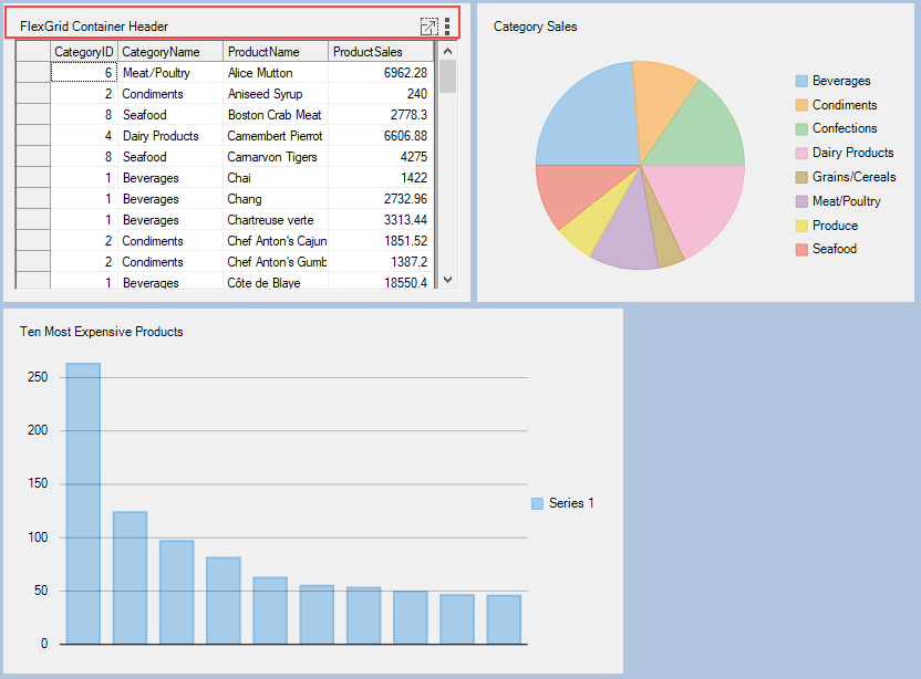
DashboardLayout allows you to display the child container header by using SetCaption method of the [C1DashboardLayout](/componentone/docs/win/online-dashboardlayout/) class. This method sets caption for the header so as to make the header visible. The header consists of caption text, a maximize icon and tool-icon with three dots positioned vertically, which can be used to hide or drag the child container.
The following image shows a header in the child container.
For setting header on a child container, use the following code:
```csharp
c1DashboardLayout1.SetCaption(c1DashboardLayout1.Items[0].ItemContainer, "FlexGrid Container Header");
```
```vbnet
c1DashboardLayout1.SetCaption(c1DashboardLayout1.Items(0).ItemContainer, "FlexGrid Container Header")
```
You can also add custom elements to the child container headers using Options.HeaderElements at design time. For more information on styling child container headers, see [Dashboard Styling](/componentone/docs/win/online-dashboardlayout/styleappearance) topic.
### Child Container Context Menu
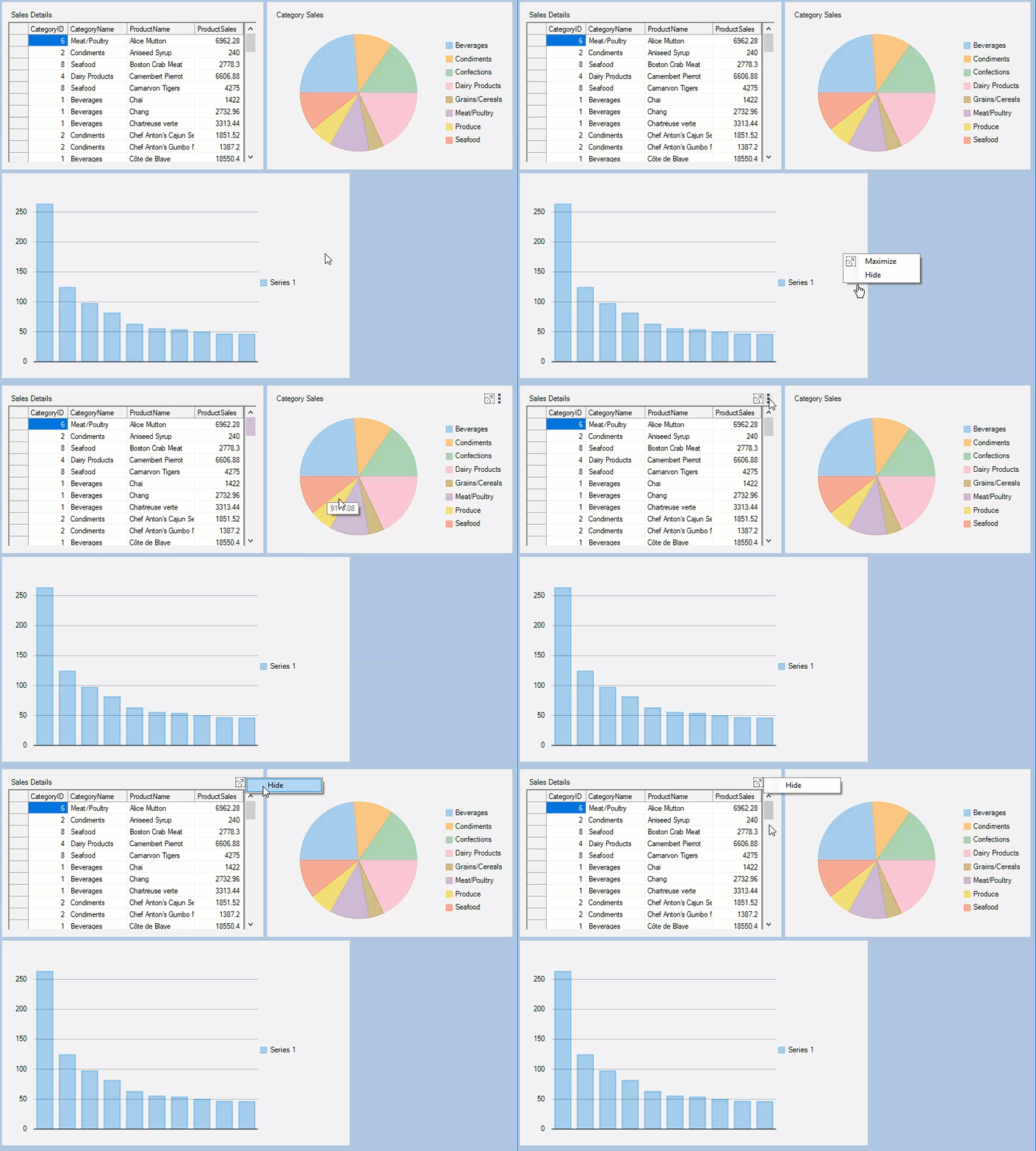
Child containers have embedded context menu which allows hiding or maximizing a child container. At runtime you can show this context menu with a right click on the empty area in a child container or with a click on the tool-icon.
The following GIF illustrates context menu displayed on right-clicking the child container.
The context menu can be customized using the ContextMenuStrip property of the [DashboardOptions](/componentone/docs/win/online-dashboardlayout/) class. To create a custom context menu in DashboardLayout control, see [Creating Custom Context Menu](/componentone/docs/win/online-dashboardlayout/walkthroughs/creatingcustomcontextmenu) topic.
## See Also
[Creating Custom Context Menu](/componentone/docs/win/online-dashboardlayout/walkthroughs/creatingcustomcontextmenu)