# Elements
## Content
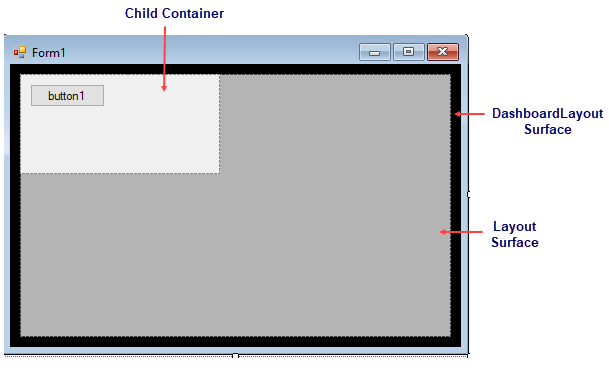
The DashboardLayout control consists of the following elements as shown in the image.
### DashboardLayout
DashboardLayout is represented by C1DashboardLayout class. It serves as the main container with an attached layout that defines how the child containers are arranged.
### Layout
The DashboardLayout element uses layout controls to create a layout for arranging child containers containing controls on the surface of the DashboardLayout control. It supports flow, grid and split layout types and each of them behave differently on resizing or arranging the child containers. Dashboard allows you to specify the type of layout using [LayoutType](/componentone/docs/win/online-dashboardlayout/) property of the [C1DashboardLayout](/componentone/docs/win/online-dashboardlayout/) class. The control communicates with the layout controls via the [ILayout](/componentone/docs/win/online-dashboardlayout/) interface. This interface can also be implemented for creating custom layouts.
### Child containers
When a control is dragged on the DashboardLayout control, a child container is automatically created to hold that control. These child containers can contain arbitrary content like text, images or any UI controls like charts, grids, maps etc. Depending on the layout you specify using the LayoutType property, the child container is either Panel class or C1SplitterPanel class. Thus, if the LayoutType property is set to [LayoutType.Grid](/componentone/docs/win/online-dashboardlayout/) or [LayoutType.Flow](/componentone/docs/win/online-dashboardlayout/). the child container is represented by the Panel class and if it is set to [LayoutType.Split](/componentone/docs/win/online-dashboardlayout/), the child container is represented by the [C1SplitterPanel](/componentone/docs/win/online-dashboardlayout/) class.
The child containers can be accessed using Items property of the C1Dashboardlayout class as depicted below:
```vbnet
((C1SplitterPanel)(c1DashboardLayout1.Items["Container1"].ItemContainer)).Dock = PanelDockStyle.Left
((C1SplitterPanel)(c1DashboardLayout1.Items["Container1"].ItemContainer)).Text = ”Splitter Panel”
((C1SplitterPanel)(c1DashboardLayout1.Items["Container1"].ItemContainer)).Collapsible = true
((C1SplitterPanel)(c1DashboardLayout1.Items["Container1"].ItemContainer)).HeaderBackColor = Color.Green
```
```csharp
((C1SplitterPanel)(c1DashboardLayout1.Items["Container1"].ItemContainer)).Dock = PanelDockStyle.Left;
((C1SplitterPanel)(c1DashboardLayout1.Items["Container1"].ItemContainer)).Text = ”Splitter Panel”;
((C1SplitterPanel)(c1DashboardLayout1.Items["Container1"].ItemContainer)).Collapsible = true;
((C1SplitterPanel)(c1DashboardLayout1.Items["Container1"].ItemContainer)).HeaderBackColor = Color.Green;
```