# Header and Footer Toolbars
## Content
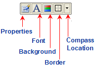
The floating toolbar for the **Header** and **Footer** element includes the following command buttons: **Properties**, **Font**, **Background**, **Border**, and a **Location** for the **Header** and **Footer** elements of the [C1Chart](/componentone/api/win/online-chart2d/dotnet-framework-api/C1.Win.C1Chart.4.8/C1.Win.C1Chart.C1Chart.html) control. The figure below provides a label for each of the command buttons for the Header and Footer toolbar.
### Exposing the Header or Footer Floating Toolbar
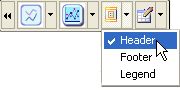
In order for the **Header** or **Footer** floating toolbar to appear you have to select either the **Header** or **Footer** from [C1Chart](/componentone/api/win/online-chart2d/dotnet-framework-api/C1.Win.C1Chart.4.8/C1.Win.C1Chart.C1Chart.html) toolbar's drop-down menu.
### Header/Footer Floating Toolbar's Command Buttons
The section below lists all of the command buttons available in the **Header/Footer** toolbar and describes the functionality of each one.
### Properties button
The properties command button exposes the **Chart Properties** designer for the **Header** and **Footer** elements when the user clicks on the properties command button.
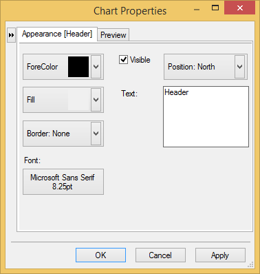
Clicking on the button opens the navigational tree view of the chart elements in the left pane of the **Chart Properties** designer.
### Font button
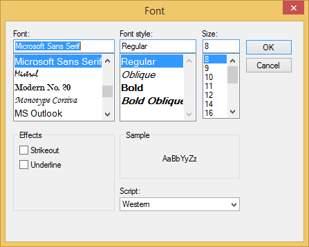
The **Font** command button exposes the **Font** dialog box for the **Header** and **Footer** element. Here the Font style can be modified for the Header and Footer's text.
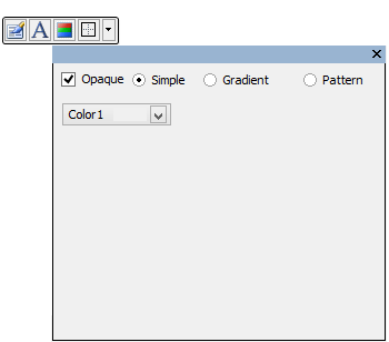
### Background button
The **Background** command button has a drop-down box that contains three different types of styles for the background and a color drop-down list box for the user to specify a color for the **Header** and **Footer's** background.
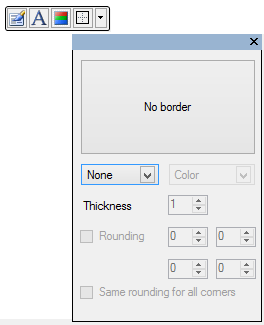
### Border button
The **Border** command button includes a drop-down box that contains editable Border styles and colors for the **Header** and **Footer's** border.
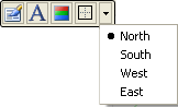
### Position button
The **Position** command button has a drop-down list box which includes a list of different compass directions (North, South, West, and East) for the user to choose from. The directions will position the **Header** or **Footer** in the North position which is above the Chart, the South position which is below the Chart, the West position which is to the left of the Chart, and the East position which is to the right of the Chart. The default compass position for the Header is north and the default position for the Footer is south.
## See Also
[Label Toolbar](/componentone/docs/win/online-chart2d/designtimetoolsforcr/workingwiththesmartd/secondaryfloatingtoo/labeltoolbar)