# Appearance and Styling
Add some styling to your DateEdit control using the appaearance-related properties in DateEdit API. Read the topic to know more about DateEdit control for WinForms.
## Content
The **Calendar** controls offer different properties to enhance the appearance in different ways based on user requirements. Also, **CalendarView** and **DateEdit** provide different styling properties to conveniently style all visual attributes of the controls.
Let's explore the appearance and styling aspects in both CalendarView and DateEdit in the below sections.
## CalendarView
**CalendarView** provides various options to style the appearance of the control as per your requirement, and change the look and feel of the application.
CalendarView offers the following appearance and styling features:
### Appearance
CalendarView provides the following properties to improve the appearance of the control.
| **Properties** | **Description** |
| --- | --- |
| [CalendarDimensions](/componentone/docs/win/online-calendar/) | Sets a value that indicates how many months will be shown. |
| [CurrentMonthDisplayOffset](/componentone/docs/win/online-calendar/) | Sets the position of the current month in a multi-dimensional calendar. For example, if the display offset is 0, then the current month is shown at the top-most left. |
| [MonthTitlePosition](/componentone/docs/win/online-calendar/) | Sets the C1.CalendarView.Position value indicating where C1.Win.Calendar.C1CalendarView control displays the month title. |
| [DayTitlePosition](/componentone/docs/win/online-calendar/) | Sets the C1.CalendarView.Position value indicating where C1.Win.Calendar.C1CalendarView control displays the day title. |
| [ShowArrowButtons](/componentone/docs/win/online-calendar/) | Sets the Boolean value indicating whether C1.Win.Calendar.C1CalendarView control displays arrow buttons. |
| [ShowToday](/componentone/docs/win/online-calendar/) | Sets a value that indicates whether to display today's date. |
| [ShowWeekNumbers](/componentone/docs/win/online-calendar/) | Sets the Boolean value indicating whether C1.Win.Calendar.C1CalendarView control displays week numbers. |
| [BoldedDates](/componentone/docs/win/online-calendar/) | Sets a DateTime array of bolded dates. |
This is how the CalendarView control looks after setting these properties:
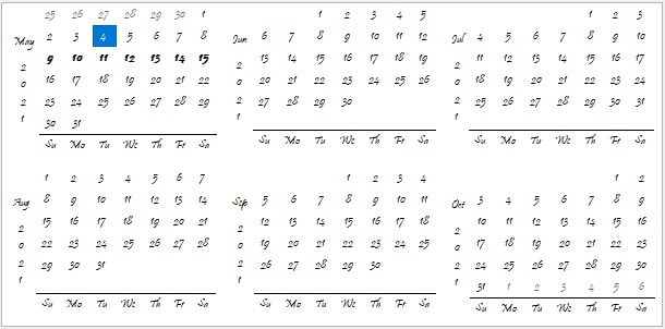
You can also implement these properties programmatically as shown in the code snippet below:
```csharp
// Add appearance properties for CalendarView
calendarView.CalendarDimensions = 6;
calendarView.CurrentMonthDisplayOffset = 0;
calendarView.DayTitlePosition = C1.CalendarView.Position.Bottom;
calendarView.MonthTitlePosition = C1.CalendarView.Position.Left;
calendarView.Font = new System.Drawing.Font("Pristina", 8F, System.Drawing.FontStyle.Regular);
calendarView.ShowArrowButtons = false;
calendarView.ShowToday = false;
calendarView.ShowWeekNumbers = false;
calendarView.BoldedDates = new DateTime[]
{
new DateTime(2021, 5, 9),
new DateTime(2021, 5, 10),
new DateTime(2021, 5, 11),
new DateTime(2021, 5, 12),
new DateTime(2021, 5, 13),
new DateTime(2021, 5, 14),
new DateTime(2021, 5, 15)
};
```
**Annually Bolded Dates**
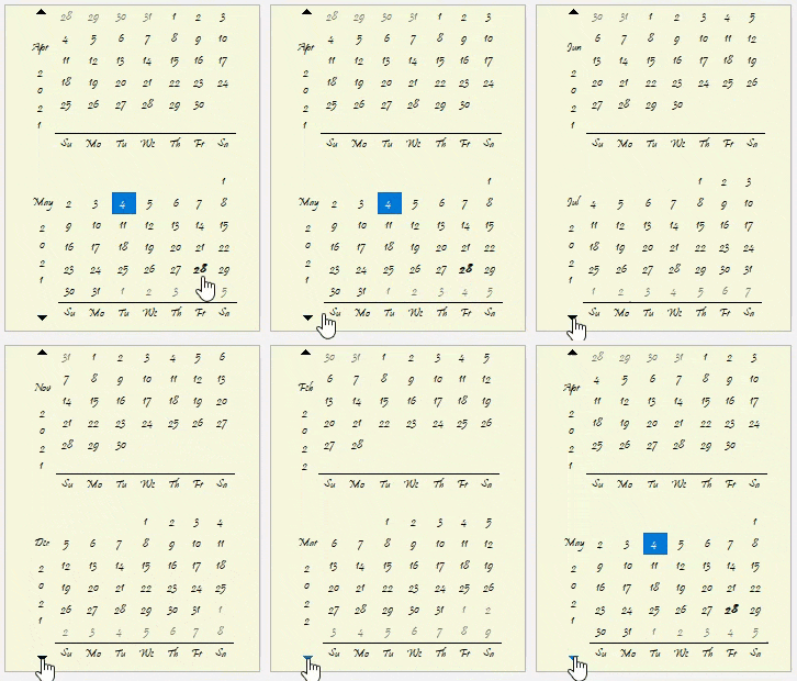
The **C1CalendarView** class provides the **AnnuallyBoldedDates** property to set the dates that appear in bold fontstyle every year. This property can be set via the **Properties** window or programmatically, just like in the case of **BoldedDates** property.
The GIF below elegantly depicts how the date '28 May' stays in bold fontstyle throughout years while navigating through the CalendarView control.
### Styling
CalendarView provides the [Styles](/componentone/docs/win/online-calendar/) property to style the calendar as well as its elements including month view, navigation, and title elements.
The list of various styling features is as follows:
* **Alignment**: Apply horizontal or vertical alignment to both calendar and its elements, such as title, navigation, and month view elements.
* **Horizontal alignment**: Align calendar or its elements horizontally by using the [HorizontalAlignment](/componentone/docs/win/online-calendar/) property.
* **Vertical alignment**: Align calendar or its elements vertically by using the [VerticalAlignment](/componentone/docs/win/online-calendar/) property.
* **Background images**: Add, align, and scale background images in calendar as well as navigation buttons and titles including day, month, and weekend titles.
* **Background image**: Set background image by using the [BackImage](/componentone/docs/win/online-calendar/) property.
* **Background image alignment**: Align background image by using the [BackImageAlignment](/componentone/docs/win/online-calendar/) property.
* **Background image scaling**: Scale background image by using the [BackImageScaling](/componentone/docs/win/online-calendar/) property.
* **Common styles**: Apply common styles, such as border, border color, font settings and background or foreground color to calendar and elements in it.
* **Border**: Set the width of the visual element by setting the [Border](/componentone/docs/win/online-calendar/) property.
* **Border color**: Change the color of the border by setting the [BorderColor](/componentone/docs/win/online-calendar/) property.
* **Font settings**: Apply font settings to all types of dates, such as bolded, ordinary, selected, today, disabled, trailing, and weekend and to all titles including day, month, week, and weekend.
* **Background color**: Change the background color of calendar or its elements by setting the [BackColor](/componentone/docs/win/online-calendar/) property.
* **Foreground color**: Apply foreground color to different dates, titles, and navigation buttons in calendar by setting the [ForeColor](/componentone/docs/win/online-calendar/) property.
* **Navigation button images**: Set images for both Previous and Next navigation buttons.
* **Previous arrow button image**: Set the Previous arrow button image by setting the [ImageArrowPrevious](/componentone/docs/win/online-calendar/) property.
* **Next arrow button image**: Set the Next arrow button image by setting the [ImageArrowNext](/componentone/docs/win/online-calendar/) property.
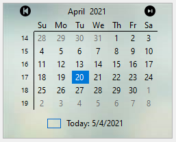
The following image displays calendar UI after implementing styling properties via **Properties** window such as **BackImage**, **ImageArrowPrevious** and **ImageArrowNext** properties applied to CalendarView.
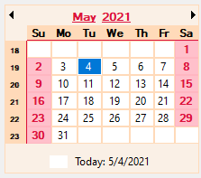
The following code snippet shows how to implement other styling properties such as **HorizontalAlignment, VerticalAlignment, Border, BorderColor, Font, ForeColor** and **BackColor**.
```csharp
// set horizontal and vertical alignment for titles and calendar
calendarView.Styles.Titles.Week.HorizontalAlignment = C1.Framework.Alignment.Far;
calendarView.Styles.Common.HorizontalAlignment = C1.Framework.Alignment.Near;
calendarView.Styles.Titles.Week.VerticalAlignment = C1.Framework.Alignment.Far;
calendarView.Styles.Common.VerticalAlignment = C1.Framework.Alignment.Near;
// set borders for different dates in calendar
calendarView.Styles.Day.Bolded.Border = new C1.Framework.Thickness(2, 2, 2, 2);
calendarView.Styles.Day.Ordinary.Border = new C1.Framework.Thickness(1, 1, 1, 1);
calendarView.Styles.Day.Weekend.Border = new C1.Framework.Thickness(1, 1, 1, 1);
// set border color for dates and titles in calendar and for calendar as well
calendarView.Styles.Day.Bolded.BorderColor = Color.Crimson;
calendarView.Styles.Day.Ordinary.BorderColor = Color.PeachPuff;
calendarView.Styles.Day.Today.BorderColor = SystemColors.ControlLightLight;
calendarView.Styles.Day.Weekend.BorderColor = Color.LightPink;
calendarView.Styles.Titles.Day.BorderColor = Color.Crimson;
calendarView.Styles.Titles.Week.BorderColor = Color.Crimson;
calendarView.Styles.Titles.Weekend.BorderColor = Color.DarkCyan;
calendarView.Styles.Common.BorderColor = Color.PeachPuff;
// apply font settings to dates and titles in calendar
calendarView.Styles.Day.Bolded.Font =
new Font ("Microsoft Sans Serif", 8.25F,
(FontStyle.Bold | FontStyle.Underline));
calendarView.Styles.Day.Weekend.Font =
new Font("Microsoft Sans Serif", 8.25F,
FontStyle.Bold, GraphicsUnit.Point, 0);
calendarView.Styles.Titles.Day.Font =
new Font("Microsoft Sans Serif", 8.25F,
FontStyle.Bold, GraphicsUnit.Point, 0);
calendarView.Styles.Titles.Month.Font =
new Font("Microsoft Sans Serif", 9F,
(FontStyle.Bold | FontStyle.Underline), GraphicsUnit.Point, 0);
calendarView.Styles.Titles.Week.Font =
new Font("Microsoft Sans Serif", 6F, FontStyle.Bold);
// set foreground color for dates and titles in calendar
calendarView.Styles.Day.Bolded.ForeColor = Color.Crimson;
calendarView.Styles.Day.Disabled.ForeColor = SystemColors.ControlText;
calendarView.Styles.Day.Trail.ForeColor = Color.Transparent;
calendarView.Styles.Day.Weekend.ForeColor = Color.Crimson;
calendarView.Styles.Titles.Month.ForeColor = Color.Crimson;
// set background color for dates and titles in calendar and for calendar as well
calendarView.Styles.Day.Bolded.BackColor = Color.Pink;
calendarView.Styles.Day.Disabled.BackColor = Color.LightGray;
calendarView.Styles.Day.Ordinary.BackColor = Color.White;
calendarView.Styles.Day.Trail.BackColor = Color.White;
calendarView.Styles.Titles.Day.BackColor = Color.PeachPuff;
calendarView.Styles.Titles.Week.BackColor = Color.PeachPuff;
calendarView.Styles.Day.Weekend.BackColor = Color.Pink;
calendarView.Styles.Common.BackColor = Color.Linen;
```
The resulting image looks as follows:
## DateEdit
**DateEdit** provides various properties to enhance the appearance and style the control as per your requirement and change the look and feel of the application you are creating.
DateEdit offers the following appearance features:
### Appearance
DateEdit provides the following options to dramatically change the appearance of the control.
| **Properties** | **Description** |
| --- | --- |
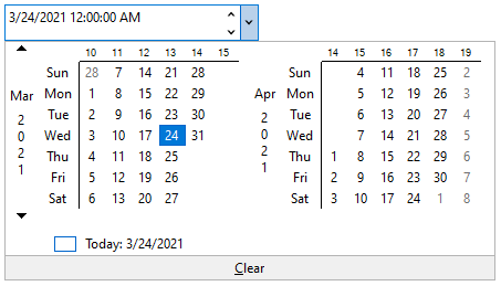
| [CalendarDimensions](/componentone/docs/win/online-calendar/) | This property specifies the number of months to display in the Calendar dropdown in DateEdit. |
| [MaxColumns](/componentone/docs/win/online-calendar/) | This property specifies the maximum number of columns to display in the dropdown Calendar in which the number of months will be accommodated. |
| [VerticalOrientationLayout](/componentone/docs/win/online-calendar/) | This property lets you set month view in vertical layout. |
| [DayNameLength](/componentone/docs/win/online-calendar/) | This property specifies the maximum length of the day names. |
| [DayTitlePosition](/componentone/docs/win/online-calendar/) | This property sets the position of the day title in the dropdown calendar. |
| [MonthTitlePosition](/componentone/docs/win/online-calendar/) | This property sets the position of the month titles in the dropdown calendar. |
| [ShowWeekNumbers](/componentone/docs/win/online-calendar/) | This property when set to true displays week numbers in the dropdown calendar. |
This is how the DateEdit control looks after setting these properties.
The following code snippet shows how to set the properties in DateEdit.
```csharp
// Customize DateEdit dropdown calendar
// specify the number of months to display
dateEdit.Calendar.CalendarDimensions = 2;
// specify the maximum number of columns to display
dateEdit.Calendar.MaxColumns = 2;
// set the vertical orientation
dateEdit.Calendar.VerticalOrientationLayout = true;
// Set the maximum length of day names
dateEdit.Calendar.DayNameLength = 3;
// Set position of day title in the dropdown calendar
dateEdit.Calendar.DayTitlePosition = C1.CalendarView.Position.Left;
// Set position of month title in the dropdown calendar
dateEdit.Calendar.MonthTitlePosition = C1.CalendarView.Position.Left;
// Set whether dropdown calendar displays week numbers
dateEdit.Calendar.ShowWeekNumbers = true;
```
**Font Settings and Alignment**
DateEdit provides the following options to change the font settings and alignment of the control:
| **Properties** | **Description** |
| --- | --- |
| Font settings | Apply font settings to the text in the DateEdit control by setting the Font property from Font Control in Systems.Windows.Forms. |
| Text alignment | Set the alignment of the text in the DateEdit control by setting the TextAlign property from TextBox in Systems.Windows.Forms. |
This is how the DateEdit control looks after changing the font settings and alignment.

The following code snippet shows how to apply font settings and text alignment in DateEdit.
```csharp
// Apply font settings
dateEdit.Font = new Font("Microsoft Sans Serif", 9F, FontStyle.Italic);
// set text alignment
dateEdit.TextAlign = HorizontalAlignment.Left;
```
### Styling
DateEdit provides [DateEditStyles](/componentone/docs/win/online-calendar/) class to style the UI of the control, both the ComboBox and dropdown calendar. The DateEdit control provides the [Editor](/componentone/docs/win/online-calendar/) property to get the styles, which determines the appearance of the DateEdit ComboBox. Different styling properties can be applied to the ComboBox such as Default, Focused, Hot, Disabled and ReadOnly. Likewise, This helps to get the styling attributes to be set on the control. DateEdit also provides the [Calendar](/componentone/docs/win/online-calendar/) property to get the styles, which determines the appearance of the drop-down Calendar.
The table below provides an idea about the different styling options:
| **Styling attributes** | **Description** |
| --- | --- |
| Default | Get styling attributes when the general appearance of the element is in default state. |
| Hot | Get styling attributes when the when the cursor is over an element. |
| Focused | Get styling attributes for the general appearance of the focused element. |
| Disabled | Get styling attributes for the general appearance of the disabled element. |
| ReadOnly | Get styling attributes for the general appearance of the read-only element. |
| Common | Get styling attributes for the general appearance of the calendar. |
The snapshot below displays Default styling attribute applied to the DateEdit control.
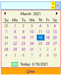
The following code snippet shows how to style the ComboBox, Calendar and Buttons in DateEdit:
```EXAMPLE
// Default ComboBox (Editor) Style
dateEdit.Styles.Editor.Default.BackColor = Color.LightCyan;
dateEdit.Styles.Editor.Default.ForeColor = Color.Brown;
dateEdit.Styles.Editor.Default.BorderColor = Color.Blue;
//Style Buttons for ComboBox (Editor)
dateEdit.Styles.Editor.Button.Default.BackColor = Color.Yellow;
dateEdit.Styles.Editor.Button.Default.ForeColor = Color.Red;
//Styles for Calendar
dateEdit.Styles.Calendar.Common.BackColor = Color.Beige;
dateEdit.Styles.Calendar.Common.BorderColor = Color.Red;
// Set ordinary day style
dateEdit.Styles.Calendar.Day.Ordinary.ForeColor = Color.DarkViolet;
//Today
dateEdit.Styles.Calendar.Day.Today.BackColor = Color.PaleGreen;
dateEdit.Styles.Calendar.Day.Today.ForeColor = Color.Orange;
//Clear button styling
dateEdit.Styles.Calendar.ClearButton.Default.BackColor = Color.Orange;
dateEdit.Styles.Calendar.ClearButton.Default.ForeColor = Color.Blue;
```
> type=note
> **Note**: The [C1CalendarView](/componentone/docs/win/online-calendar/) and [C1DateEdit](/componentone/docs/win/online-calendar/) classes for **.NET** provides the Styles property that has more styles settings for calendar and editor in comparison to its **.NET** **Framework** counterparts.