# FlexChart Field
## Content
FlexReportDesigner provides the field type, **FlexChart** field. This field simplifies adding data visualization capabilities to FlexReport using flexible data binding, multiple chart types, and supports grouping and data aggregation.
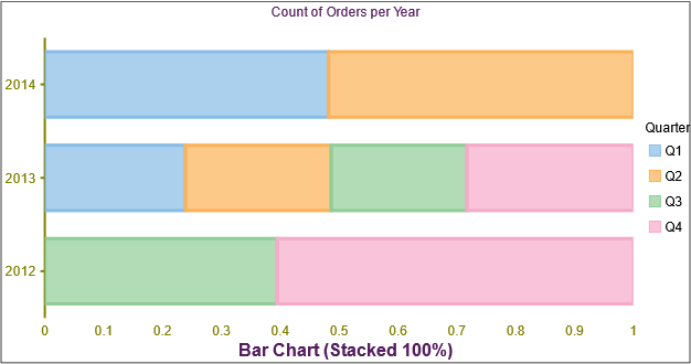
For more information on FlexChart, see[ FlexChart documentation](https://developer.mescius.com/componentone/docs/win/online-flexchart/overview.html).
## Bind FlexChart Field with Data
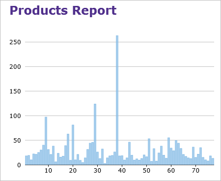
When you add the **FlexChart** field to your report, you need to bind it to data for populating the data in the displayed chart, say Column chart, as shown below. The following steps show how to bind the FlexChart field with data in FlexReportDesigner application.
1. Create a new report in FlexReportDesigner.
2. In **Data** tab, bind the Main data source with Products table of C1Nwind.mdb database.
3. Under **INSERT** tab, select FlexChart field  and draw it in the Header section.
4. Select the FlexChart.
5. In the **Properties** window, set the desired Chart Type, say Column chart, from ChartType dropdown.
6. Navigate to Series and click the ellipsis button next to it.
7. In the **Series Collection Editor**, click Add button to add a series data group.
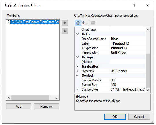
8. Navigate to **Data** and set the **DataSourceName** as Main.
9. Set **Label** as ProductID.
10. Set **XExpression** to ProductID.
11. Set **YExpression** to UnitPrice.
12. Close the Editor.
13. Click on Preview.
## Supported Chart Type
The **FlexChartField** in **FlexReport** allows you to set a specific chart type using C1.Chart.ChartType property. It allows you to visualize data through different chart types such as Area, Bar, Bubble, Candlestick, Column, Funnel, HighLowOpenClose, Histogram, Line, LineSymbols, RangedHistogram, Scatter, Spline, SplineArea, SplineSymbols, Step, StepArea and StepSymbols. The chart types can be easily selected using the ChartType property in the Properties window of the **FlexReportDesigner**.
### WinForms Area Chart
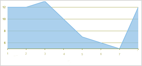
Area charts are line charts with area between the line chart and axis filled with a color or shading. Each series is drawn on top of the preceding series.
### WinForms SplineArea Chart
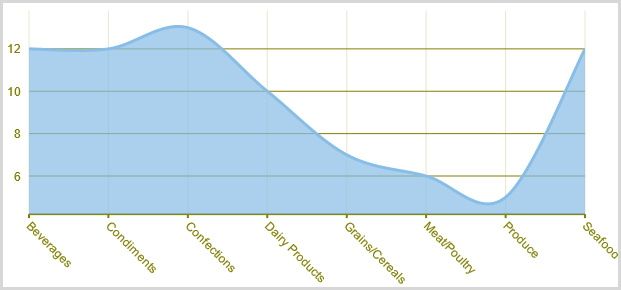
A SplineArea Chart is similar to an area chart. The only difference is that it connects data points using splines instead of straight lines and fills the area enclosed by the splines.
### WinForms Bar Chart
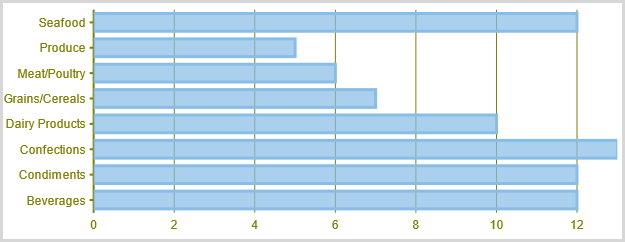
Bar charts compare categorical data through the horizontal bars, where length of each bar represents the value of the corresponding category. Y-axis in these charts is a category axis.
### WinForms Column Chart
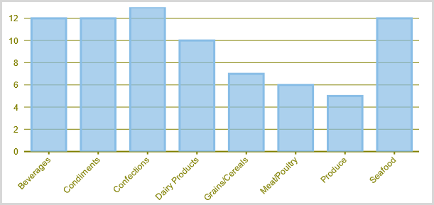
Column charts are simply vertical version of bar charts and they use X- axis as a category axis. Though bar charts and column charts can be used interchangeably, column charts are preferred where number of values is too large to be accommodated on an X-axis while bar charts are preferred in the case of long category titles which are difficult to fit on an X-axis or in the case of large number of categories.
### WinForms Bubble Chart
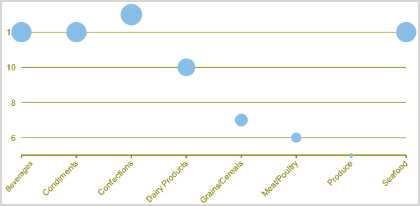
A Bubble chart combines two independent values to supply both the point y value and the point sizes. Bubble charts are used to represent an additional data value at each point by changing its size. The Y array elements determine the Cartesian position (as in a XY-Plot chart), and the Y1 element values determine the size of the bubble at each point. The size of the points can be encoded according to area or diameter.
### WinForms Scatter Chart
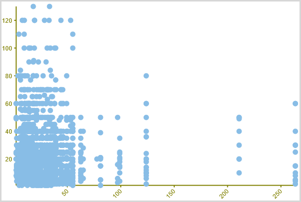
A Scatter chart uses two values to represent each data point. It depicts relationship among items of different data series. This type of chart is often used to represent scientific data, and can highlight the deviation of assembled data from predicted data or result.
### WinForms Line Chart
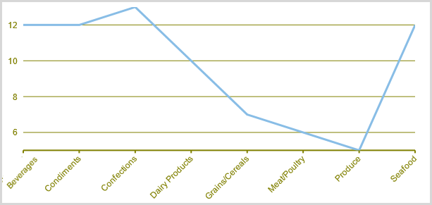
A Line chart displays trends over a period of time by connecting different data points in a series with a straight line. It is the most effective way of denoting changes in the values between different groups of data.
### WinForms LineSymbols Chart
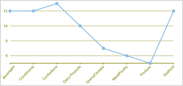
A LineSymbols chart is a combination of the Line chart and the Scatter chart. The chart plots data points by using symbols and connects those data points by using lines.
### WinForms Spline Chart
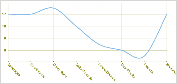
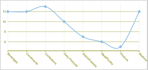
A Spline chart is similar to a line chart except that it connects data points by using splines rather than straight lines. It is specifically used for representing data that requires the use of curve fittings.
### WinForms SplineSymbols Chart
A SplineSymbols chart combines the Spline chart and the Scatter chart. The chart plots data points by using symbols and connects those data points by using splines.
### WinForms Funnel Chart
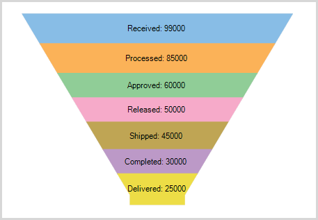
A funnel chart represents sequential stages in a linear process. This chart can be useful in identifying potential problem areas in processes where it is noticeable at what stages and rate the values decrease.
### WinForms Stock Charts
Stock charts used in financial applications to show the opening, closing, high and low prices of a given stock. The types of stock charts are as follows:
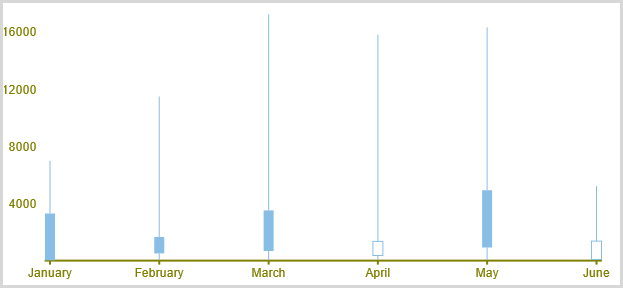
* **Candlestick Chart**: A Candlestick chart is a special type of HighLowOpenClose chart that integrates Bar and Line charts to depict a range of values over time. It consists of visual elements known as candles that are further comprised of three elements: body, wick, and tail. The body represents the opening and the closing value, while the wick and the tail represent the highest and the lowest value respectively.
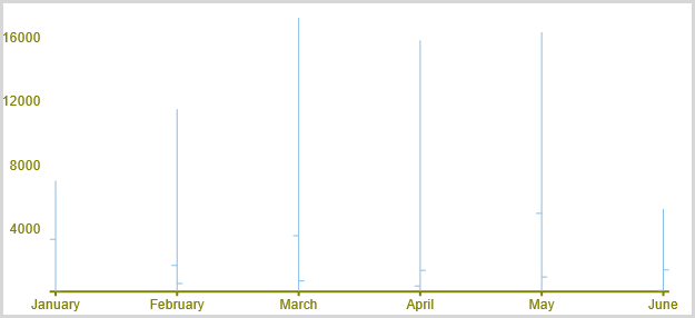
* **HighLowOpenClose**: HighLowOpenClose charts combine four independent values to supply high, low, open, and close data for a point in a series. In addition to showing the high and low value of a stock, the Y2 and Y3 array elements represent the stock's opening and closing price, respectively.
### WinForms Histogram Chart
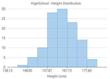
Histograms are visual representation of data distribution over a continuous interval or certain time period. These charts comprise of vertical bars to indicate the frequency in each interval or bin created by dividing the raw data values into a series of consecutive and non-overlapping intervals.
### WinForms RangedHistogram Chart
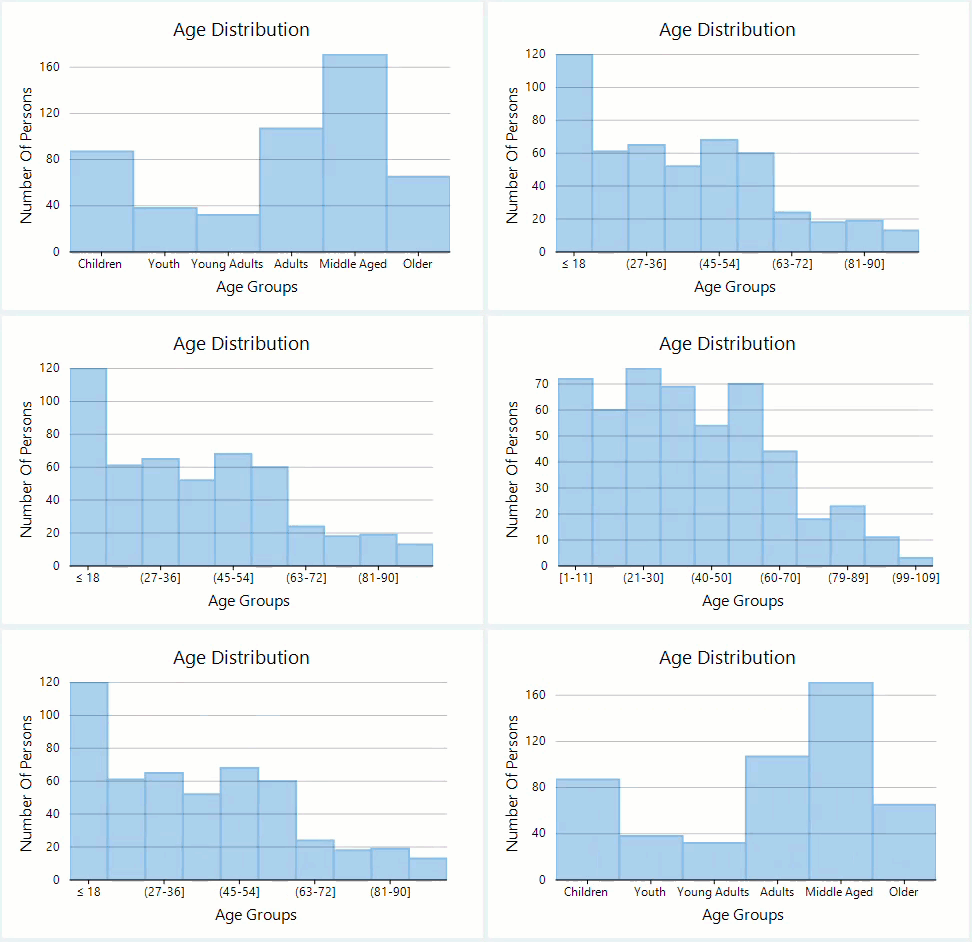
Ranged histogram is a modern Excel-like histogram chart that helps visualize frequency distribution on Y-axis, against ranged X-axis. Like histogram chart type, bins are created by dividing the raw data values into a series of consecutive, non-overlapping intervals.
### WinForms Step Charts
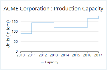
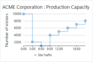
Step charts use vertical and horizontal lines to connect the data points to form a step-like progression. These charts are generally used to demonstrate the sudden change in data that might occur on irregular intervals and remains constant till the next change.
### WinForms StepArea Chart
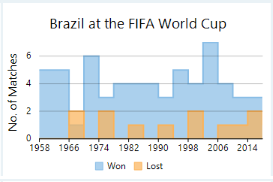
Step area charts are area charts in which points are connected by vertical and horizontal line segments, that resemble staircase steps. The area between X-axis and line segment is filled with color or some pattern.
### WinForms Step Symbol Chart
Step symbol chart is a slight variation of step chart and is displayed with markers on the data points. These charts are used when it is required to know the exact data points which have been used to plot the chart.
## Grouping and Aggregate
FlexReport allows using **FlexChartField** to render a FlexChart in FlexReport and perform grouping and aggregation in it. Let us create a report to show grouping and aggregation of data.
The image below shows FlexReport containing FlexChart field where grouping and aggregation is performed on data.
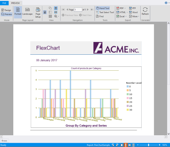
To create a report showing grouping and aggregation of data in FlexChart, follow these steps.
1. In the **FlexReportDesigner** application, create a new report by navigating through the **Report Wizard**.
2. Bind the report to the **Main** data source, by specifying the following Sql Statement.
`SELECT Categories.*, Categories.CategoryID as CategoryID, Products.* FROM Categories INNER JOIN Products ON Categories.CategoryID = Products.CategoryID`
3. Add a **SubSection** to the **Header** section and add **FlexChart** field to it.
4. In the **Properties** window, expand **AxisX** and set the value of LabelAngle property to **-10**.
5. Navigate to AxisX\|Style and set Font properties to **Arial, 9pt, Regular**, StrokeColor to **Olive**, and StrokeWidth to **30**.
6. Navigate to AxisY and set Font properties to **Arial, 9pt, Regular**, StrokeColor to **Olive**, and StrokeWidth to **15**.
7. Set the Border Color to **Black**, Style to **Solid** and Width to **10**.
8. Navigate to CategoryGroups and click ellipsis button next to it.
The **DataGroup Collection Editor** opens.
9. In the **DataGroup Collection Editor**, click **Add** button to add a data group and set it's GroupExpression to **CategoryID**.
10. Close the Editor.
11. Navigate to Footer\|Content and set it to **Group By Category and Series**.
12. Navigate to Header\|Content and set it to **Count of products per Category**.
13. Navigate to Legend\|Title and set it to **Reorder Level**.
14. Navigate to Series and click the ellipsis button next to it.
15. In the **Series Collection Editor**, click **Add** button to add a series.
16. Navigate to Data\|YExpression and set it's value to **Count(\*)**.
With **Count(\*)**, we are setting aggregate data to the **FlexChartField**.
17. Close the Editor.
18. Navigate to SeriesGroups and click the ellipsis button next to it.
19. In the **Data Group Collection Editor**, click **Add** button to add a series and set it's GroupExpression to **RecordLevel**.
20. Close the Editor.
21. Navigate to XLabelExpression and set it to **CategoryName**.
22. Click **Preview** button to switch to Preview mode to view the report.
## FlexChart Navigation
FlexChart field allows navigation to another report, a URL or script via the **Hyperlink** property of **FlexChartField** or a particular Series.
Suppose you want to show Total Orders per Year and monthly sales for a particular year. Both these tasks can be achieved in FlexReport using FlexChart navigation feature. In one report, the chart shows Total Orders per year and in the other, the chart shows Sales per Month along with the total orders and amount received every month. If you click on one series, the report navigates to the chart and pass the year for which Monthly sales are shown.
Let us create a report to navigate from a series to other report, or data within a report.
1. In the **FlexReportDesigner** application, create two new reports, **Orders Report** and **Sales Report**, by navigating through the **Report Wizard**.
2. Bind the reports to the **Main** data source, by specifying the following Sql Statement.
`SELECT o.OrderDate, od.Quantity * od.UnitPrice AS OrderItemSum FROM Orders AS o, [Order Details] AS od WHERE o.OrderId = od.OrderId`
3. Add a parameter, **pYear**, to the report and set it's DataType to **Integer**, Prompt to **Year**, and Value to **2012**.
4. Add one **FlexChart** field in **Orders Report** and two **FlexChart** field in **Sales Report**.
5. Select **FlexChart** field in **Orders Report**.
6. In the **Properties** window, navigate to Series and click the ellipsis button next to it.
7. In the **Series Collection Editor**, click **Add** button to add a series data group\, navigate to Data\|YExpression and set it's value to **Sum(OrderItemSum)**.
8. Navigate to Hyperlink\|LinkTarget and set it to **Bookmark**.
9. Click the ellipsis button next to the ParameterValues, add a parameter named **pYear** with **=Year(OrderDate)** value, and close the **ParametersValues** Editor.
10. Set the Hyperlink\|Report to **Sales Report**.
11. Close the Editor.
12. Navigate to SeriesGroups and click the ellipsis button next to it.
13. In the **Data Group Collection Editor**, click **Add** button to add a series and set it's GroupExpression to **Year(OrderDate)**.
14. Close the Editor.
15. Select the first FlexChart field in Sales Report.
16. In the **Properties** window, navigate to Series and click the ellipsis button next to it.
17. In the **Series Collection Editor**, click **Add** button to add a series data group.
18. Navigate to Hyperlink\|LinkTarget and set it to **Bookmark**.
19. Set the Bookmark to **=Month(OrderDate)**.
20. Close the Editor.
21. Navigate to SeriesGroups and click the ellipsis button next to it.
22. In the **Data Group Collection Editor**, click **Add** button to add a series and set it's GroupExpression to **Month(OrderDate)**.
23. Close the Editor.
24. Select the second **FlexChart** field in **Sales Report**.
25. In the **Properties** window, navigate to Series and click the ellipsis button next to it.
26. In the **Series Collection Editor**, click **Add** button to add a series data group\, navigate to Data\|YExpression and set it's value to **Sum(OrderSum)**.
27. Close the Editor.
28. Select the **Orders Report** and click **Preview** button to switch to the Preview mode to see how FlexChart navigation works in FlexReport.