# Styling TreeView
Develop powerful and lightweight web applications using ASP.NET MVC controls. Learn more about the ComponentOne MVC controls in ASP.NET MVC documentation.
## Content
The TreeView control allows to customize its appearance using **CSS**. You can create your own custom CSS and then apply it to the TreeView control using [CssClass](/componentone/api/mvc/online-mvc/dotnet-framework-api/C1.Web.Mvc/C1.Web.Mvc.Control.CssClass.html) property. The following image shows how the TreeView control appears after using a custom CSS class.
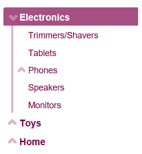
The example uses **CssClass** property to apply custom cascading styling sheets in the TreeView control. The below example code uses **Property** model added in the [QuickStart](/componentone/docs/mvc/online-mvc/workwithcontrols/TreeView/TreeViewQuickStart) section.
### Add Custom Stylesheet
Create a new ASP.NET MVC application. Once you have created the application, a **Content** folder is created in the **Solution Explorer** after adding the view to the application. To add a custom style sheet in your application, follow these steps:
1. In the Solution Explorer, right-click the **Content** folder.
2. From the context menu, select **Add | Style Sheet**. The **Specify Name for Item** dialog appears.
3. Set name of the style sheet (for example: `app.css)` and click **OK**.
4. Replace the default code of **app.css** file with the code given below.
```css
.wj-treeview {
font-size: 120%;
margin-bottom: 8px;
}
/* custom tree styles */
.custom-tree.wj-treeview {
color: #80044d;
}
/* default nodes */
.custom-tree.wj-treeview .wj-node {
}
/* level 0 and deeper nodes */
.custom-tree.wj-treeview .wj-nodelist > .wj-node {
font-size: 120%;
font-weight: bold;
}
/* level 1 and deeper nodes (smaller font, vertical line along the left) */
.custom-tree.wj-treeview .wj-nodelist > .wj-nodelist > .wj-node,
.custom-tree.wj-treeview .wj-nodelist > .wj-nodelist > .wj-nodelist {
font-size: 110%;
font-weight: normal;
border-left: 4px solid rgba(128, 4, 77, 0.3);
}
/* level 2 and deeper nodes (smaller font, thinner border) */
.custom-tree.wj-treeview .wj-nodelist > .wj-nodelist > .wj-nodelist > .wj-node,
.custom-tree.wj-treeview .wj-nodelist > .wj-nodelist > .wj-nodelist > .wj-nodelist {
font-size: 100%;
font-style: italic;
opacity: 0.8;
border-left: 2px solid rgba(128, 4, 77, 0.3);
}
/* expanded node glyph */
.custom-tree.wj-treeview .wj-nodelist .wj-node:before {
content: "\e114";
font-family: 'Glyphicons Halflings';
top: 4px;
border: none;
opacity: .3;
transition: all .3s cubic-bezier(.4,0,.2,1);
}
/* collapsed node glyph */
.custom-tree.wj-treeview .wj-nodelist .wj-node.wj-state-collapsed:before,
.custom-tree.wj-treeview .wj-nodelist .wj-node.wj-state-collapsing:before {
transform: rotate(-180deg);
transition: all .3s cubic-bezier(.4,0,.2,1);
}
/* selected node */
.custom-tree.wj-treeview .wj-node.wj-state-selected {
color: white;
background: rgba(128, 4, 77, 0.70);
}
```
#### In Code
The example code changes the collapse/expand icons, uses different font sizes depending on node level, and adds a vertical bar to the left of the level one nodes.
**Styling.cshtml**
```razor
@using
@model Property[]
@(Html.C1().TreeView().CssClass("custom-tree")
.Bind(Model)
.DisplayMemberPath("Header")
.ChildItemsPath("Items"))
```