# Auto Grid Layout
DashboardLayout for MVC supports arranges tiles in tabular form in grid layout. Learn more about all the supported layouts by DashboardLayout in MVC documentation.
## Content
Auto grid layout, as the name suggests, arranges the tiles in the tabular form automatically. An auto grid layout consists of groups which are rendered in the direction specified by the **Orientation** property. The property also defines the direction in which each group expands. You can also define the maximum number of rows or columns that each group can have in horizontal or vertical orientation respectively using **MaxRowsOrCols** property.
For instance, when orientation is set to horizontal, tiles are added row-wise until the maximum row count is reached. Once that limit is reached, the layout starts expanding horizontally by adding new columns one after the other. There is no limit to the number of columns that can be added in the horizontal orientation.
The auto grid layout also supports cell merging by spanning rows or columns through **RowSpan** and **ColumnSpan** properties of the tile available in the designer.
You can set the auto grid layout using the **AttachAutoGridLayout** method provided by the [DashboardLayoutBuilder](/componentone/api/mvc/online-mvc/dotnet-framework-api/C1.Web.Mvc/C1.Web.Mvc.DashboardLayout.html) class. The layout automatically positions the tiles in the DashboardLayout control. Each cell in the table can contain multiple controls, and these controls can be grouped together with the help of the [AutoGridGroup](/componentone/api/mvc/online-mvc/dotnet-framework-api/C1.Web.Mvc/C1.Web.Mvc.AutoGridGroup.html) class. Also, it provides [AutoGridTile](/componentone/api/mvc/online-mvc/dotnet-framework-api/C1.Web.Mvc/C1.Web.Mvc.AutoGridTile.html) class that represents the tiles in the auto grid layout.
The following image shows how DashboardLayout control appears after adding the auto grid layout.
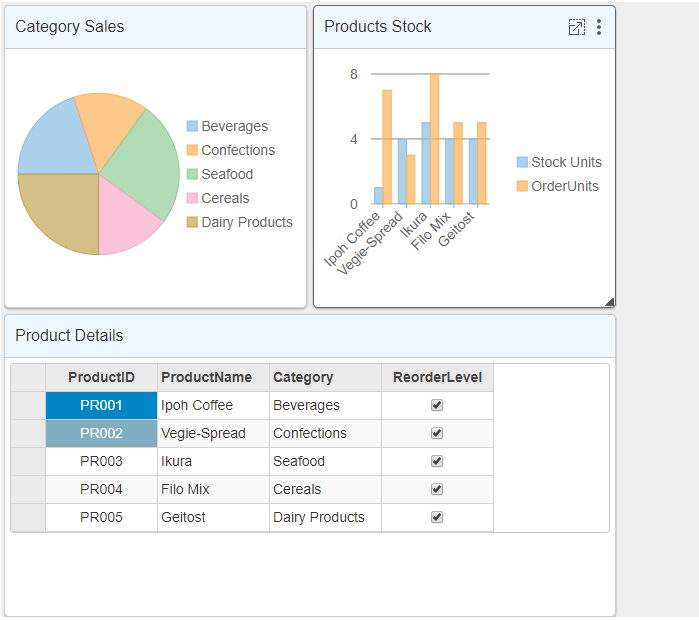
The following code example demonstrates how to set auto grid layout for the DashboardLayout control. This example uses the sample created in the [QuickStart](/componentone/docs/mvc/online-mvc/workwithcontrols/DashboardLayout/DashboardQuickStart) section.
```razor
@using ApplicationName.Models
@model IEnumerable
Product Dashboard Demo
@(Html.C1().FlexPie
().Id("CategorySales")
.Bind("Category", "Sales", Model))
@(Html.C1().FlexChart().Id("ProductsStock")
.Bind("ProductName", Model)
.ChartType(C1.Web.Mvc.Chart.ChartType.Column)
.Series(sers =>
{
sers.Add()
.Binding("UnitsInStock")
.Name("Stock Units");
})
.Series(sers =>
{
sers.Add()
.Binding("UnitsOnOrder")
.Name("OrderUnits");
}))
@(Html.C1().FlexGrid().Id("ProductDetails")
.AutoGenerateColumns(false)
.Bind(Model)
.Columns(bl =>
{
bl.Add(cb => cb.Binding("ProductID").Align("Center"));
bl.Add(cb => cb.Binding("ProductName"));
bl.Add(cb => cb.Binding("Category"));
bl.Add(cb => cb.Binding("ReorderLevel"));
}))
Auto Grid Layout
@(Html.C1().DashboardLayout()
.AttachAutoGridLayout(mglb => mglb.Orientation(LayoutOrientation.Vertical)
.MaxRowsOrColumns(3)
.CellSize(303)
.Items(isb =>
{
isb.Add().Children(cb =>
{
cb.Add().HeaderText("Category Sales")
.Content("#CategorySales")
.RowSpan(1).ColumnSpan(1);
cb.Add().HeaderText("Products Stock")
.Content("#ProductsStock")
.RowSpan(1).ColumnSpan(1);
});
isb.Add().Children(cb =>
{
cb.Add().HeaderText("Product Details")
.Content("#ProductDetails")
.RowSpan(1).ColumnSpan(2);
});
})))
```