# Key Features
## Content
InputDateRange control is a simple control with a clean and interactive interface which looks similar to the following image:
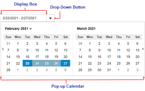
The **InputDateRange** control consists of the following elements:
* **Display Box**
The display box shows the selected date range. You can set the date range by entering numeric values or by selecting a date from the pop-up calendar at runtime.
* **Drop-Down Button**
The drop-down button opens a calendar from where you can select a date range to display in the display box.
* **Pop-up Calendar**
The pop-up calendar displays a two month calendar, by default, and allows you to select a date range to be displayed in the display box. It appears when you click the drop-down button.