# DropDownCssClass
## Content
You can get or set a CSS class name to add to the controls drop-down element. The property is useful when you are styling the drop-down element, because it is shown as a child of the document body rather than as a child of the control itself, which prevents using CSS selectors based on the parent control. You can use this property to display multiple columns in a ComboBox dropdown.
The following code example demonstrates how to enable multi-column using [DropDownCssClass](/componentone/api/mvc/online-mvc-core/dotnet-api/C1.AspNetCore.Mvc/C1.Web.Mvc.IDropDown.DropDownCssClass.html) property. This example uses the sample created in the [Quick Start](/componentone/docs/mvc/online-mvc-core/WorkingwithControls/Input/ComboBox/ComboBoxQuickStart) section.
DropDownCssClass property is available in the following Input DropDown controls;
* InputColor
* InputDate
* AutoComplete, ComboBox
* InputTime
* MultiSelect
* Menu
The following image shows how the Menu appears after applying the **DropDownCssClass** property: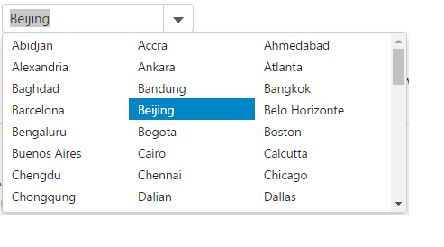
The following code example demonstrates how to use DropDownCssClass property.
**IndexController.cs**
```razor
public ActionResult Index()
{
ViewBag.Cities = Models.Cities.GetCities();
return View();
}
```
**ComboBox.cshtml**
```razor
@{ List cities = ViewBag.Cities;}
```