# Manual Grid Layout

## Content


Manual grid layout, as the name suggests, arranges the tiles in the tabular form in the specified manner. The layout is similar to auto grid layout except the fact that you can specify the row and column numbers where a particular tile should be positioned.

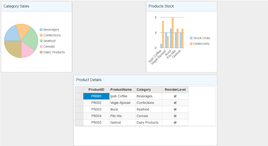
You can set the manual grid layout using the **AttachManualGridLayout** method provided by the [DashboardLayoutBuilder](/componentone/api/mvc/online-mvc-core/dotnet-api/C1.AspNetCore.Mvc/C1.Web.Mvc.DashboardLayout.html) class. Position of the tiles in the manual grid layout is specified using the **Row** and **Column** properties of the **ManualGridTileBuilder** class. Each cell in the manual grid layout can contain multiple controls, and these controls can be grouped together with the help of the [ManualGridGroup](/componentone/api/mvc/online-mvc-core/dotnet-api/C1.AspNetCore.Mvc/C1.Web.Mvc.ManualGridGroup.html) class. Also, it provides the [ManualGridTile](/componentone/api/mvc/online-mvc-core/dotnet-api/C1.AspNetCore.Mvc/C1.Web.Mvc.ManualGridTile.html) class that represents the tiles in the manual grid layout.<br /><br />The following image shows how DashboardLayout control appears after adding the manual grid layout. This example uses the sample created in the [QuickStart](/componentone/docs/mvc/online-mvc-core/WorkingwithControls/DashboardLayout/DashboardQuickStart) section.
![](https://cdn.mescius.io/document-site-files/images/9b6a6cfe-b8e8-42e9-8a04-da6cb7762977/images/manualgridlayout.png)

The following code example demonstrates how to set manual grid layout for the **DashboardLayout** control.

```html
@model IEnumerable<ProductData>
<style>
    .wj-dashboard .wj-flexchart {
        margin: 0px;
        padding: 4px;
        border: none;
        height: 240px;
    }
</style>
<c1-dashboard-layout>
    <c1-manual-grid-layout orientation="Vertical" max-rows-or-columns="3" cell-size="303">
        <c1-manual-grid-group>
            <c1-manual-grid-tile header-text="Category Sales" row-span="1" column-span="1">
                <c1-flex-pie binding-name="Category" binding="Sales">
                    <c1-items-source source-collection="Model"></c1-items-source>
                </c1-flex-pie>
            </c1-manual-grid-tile>
            <c1-manual-grid-tile header-text="Products Stock" row-span="1" column-span="1" row="1" column="3">
                <c1-flex-chart binding-x="ProductName" chart-type="Column">
                    <c1-items-source source-collection="@Model"></c1-items-source>
                    <c1-flex-chart-series name="Stock Units" binding="UnitsInStock"></c1-flex-chart-series>
                    <c1-flex-chart-series name="Order Units" binding="UnitsOnOrder"></c1-flex-chart-series>
                </c1-flex-chart>
            </c1-manual-grid-tile>
        </c1-manual-grid-group>
        <c1-manual-grid-group>
            <c1-manual-grid-tile header-text="Product Details" column-span="2" row-span="1" row="1" column="2">
                <c1-flex-grid auto-generate-columns="false">
                    <c1-flex-grid-column binding="ProductID" width="150"></c1-flex-grid-column>
                    <c1-flex-grid-column binding="ProductName" width="150"></c1-flex-grid-column>
                    <c1-flex-grid-column binding="Category" width="150"></c1-flex-grid-column>
                    <c1-flex-grid-column binding="ReorderLevel" width="150"></c1-flex-grid-column>
                    <c1-items-source source-collection="@Model" width="150"></c1-items-source>
                </c1-flex-grid>
            </c1-manual-grid-tile>
        </c1-manual-grid-group>
    </c1-manual-grid-layout>
</c1-dashboard-layout>
```