# Selection
## Content
Calendar allows different types of selections. It lets you select single or multiple dates at runtime and display specific date selections through code. In addition, Calendar provides date range selection facility. Let us discuss how to select a single date, multiple dates or range of dates in the following sections.
### Select a Specific Date
By default, one day can be selected at a time. You can display a particular date selected in the Calendar, when the control loads by setting the [C1Calendar.SelectedDate](/componentone/api/maui/online-maui/dotnet-api/C1.Maui.Calendar/C1.Maui.Calendar.C1Calendar.SelectedDate.html) property.
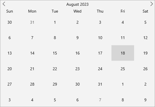
The following code snippet shows how to set the **SelectedDate** property:
```xml
```
### Select Multiple Dates
You can display multiple dates selected in Calendar simply by using code. The following image shows multiple dates selected in Calendar when the selection is set through code.
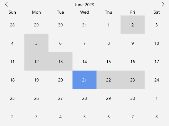
To select multiple dates through code, you can use the [SelectedDates](/componentone/api/maui/online-maui/dotnet-api/C1.Maui.Calendar/C1.Maui.Calendar.C1Calendar.SelectedDates.html) property as shown in the code snippet below:
```csharp
DateTime[] dateTimes = new DateTime[]
{
new DateTime(2023, 06, 02),
new DateTime(2023, 06, 05),
new DateTime(2023, 06, 12),
new DateTime(2023, 06, 13),
new DateTime(2023, 06, 22),
new DateTime(2023, 06, 23),
};
// Set the list of selected dates
calendar.SelectedDates = dateTimes;
```
### Select a Date Range
By default, Calendar allows you to select a day in the displayed calendar month. However, you can change this default behavior by using the [SelectionMode](/componentone/api/maui/online-maui/dotnet-api/C1.Maui.Calendar/C1.Maui.Calendar.C1Calendar.SelectionMode.html) property that allows multiple selection of dates across months by simply dragging the mouse horizontally at runtime. The **SelectionMode** property of the [C1Calendar](/componentone/api/maui/online-maui/dotnet-api/C1.Maui.Calendar/C1.Maui.Calendar.C1Calendar.html) class allows you to select a single date or multiple dates using the [C1SelectionMode](/componentone/api/maui/online-maui/dotnet-api/C1.Maui.Core/C1.Maui.Core.C1SelectionMode.html) enumeration which specifies the selection behavior of the Calendar control. In addition, Calendar also allows you to limit the maximum number of days that can be selected by the end user using the [MaxSelectionCount](/componentone/api/maui/online-maui/dotnet-api/C1.Maui.Calendar/C1.Maui.Calendar.C1Calendar.MaxSelectionCount.html) property.
The following gif shows a date range selected in the calendar control across multiple months.
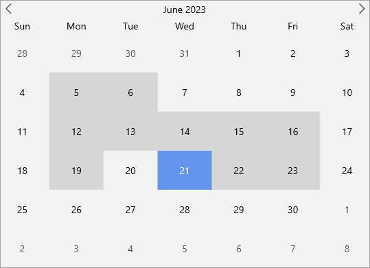
To allow the end user to select limited number of days, use the following code. In this example, we are setting the **SelectionMode** property to **C1SelectionMode.Multiple** to allow user to select multiple dates and setting the **MaxSelectionCount** to **10** to set it as a limit for the date range selection.
**xml**
```xml
```
**csharp**
```csharp
calendar.SelectionMode = C1.Maui.Core.C1SelectionMode.Multiple;
calendar.MaxSelectionCount = 10;
```
### Display a Specific Date Range for Selection
You can customize the Calendar control to show a limited set of days in the calendar by specifying minimum and maximum dates and restrict the selection to the specified range of dates from the calendar. Setting a minimum date helps you to display the earliest date that the end user can select. Likewise, setting a maximum date helps you to display the last date the end user can select. You can set the minimum and maximum dates for selection in the Calendar control by using the [MinDate](/componentone/api/maui/online-maui/dotnet-api/C1.Maui.Calendar/C1.Maui.Calendar.C1Calendar.MinDate.html) and [MaxDate](/componentone/api/maui/online-maui/dotnet-api/C1.Maui.Calendar/C1.Maui.Calendar.C1Calendar.MaxDate.html) properties of **C1Calendar** class.
In the following image, the minimum and maximum date has been set to 5/5/2023 and 23/5/2023 respectively. As you can observe all other date values outside this range are disabled, and only a particular date range can be selected.
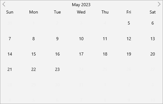
The following code uses the **MinDate** and **MaxDate** properties to display the available date range for selection in the calendar:
```xml
```