# Custom Nodes
Customize the nodes of Blazor TreeView by adding checkboxes, node expand/collapse icons and item template. Learn about node customization in Blazor documentation.
## Content
TreeView enables you to create and display custom nodes in place of the default nodes. It allows various customizations, for instance, display checkboxes for nodes, create custom views and add icons for showcasing the expanded and collapsed nodes.
## Display Checkboxes for Nodes
TreeView supports node selection using check boxes. It allows you to display check boxes for each node in the TreeView and provides users the ability to select nodes using the check boxes. By default, TreeView does not display check boxes against the nodes. To display checkboxes against each node or item in the TreeView control, you can simply set [ShowCheckBoxes](/componentone/api/blazor/online-blazor/dotnet-api/C1.Blazor.TreeView/C1.Blazor.TreeView.C1TreeView.ShowCheckboxes.html) property of the [C1TreeView](/componentone/api/blazor/online-blazor/dotnet-api/C1.Blazor.TreeView/C1.Blazor.TreeView.C1TreeView.html) class to **true**.
Additionally, you can enable multiple node selection in the TreeView control using the [SelectionMode](/componentone/api/blazor/online-blazor/dotnet-api/C1.Blazor.TreeView/C1.Blazor.TreeView.C1TreeView.SelectionMode.html) property. To know more about displaying multiple selection and other selection modes in the TreeView control, see [Node Selection](/componentone/docs/blazor/online-blazor/controls/treeview-overview/treeview-behavior#selection).
The following image shows multiple selection and check boxes beside each TreeView node.
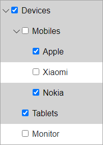
The following code demonstrates how to display check boxes beside each node and enable multiple node selection.
```razor
@using C1.Blazor.Core
@using C1.Blazor.TreeView
```
### Create Custom View using ItemTemplate
You can customize the TreeView control by using special templates to render items and create your own view. These templates can be set by using [ItemTemplate](/componentone/api/blazor/online-blazor/dotnet-api/C1.Blazor.TreeView/C1.Blazor.TreeView.C1TreeView.ItemTemplate.html) property of the [C1TreeView](/componentone/api/blazor/online-blazor/dotnet-api/C1.Blazor.TreeView/C1.Blazor.TreeView.C1TreeView.html) class and can be used to specify custom content in the TreeView.
The following image shows the custom view of TreeView created using ItemTemplates.
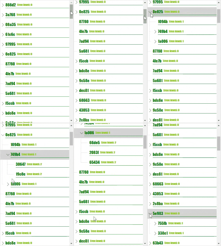
The following code showcases the use of ItemTemplates to create a custom view.
```razor
@using C1.Blazor.TreeView
@using C1.Blazor.Core
@if (context is TreeViewItem { DataItem: Directory dir } item)
{
@dir.Name Tree level: @item.TreeLevel
}
@code{
public class Directory
{
public string Name { get; set; }
public List Subdirectories { get; set; }
}
int Random()
{
return new Random().Next(0, 5);
}
IList _directories = new List();
protected override void OnInitialized()
{
for (int i = 0; i < 100; i++)
{
var root = new Directory
{
Name = Guid.NewGuid().ToString().Substring(0, 5),
Subdirectories = new List()
};
var childCount = Random();
for (int j = 0; j < childCount; j++)
{
var subChildCount = Random();
var subRoot = new Directory
{
Name = Guid.NewGuid().ToString().Substring(0, 5),
Subdirectories = new List()
};
for (int k = 0; k < subChildCount; k++)
{
subRoot.Subdirectories.Add(new Directory
{
Name = Guid.NewGuid().ToString().Substring(0, 5),
});
}
root.Subdirectories.Add(subRoot);
}
_directories.Add(root);
}
}
}
```
### Expand and Collapse Node Icons
TreeView allows you to customize its expand/collapse icons. It provides the following properties in the **C1TreeView** class which can be used to customize the expand and collapse icons in the TreeView control.
| **Properties** | **Description** |
| --- | --- |
| **[CollapsedIconTemplate](/componentone/api/blazor/online-blazor/dotnet-api/C1.Blazor.TreeView/C1.Blazor.TreeView.C1TreeView.CollapsedIconTemplate.html)** | The content template which is used to create icons for tree item in collapsed state |
| **[ExpandedIconTemplate](/componentone/api/blazor/online-blazor/dotnet-api/C1.Blazor.TreeView/C1.Blazor.TreeView.C1TreeView.ExpandedIconTemplate.html)** | The content template which is used to create icons for tree item in expanded state |
| **[ExpandedIconStyle](/componentone/api/blazor/online-blazor/dotnet-api/C1.Blazor.TreeView/C1.Blazor.TreeView.C1TreeView.ExpandedIconStyle.html)** | The style applied to the expanded/collapsed icon. |
The **CollapsedIconTemplate** and **ExpandedIconTemplate** properties create icons for collapsed and expanded nodes of the TreeView control using [C1IconTemplate](/componentone/api/blazor/online-blazor/dotnet-api/C1.Blazor.Core/C1.Blazor.Core.C1IconTemplate.html) class, respectively.
The following images displays TreeView nodes with the expand/collapse icons.
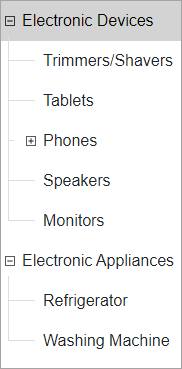
The following code demonstrates how you can use the properties listed in the table above to change the icons for the TreeView nodes.
```razor
@using C1.Blazor.TreeView
@using C1.Blazor.Core
@code{
public class Directory
{
public string Name { get; set; }
public List Subdirectories { get; set; }
public bool Expanded { get; set; } = true;
}
readonly IList _dataSource = new List()
{
new Directory()
{
Name = "Electronic Devices",
Subdirectories = new List
{
new Directory { Name = "Trimmers/Shavers" },
new Directory { Name = "Tablets" },
new Directory
{
Name = "Phones",
Subdirectories = new List
{
new Directory { Name = "Apple" },
new Directory { Name = "Motorola" },
new Directory { Name = "Nokia" },
new Directory { Name = "Samsung" }
}
},
new Directory { Name = "Speakers" },
new Directory { Name = "Monitors" }
}
},
new Directory
{
Name = "Electronic Appliances",
Subdirectories = new List()
{
new Directory {Name = "Refrigerator"},
new Directory {Name = "Washing Machine"}
}
},
};
}
```