# Menu
Blazor Edition provides a set of native UI controls built for Blazor such as FlexGrid, Chart, ListView, and input controls including AutoComplete and ComboBox.
## Content
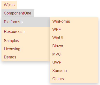
**Menu for Blazor** is a control that displays a text element with a drop-down list of commands that the user can invoke by a click or touch. It allows flat or hierarchical organization of elements associated with easy navigation. With the Menu control, you can generate traditional-looking menus that support deeply nested items and provide pop-up menus that associate frequently-used commands with selected objects. Additionally, it allows you to adjust the orientation of the menus according to your application.
## Key Features
Make the most of the **Menu** by taking advantage of the following key features:
* **Flat and Hierarchical Menu**
The Menu control gives you the flexibility to create a flat or hierarchical menus according to your application requirements. For more information, see [Menus and Sub-Menus](/componentone/docs/blazor/online-blazor/controls/menu/menusandsubmenu).
* **Orientation**
The **Menu** control allows you to set the direction of rendering the menu. For more information, see [Orientation](/componentone/docs/blazor/online-blazor/controls/menu/menu-orientation).
.
* **Deep Menus**
Menu control allows you to nest menus to any depth. See [Nested Submenus](/componentone/docs/blazor/online-blazor/controls/menu/menusandsubmenu#nested) for more information.
* **Icons for Menu Items**
Menu allows you to use an icon for each menu item along with the menu label.