# Expander
Blazor Edition provides a set of native UI controls built for Blazor such as FlexGrid, Chart, ListView, and input controls including AutoComplete and ComboBox.
## Content
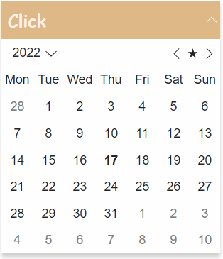
**Expander for Blazor**, as the name suggests, allows you to create an expandable and collapsible information panel that can include text, images, and controls. The Expander control appears as a header and a blank content panel whose behaviors, such as the expandability and the direction, can be modified based on your requirements.
## Key Features
* **Expand Direction**
The Expander control has the ability to expand in four different directions, namely Top, Right, Bottom, and Left. This allows you to change the direction in which the control expands. For more information, see the [Expand Direction](/componentone/docs/blazor/online-blazor/controls/layout-controls/expander/expander-expand-direction) topic.
* **Custom Header**
The Expander control's header can be easily customized by adding some text or controls in it. For more information on the expander header, see [Header](/componentone/docs/blazor/online-blazor/controls/layout-controls/expander/header).
* **Control Expandability**
Choose whether or not the Expander control can be expanded or collapsed upon page load by simply using a single property. For more information, see the [Expandability](/componentone/docs/blazor/online-blazor/controls/layout-controls/expander/expandability) topic.
* **Configure Items in an Organized Pattern**
Expander is designed to maximize space. Configure the size and position of the expander to hide items until needed.