# Window Elements
Blazor Edition provides a set of native UI controls built for Blazor such as FlexGrid, Chart, ListView, and input controls including AutoComplete and ComboBox.
## Content
Windows is a simple popup window component with simple and interactive UI. It consists of a header, content, and footer. However, you can choose to display or hide any of these elements. Let us get to know more about these elements and how to display them in the Window control in the following sections.
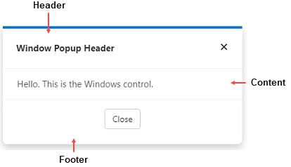
**Window** consists of the following elements:
* **Header**: Represents the header which is displayed at the top of the Window. To learn how to add header to Window programmatically, see [Header](/componentone/docs/blazor/online-blazor/controls/input-controls/window/window-elements#add-header) section.
* **Content**: Represents the inner content displayed in the body of the Window. To learn how to add content to Window programmatically, see [Content](/componentone/docs/blazor/online-blazor/controls/input-controls/window/window-elements#add-content) section.
* **Footer**: Represents the footer which is displayed at the bottom of the Window. To learn how to add footer to Window programmatically, see [Footer](/componentone/docs/blazor/online-blazor/controls/input-controls/window/window-elements#add-footer) section.
### Add Header
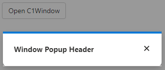
Window allows you to display a header at the top. You can add a header to the Window component using [PopupHeader](/componentone/api/blazor/online-blazor/dotnet-api/C1.Blazor.Input/C1.Blazor.Input.C1Window.PopupHeader.html) property of the [C1Window](/componentone/api/blazor/online-blazor/dotnet-api/C1.Blazor.Input/C1.Blazor.Input.C1Window.html) class.
```razor
Window Popup Header
@code{
C1Window myPopup;
void OpenPopup()
{
myPopup.Open();
}
void ClosePopup()
{
myPopup.Close();
}
}
```
### Add Content
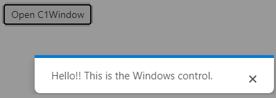
To add content to Window, you can use the [PopupContent](/componentone/api/blazor/online-blazor/dotnet-api/C1.Blazor.Input/C1.Blazor.Input.C1Window.PopupContent.html) property of the **C1Window** class as shown in the following code:
```razor
Hello!! This is the Windows control.
@code{
C1Window myPopup;
void OpenPopup()
{
myPopup.Open();
}
void ClosePopup()
{
myPopup.Close();
}
}
```
### Add Footer
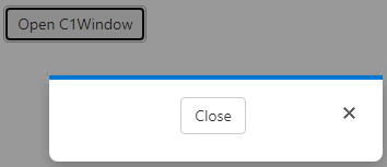
In addition to header and content, you can also add footer to the Window component. To add footer in the Window component, you can use [PopupFooter](/componentone/api/blazor/online-blazor/dotnet-api/C1.Blazor.Input/C1.Blazor.Input.C1Window.PopupFooter.html) property of the **C1Window** class.
```razor